• It
Sign in Get Pulp Pulp 28
Pulp
Sign in Get Pulp Pulp 28
Pulp
  • Inspiration93
  • Stories88
  • News174
  • Pulp Archive
  • Materials Index
  • About Pulp
  • Tell Us
  • Sign in
  • Get Pulp
  • Pulp 28
  • It
Browse Themes
Corporate communicationDigital printingGraphic designIllustrationInterviewsLabelLarge formatPackagingPeople & PaperPhotographyPrintingPublishingSustainabilityInspirationStoriesNews
Pulp

Log-In

Please enter your credentials to access all Pulp contents.

Forgot your password?

New to Pulp? Register for free

New to Pulp?

Register for free to have full access to our content.

Register

2 min minutes
News

Wishing bell

An identity design project for a Slovenian hotel includes the creation of a box of chocolates inspired by a local legend
Graphic designPackagingPrinting

Starkl Hotel and Restaurant is a small family-run boutique hotel situated on the shores of Lake Bled in Slovenia’s Upper Carniola region. In existence for nearly 100 years, the hotel recently commissioned a new identity by Studio Hrastar (Milan and Ljubljana) as part of a project to redefine its positioning as one of the most unique hotels in the country.

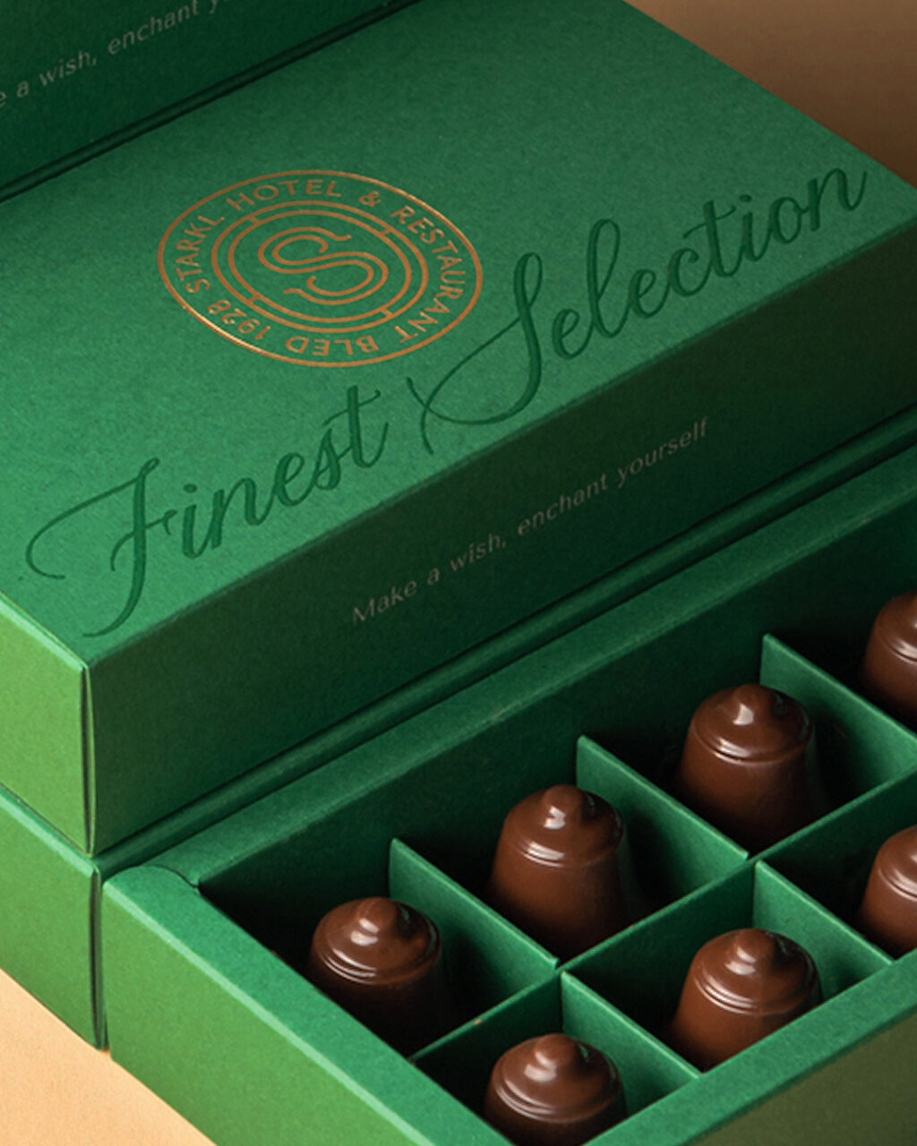
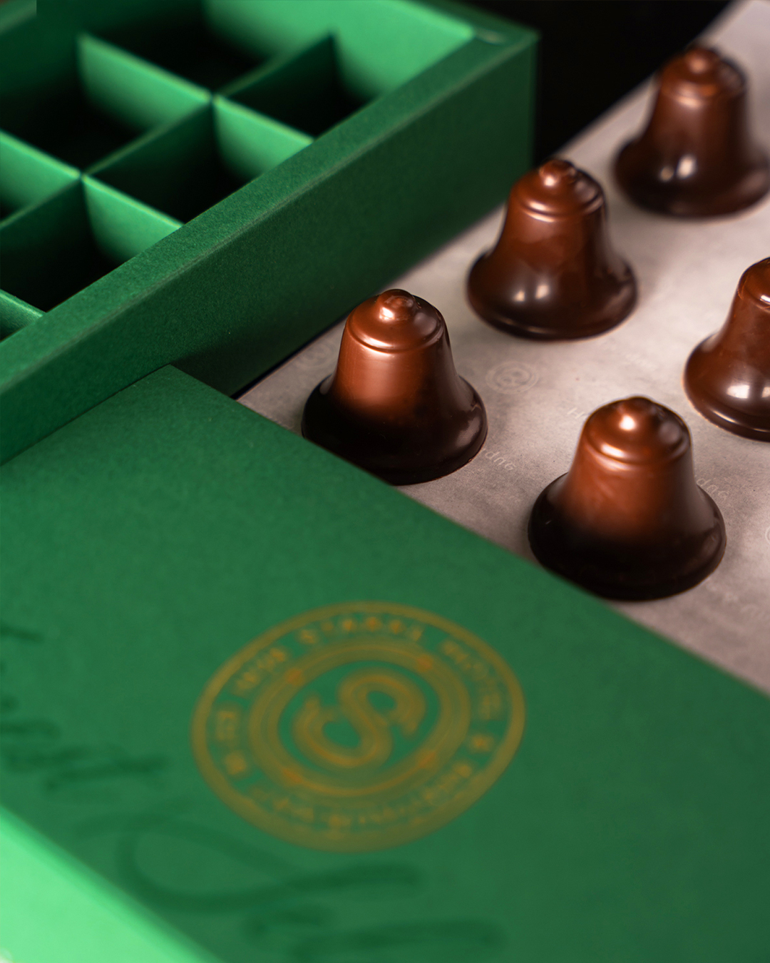
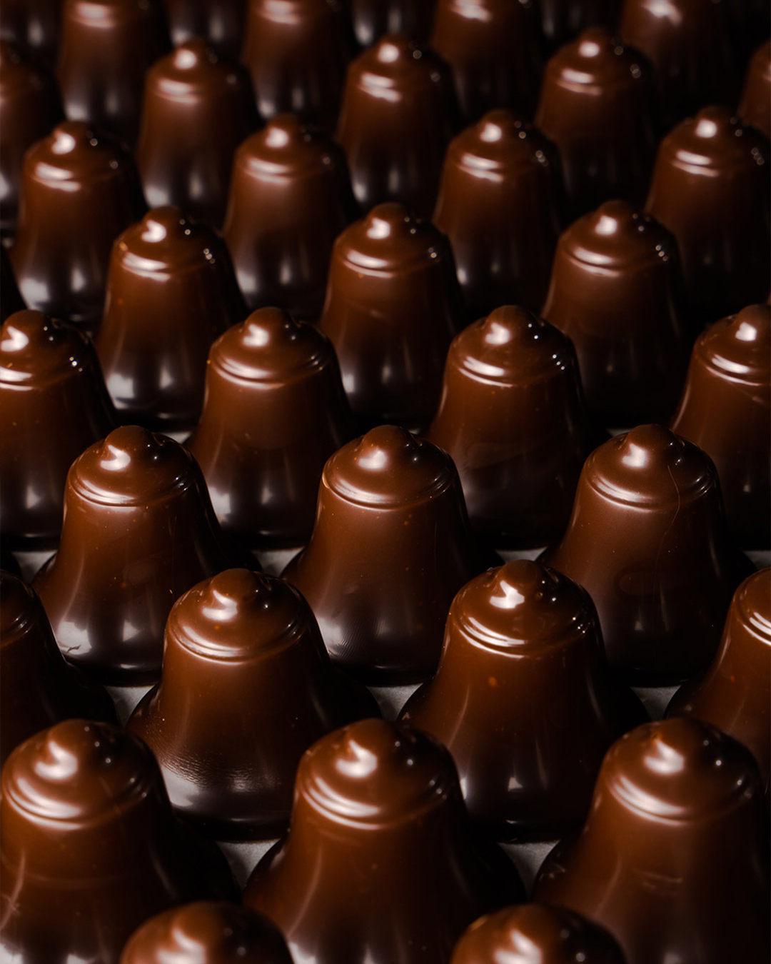
The hotel also makes its own gifts for guests – its latest being a box of handmade praline ‘wishing bell’ chocolates. The design of the chocolates reflects the unique location of the hotel and references a local legend. According to Tomaz Hrastar, whose studio helped to develop the product and design its packaging, the chocolates are inspired by a story surrounding the famous lake.

‘There is a small island with a church in the middle of the lake,’ he explains. ‘According to legend, a widow who lived in the nearby castle was travelling to the island on a small boat when she lost a bell she had brought with her to place in the church. The bell sank to the bottom of the lake.

‘The legend holds that if you visit the island, ring a bell a make a wish, your wish will come through. We paid tribute to the legend and made chocolates in the shape of a bell and packaged them in a beautiful box.’

The packaging displays the identity Hrastar designed for Starkl – a gold monogrammed ‘S’ surrounded by the name and the date of the hotel’s founding – and employs the typefaces Tenor Sans (Denis Masharov), Silka (Atipo Foundry) and Hello Bride (50Fox).

Paper: Sirio Color Foglia 290 g/m2

starkl.si

studiohrastar.com

Hotel Starkl Instagram

Studio Hrastar Instagram

Photography: Teotim Logar Zorn

Featured Materials

Sirio Color

An extensive range of pulp-dyed uncoated papers and boards with light-fast colours, available in weights ranging from 80 to 700 gsm. Pure ECF and FSC® certified.

Related articles

Inspiration 11/09/2025

Through the eyes of Avedon

A new book celebrates the rarely seen advertising work of a great photographer. By Patrick Baglee
PhotographyPrintingPublishing
Stories 21/06/2022

People and paper: Fernando Gutiérrez

For Fernando Gutiérrez design is about relationships, dialogue and letting things speak for themselves. By John L. Walters
Graphic designInterviewsLabelPackaging
Stories 14/06/2022

Surprise effect

Canadian by birth but Milanese by choice, Ginette Caron defies convention with designs shaped by her unique perspective. By Silvia Sfligiotti
Graphic designLarge formatPrinting
Inspiration 18/07/2024

Green light

Digital printing gave Studio Lowrie the freedom to make an adventurous monograph for WG+P Architects. By Alex J. Todd
Digital printingGraphic designPublishing
Pulp © 2026
Fedrigoni
Fedrigoni
COOKIE POLICY PRIVACY POLICY ACCESSIBILITY STATEMENT
Pulp © 2026