• It
Sign in Get Pulp Pulp 27
Pulp
Sign in Get Pulp Pulp 27
Pulp
  • Inspiration82
  • Stories79
  • News162
  • Pulp Archive
  • Materials Index
  • About Pulp
  • Tell Us
  • Sign in
  • Get Pulp
  • Pulp 27
  • It
Browse Themes
Corporate communicationDigital printingGraphic designIllustrationInterviewsLabelLarge formatPackagingPeople & PaperPhotographyPrintingPublishingSustainabilityInspirationStoriesNews
Pulp

Log-In

Please enter your credentials to access all Pulp contents.

Forgot your password?

New to Pulp? Register for free

New to Pulp?

Register for free to have full access to our content.

Register

3 min minutes
News

Gourmet elixir

Based on old apothecaries, Gallén+Ibáñez promote truth and quality with Carmen del Poaig extra virgin olive oil packaging
Graphic designPackagingPrinting

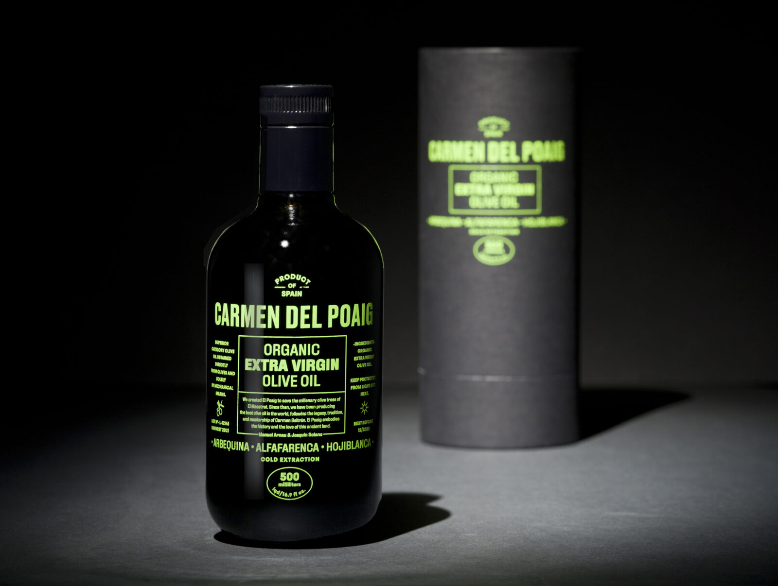
Designed by Valencia-based Gallén+Ibáñez (Marisa Gallén and Carmina Ibáñez), Carmen del Poaig extra virgin olive oil is one of the latest limited-edition launches by organic olive oil producer El Poaig.

El Poaig, founded by Manuel Arnau and Joaquim Solano in 2008, launched two ultra-premium olive oils on a mission to protect the 1000-year old olive trees of Maestrat. Nearly fifteen years later, they launched Carmen del Poaig limited production oil which is specially focused on the North American gourmet market.

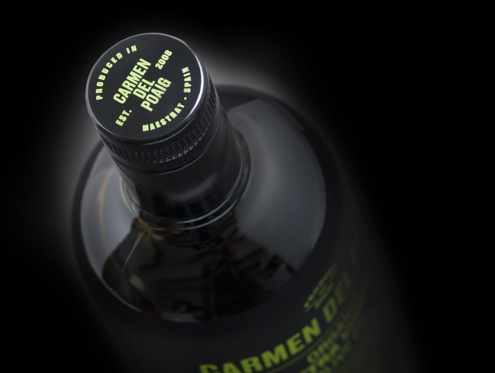
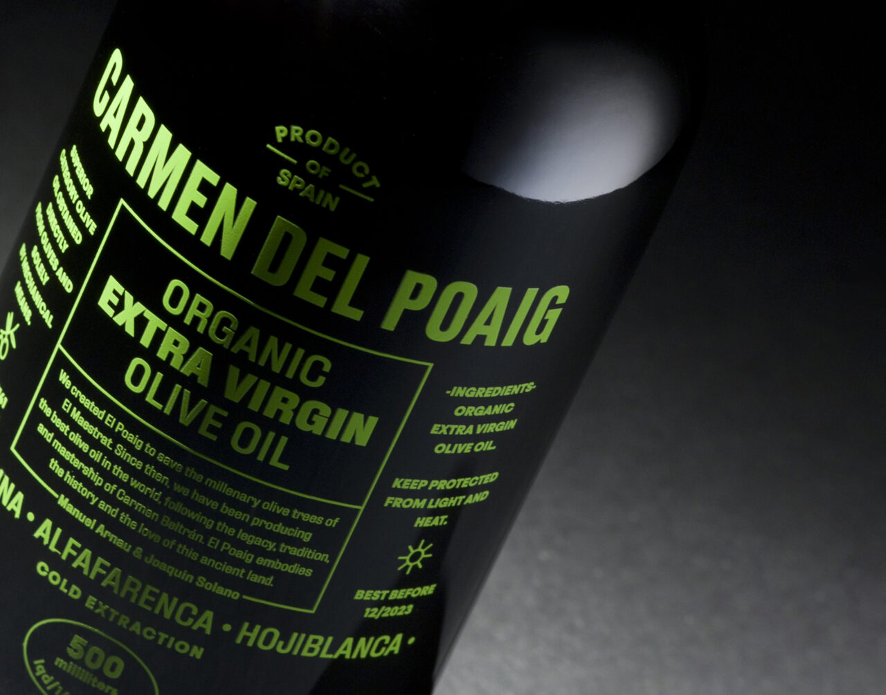
When asked about the creative process for the project Ibáñez states, ‘We needed a concept for the identity and packaging that represented the honesty and excellence of this traditional product. Truthfulness and quality, without pretence. We selected a black glass bottle and its rounded shapes reminded us of the bottles and jars of the old apothecaries’.

Gallén and Ibáñez also gained inspiration from vintage advertisements for medicines and remedies. They wanted to highlight the relationship between healthy Mediterranean living and this extraordinary product. They adapted the typographic style to reflect this and Ibáñez says, ‘the language was perfect to communicate Carmen del Poaig as a perfect elixir for life’.

The team chose Sirio Fiandra because it complied with all the sustainability certifications and had the black tone they wanted. Ibáñez states, ‘The texture is perfect because, as well as being elegant, it conceals any scratches or fingerprints that might be caused by rubbing or transport’.

Papers: Sirio Ultra Black E/65 Fiandra

carminaibanez.com

gallenibanez.com

elpoaig.com

Featured Materials

Sirio Color

An extensive range of pulp-dyed uncoated papers and boards with light-fast colours, available in weights ranging from 80 to 700 gsm. Pure ECF and FSC® certified.

Related articles

News 22/09/2022

Natural minimalistic

Di Carlo’s low intervention wine-making process is reflected in Stefano Bracci’s labels for its Nobu 1830 range
Graphic designLabel
Inspiration 10/04/2025

Mr Kitching in Italy

Last summer, the Tipoteca Foundation hosted an intense, four-day letterpress workshop led by Alan Kitching. By Paul Shaw. Photography by Andrea Basile
Graphic designPrinting
News 22/08/2024

Fedrigoni Top Award 2025

Submit your project today for the ultimate celebration of beauty and creativity
Corporate communicationDigital printingGraphic designIllustrationLabelLarge formatPackagingPhotography
Inspiration 23/05/2024

Her Senses

‘Luckily the paper is eco-friendly, recycled and recyclable, which in return gives me – as a brand creator – a sense of confidence and peace of mind.’
PackagingSustainability
Pulp © 2025
Fedrigoni
Fedrigoni
COOKIE POLICY PRIVACY POLICY ACCESSIBILITY STATEMENT
Pulp © 2025