• It
Sign in Get Pulp Pulp 27
Pulp
Sign in Get Pulp Pulp 27
Pulp
  • Inspiration82
  • Stories79
  • News162
  • Pulp Archive
  • Materials Index
  • About Pulp
  • Tell Us
  • Sign in
  • Get Pulp
  • Pulp 27
  • It
Browse Themes
Corporate communicationDigital printingGraphic designIllustrationInterviewsLabelLarge formatPackagingPeople & PaperPhotographyPrintingPublishingSustainabilityInspirationStoriesNews
Pulp

Log-In

Please enter your credentials to access all Pulp contents.

Forgot your password?

New to Pulp? Register for free

New to Pulp?

Register for free to have full access to our content.

Register

3 min minutes
News

Decant the data

Advision collaborates with tech company ArchivaGroup to create one-of-a-kind wine labels
Digital printingGraphic designLabelPackagingPrinting
‘In this project, data is not just a starting point—it’s the driving force.’

Nestled in the heart of Valpolicello, a renowned wine region in northern Italy, creative studio Advision has a distinctive approach for packaging in the food and beverage sector. Recently the studio teamed up with ArchivaGroup, an Italian company that specialises in digital transformation and document management, to develop a limited-edition label that transforms data into storytelling.

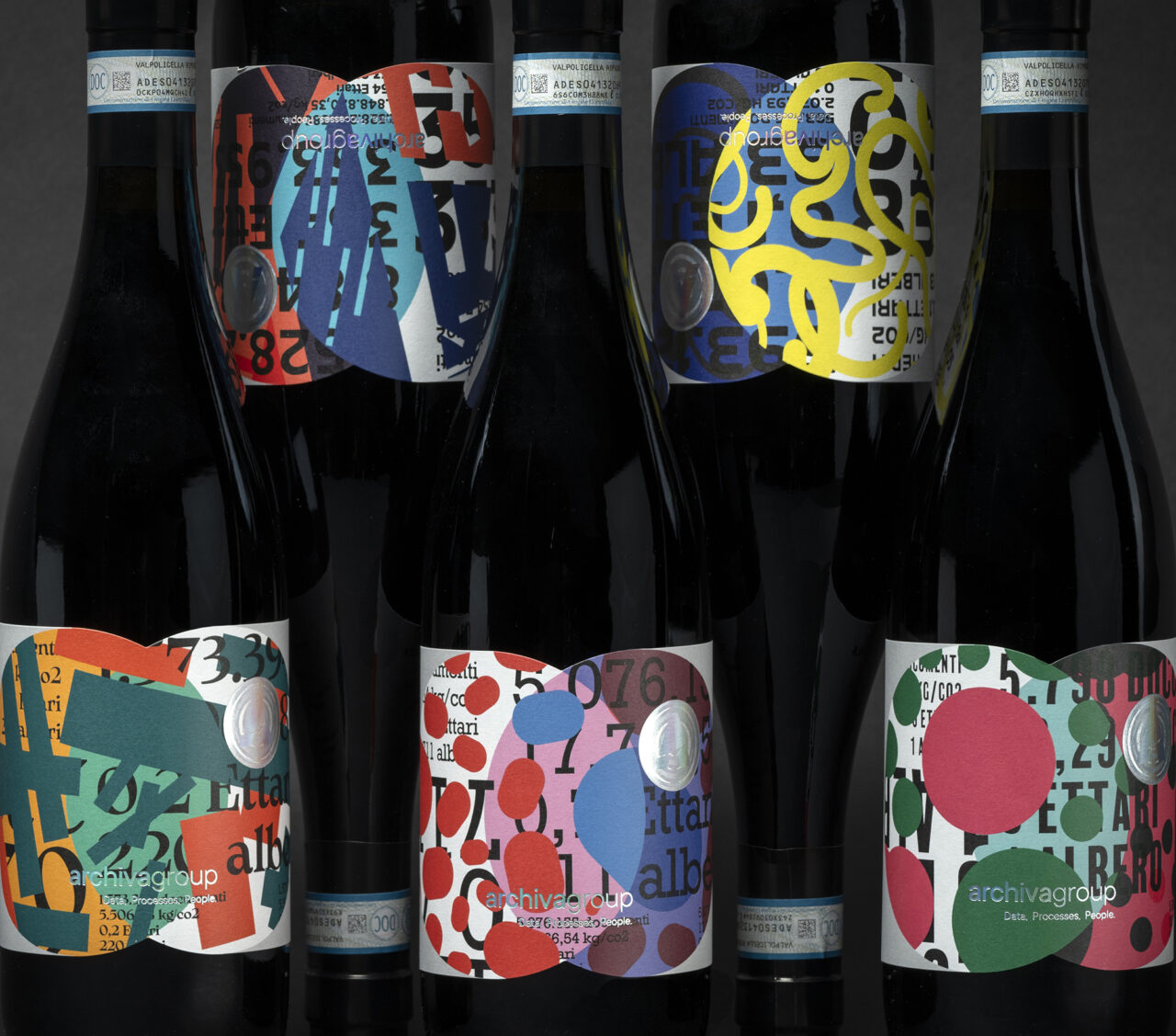
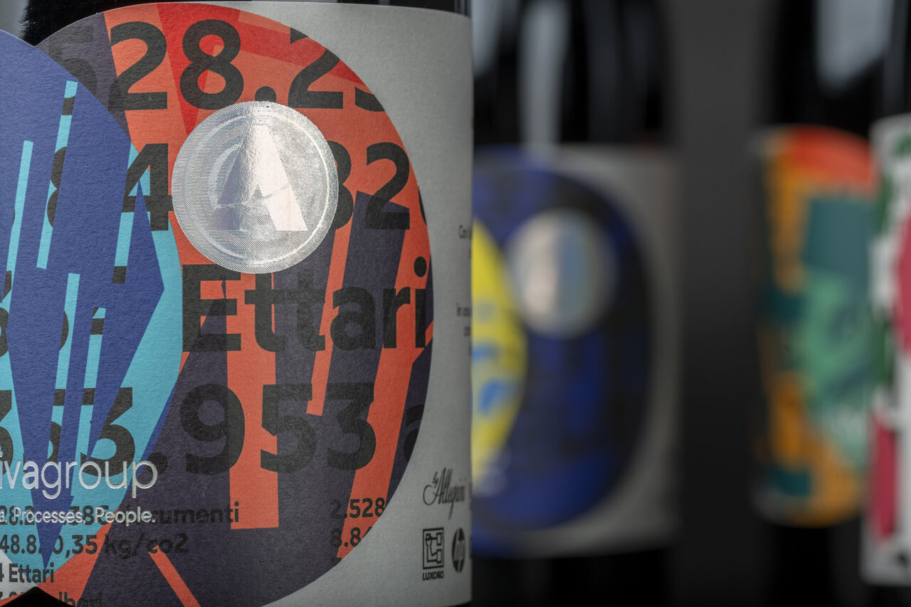
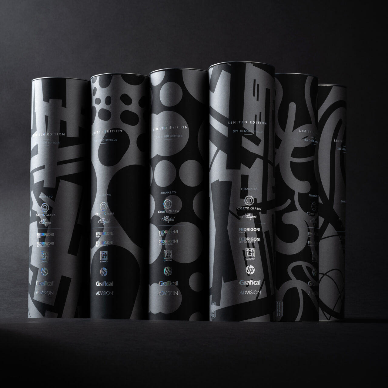
Starting with a bottle of Valpolicello Ripasso from Corte Giara Winery, Advision created a multi-layered packaging experience that was different for every ArchivaGroup customer that received them. Each one-of-a-kind wine label was printed (by Grafical, near Verona), on an HP Indigo digital press using the applications Mosaic and Collage, with variable data that included the recipient’s name, along with visual patterns and colours that represent how ArchivaGroup helps reduce the global impact of that specific customer’s processes. Advision art director Matteo Zantedeschi says, ‘In this project, data is not just a starting point – it’s the driving force.’

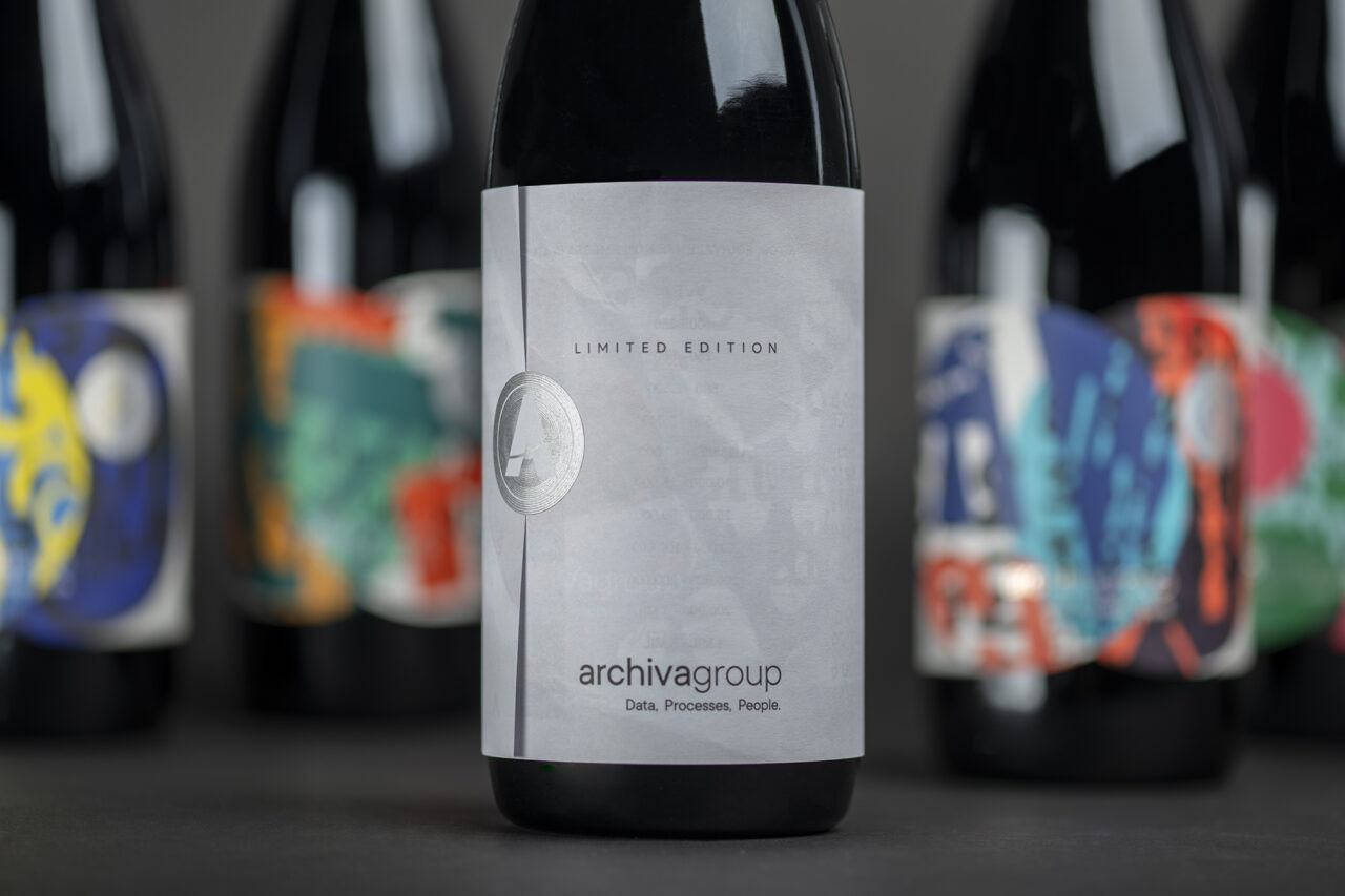
The label is printed on Fedrigoni’s Re-Play range, the first example of upcycling in the self-adhesive industry within a closed-loop recycling system. A small, yet unique detail featured on the label is precision Luxoro KURZ’s laser seamless foil with micro-engraved dies of the ArchivaGroup’s logo mark, produced by German-based stamping manufacturer Hinderer+Muehlich.

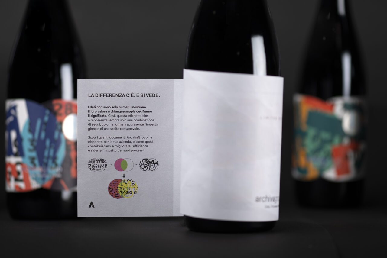
The packaging also includes a paper wrapper made from Arena ExtraWhite Smooth 90g/m2, which has a semi-transparent element, creating a layered effect over the label below. There is also an outer carton for the bottle that uses Sirio Color Black with silver ink and hot foil printing.

The textures and vibrant colours of the labels, combined in a unique way, tell the story of collaboration with ArchivaGroup.

Papers:
Re-Play Nature White WS FSC
Arena ExtraWhite Smooth 90g/m2
Sirio Color Black

ad-vision.it

Advision Instagram

archivagroup.com

hinderer-muehlich.com

grafical.it

cortegiara.com

Featured Materials

Sirio Color

An extensive range of pulp-dyed uncoated papers and boards with light-fast colours, available in weights ranging from 80 to 700 gsm. Pure ECF and FSC® certified.

Re-Play

An innovative self-adhesive range where the siliconized backing of the label, usually discarded, is upcycled, becoming an integral part of the facestock. Uncoated, embossed, pearlescent and neck label versions available.

Arena

The Arena range is available in four shades: a bright Ivory, on OBA-free Natural, a warm White and a cool Extra White in a wide choice of sheet sizes, grain directions and grammages. Arena is available in three finishes: Smooth, Rough and Bulk. Also available in self-adhesive sheet version.

Related articles

Inspiration 11/04/2024

Bound in connubial bliss

Italian company Graphistudio has given the wedding album a high-profile makeover. By Andrew Robertson
Digital printingGraphic designPrinting
Inspiration 16/11/2022

The perfect pig

Deberlou’s award-winning packaging for a Mallorcan dried sausage reflects the ancient traditions and craftmanship that goes into its production. By Sarah Snaith
Graphic designLabelPackaging
Inspiration 06/06/2022

Feels like sculpture

Design agency Brighten the Corners’ books for sculptor Anish Kapoor cross the void between gallery and printed page. By John L. Walters
Graphic designPhotographyPublishing
Inspiration 18/07/2024

Green light

Digital printing gave Studio Lowrie the freedom to make an adventurous monograph for WG+P Architects. By Alex J. Todd
Digital printingGraphic designPublishing
Pulp © 2025
Fedrigoni
Fedrigoni
COOKIE POLICY PRIVACY POLICY ACCESSIBILITY STATEMENT
Pulp © 2025