• It
Sign in Get Pulp Pulp 27
Pulp
Sign in Get Pulp Pulp 27
Pulp
  • Inspiration88
  • Stories88
  • News173
  • Pulp Archive
  • Materials Index
  • About Pulp
  • Tell Us
  • Sign in
  • Get Pulp
  • Pulp 27
  • It
Browse Themes
Corporate communicationDigital printingGraphic designIllustrationInterviewsLabelLarge formatPackagingPeople & PaperPhotographyPrintingPublishingSustainabilityInspirationStoriesNews
Pulp

Log-In

Please enter your credentials to access all Pulp contents.

Forgot your password?

New to Pulp? Register for free

New to Pulp?

Register for free to have full access to our content.

Register

2 min minutes
News

Along the right guidelines

The design of the latest Fabriano catalogue reaffirms its typographic identity
Corporate communicationGraphic designPrintingPublishing

For many Italians, Perugian designer Simone Scimmi included, the Fabriano name has a special place in their memories of making art at school. ‘From children’s drawings to high school technical drawings – this was one of the reasons that made me approach this project with great passion,’ says Scimmi of the new trilingual (Italian, English, German) general catalogue [Catalogo Generale] he has designed for the paper company.

Scimmi aimed to make its design consistent with the recent Fabriano brand refresh by Pentagram (see Pulp 23). ‘The creative choices were strategically aligned with the new guidelines,’ says Scimmi. ‘My interpretation is in the grids on the spreads, the balanced colour palette of the paper categories, the use of typography and the selection of photographs.’

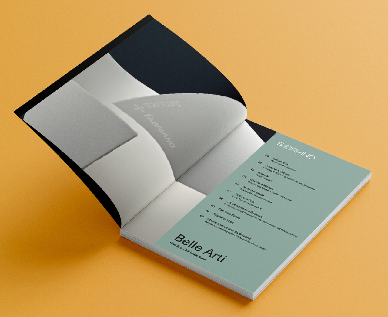
The cover shows the ‘FA’ ligature adapted by Pentagram from Carlo Cattaneo’s original 1970s logo, itself influenced by Herb Lubalin and Tom Carnase’s Avant Garde Gothic. The cover is a high-resolution photograph (by Gian Domenico Troiano) of a composition of four overlapping papers taken from different Fabriano collections. ‘The idea was to enhance the construction lines,’ says Scimmi.’ Inside, a monochrome photo of watermarked papers shows the tactility of Fabriano Artistico papers.

Arena Natural Smooth 140g/m2 is used for the inside pages, with a 250g/m2 weight for the cover. ‘I found the warm white perfect for the mood of the project and its contents,’ says Scimmi. ‘The sans typography is enhanced by the smooth touch of the paper.’

‘A Spotlight on Fabriano’

simonescimmi.com

Simone Scimmi Design Studio Instagram

fabriano.com/

Gian Domenico Troiano Behance

Featured Materials

Arena

The Arena range is available in four shades: a bright Ivory, on OBA-free Natural, a warm White and a cool Extra White in a wide choice of sheet sizes, grain directions and grammages. Arena is available in three finishes: Smooth, Rough and Bulk. Also available in self-adhesive sheet version.

Related articles

News 16/03/2023

Food for thought

Designed by Estiu, the Hedonistic Guide Yearbook celebrates the best of Valencian eateries
Graphic designPrintingPublishing
Stories 10/06/2022

In the republic of letters

The Italian cooperative CAST is bringing type culture into the future – while keeping its roots in the past. By Silvia Sfligiotti
IllustrationInterviewsPrinting
News 14/10/2024

Ten years of people and paper

On 22 October we celebrate a decade of Pulp at Fedrigoni UK
Graphic designInterviewsLabelLarge formatPackagingPeople & PaperPrinting
Stories 27/02/2025

Need to know: Beneath the surface

From atmospheric conditions to adhesives and paper, there are myriad factors that affect drinks labels. By Henry Miles
Graphic designLabelPrinting
Pulp © 2025
Fedrigoni
Fedrigoni
COOKIE POLICY PRIVACY POLICY ACCESSIBILITY STATEMENT
Pulp © 2025