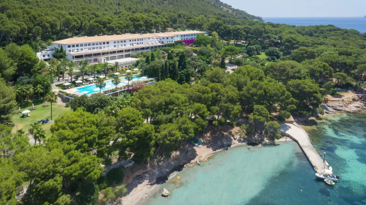
With offices in Barcelona and San Francisco, design studio Mucho collaborated with the luxury hotel company Four Seasons to create branded print collateral for their latest resort. Located on the northernmost tip of the Spanish island Mallorca, called Cap de Formentor, the Four Seasons Resort Mallorca at Formentor is nestled on the 20km long peninsula. The resort is a long, graceful structure that traces the landscape, surrounded by crystal-clear waters, rich green pines and rugged cliffs.
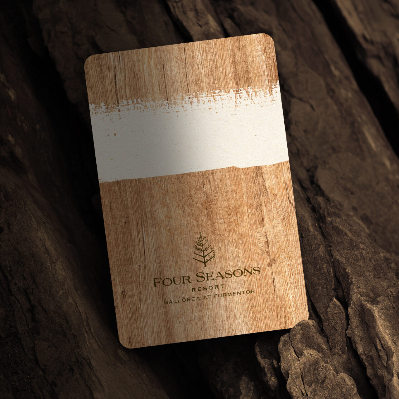
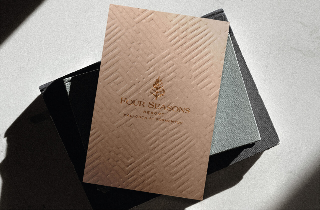
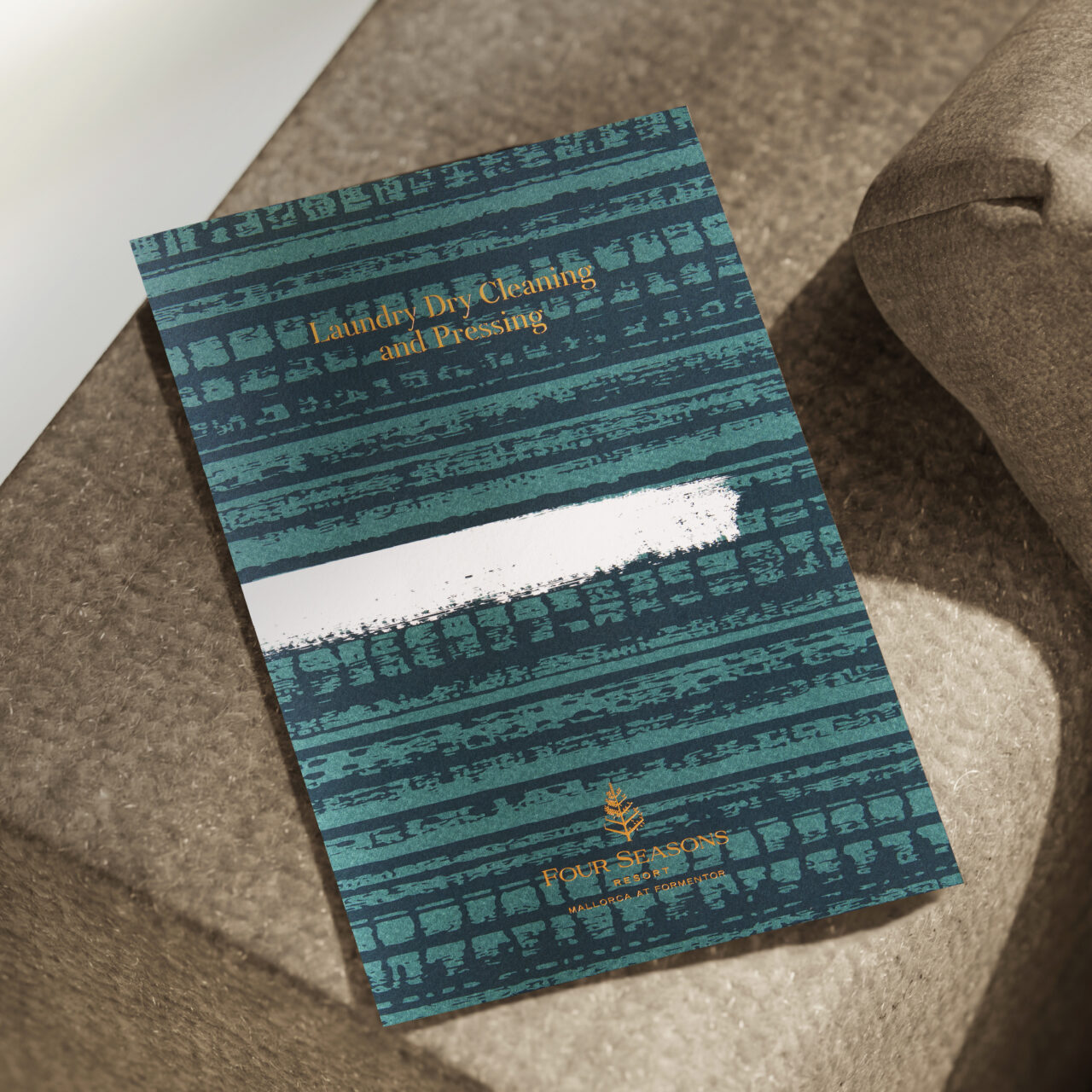
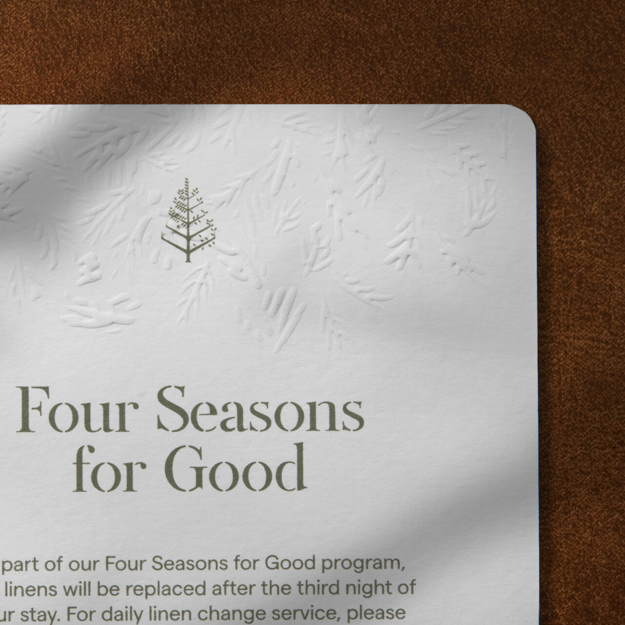
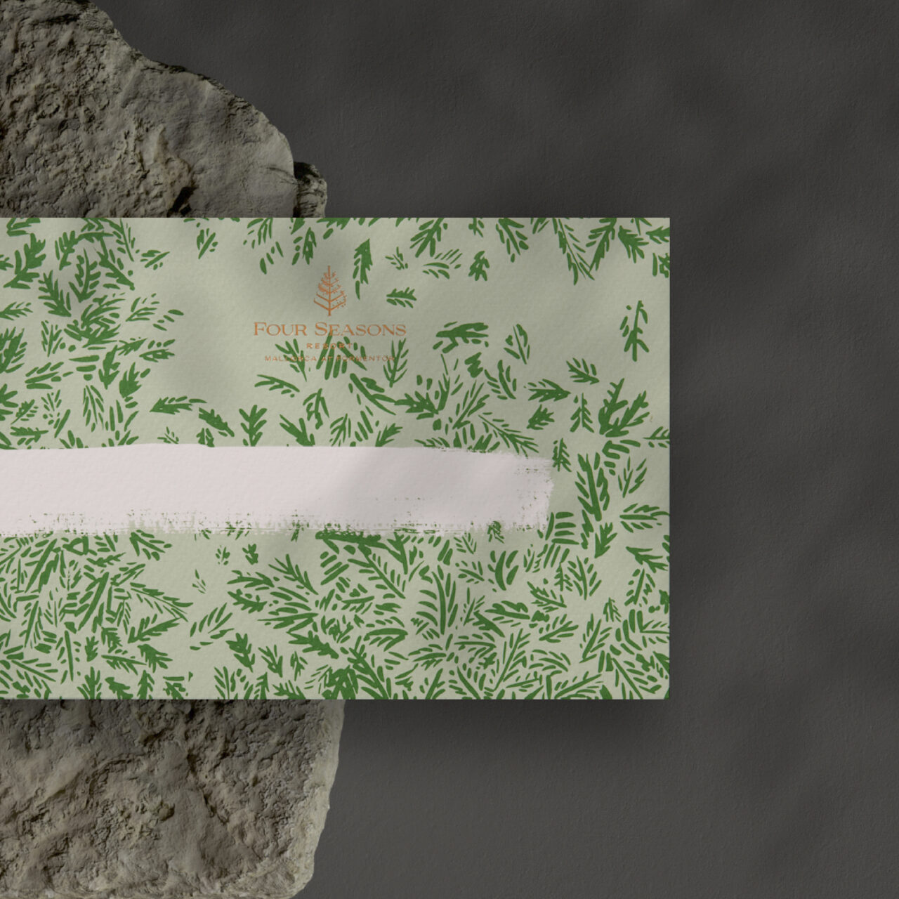
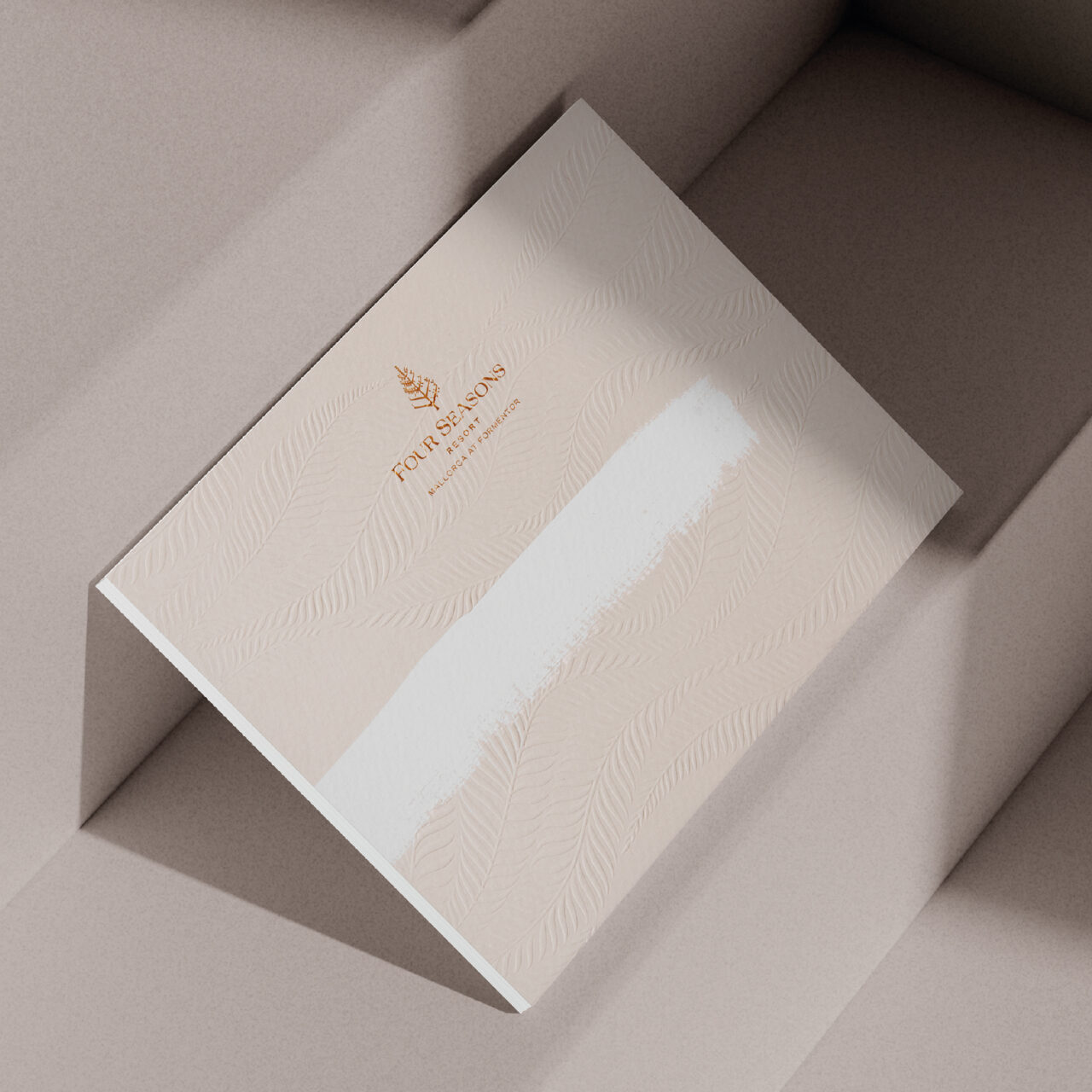
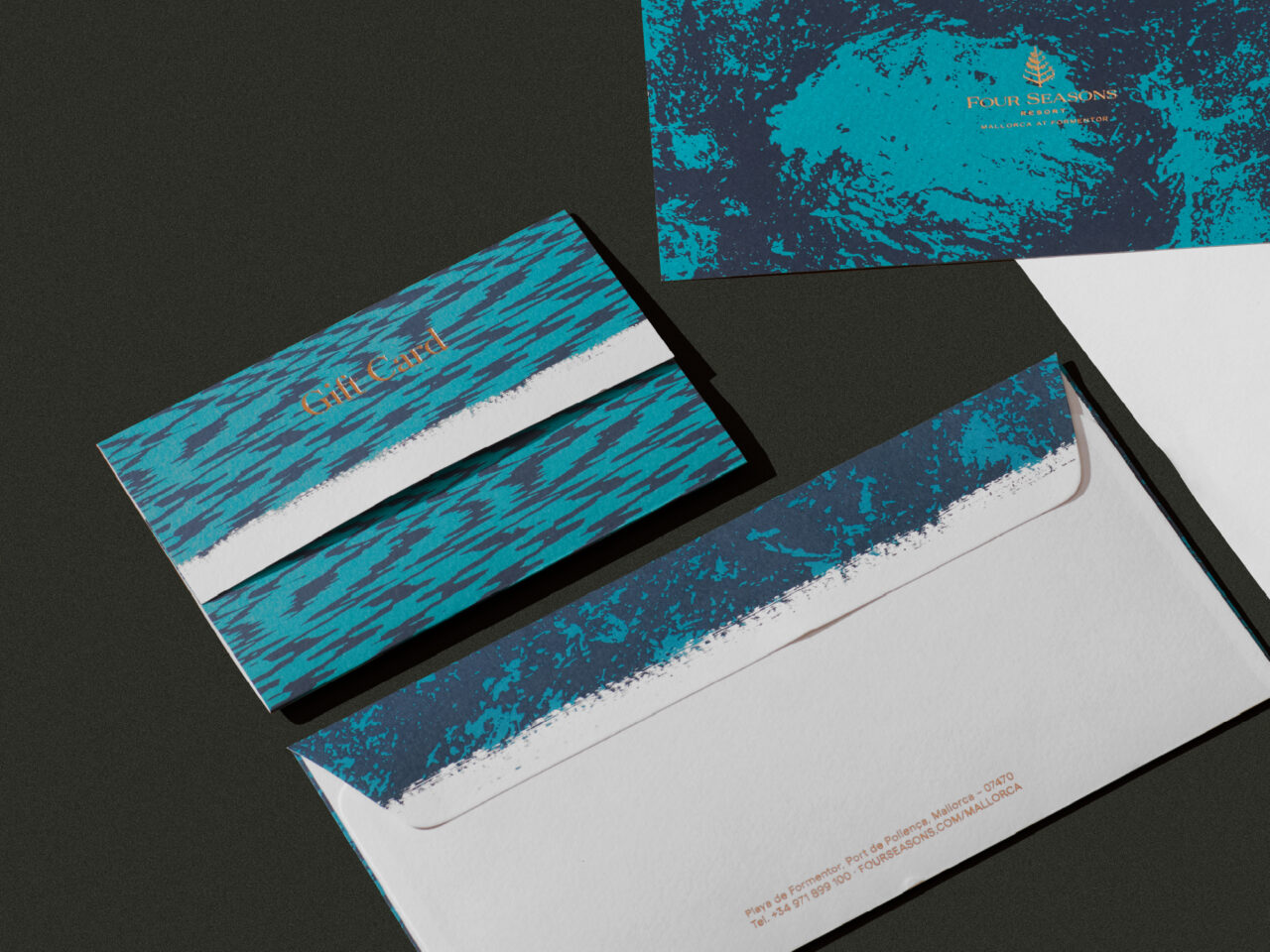
The client had a clear intention for the project: to create a brand experience that reflects the heritage of the Four Seasons name while grounding it in the local context of Mallorca’s Formentor. The concept developed from the phrase, ‘A stroke of white between the pine’s green’, connecting the architecture of the structure to the Mediterranean flora, ‘blending nature and sophistication’.
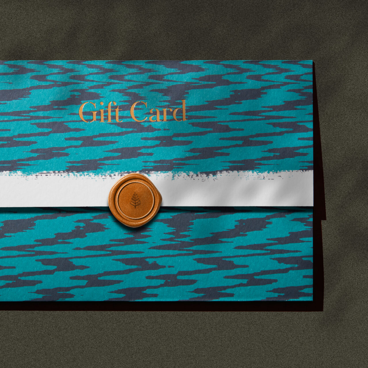
This collaborative project was developed by the team at Mucho, led by partner and creative director Pablo Juncadella, with design director Nico Wölfl taking charge on design. Working with mood boards, Mucho’s process began with an investigation into the essence of Formentor: its history, landscape and culture, including traditional Mallorcan fabrics. Wölfl says, ‘We aimed to capture the Mediterranean spirit of the island through a design that feels both elevated and tactile.’ They investigated this tactility with material tests, translating the spirit into print that evokes ‘texture, warmth and closeness’, inspired by the location.
Various printed and embossed items – including a welcome card, ‘sustainability’ card, a key card and its holder – used Tintoretto Neve in varied weights, chosen for its subtle texture and soft grain. They collaborated with specialised print studio Gráficas Fenix to implement a range of printing techniques, including textured inks, debossing and foils.
More about Mucho in ‘Spun silver’ (Pulp 01) and ‘Sicilian counterpoint’.
Papers:
Tintoretto Neve 350, 200 and 140g/m2