• It
Sign in Get Pulp Pulp 28
Pulp
Sign in Get Pulp Pulp 28
Pulp
  • Inspiration93
  • Stories88
  • News174
  • Pulp Archive
  • Materials Index
  • About Pulp
  • Tell Us
  • Sign in
  • Get Pulp
  • Pulp 28
  • It
Browse Themes
Corporate communicationDigital printingGraphic designIllustrationInterviewsLabelLarge formatPackagingPeople & PaperPhotographyPrintingPublishingSustainabilityInspirationStoriesNews
Pulp

Log-In

Please enter your credentials to access all Pulp contents.

Forgot your password?

New to Pulp? Register for free

New to Pulp?

Register for free to have full access to our content.

Register

2 min minutes
News

Natural minimalistic

Di Carlo’s low intervention wine-making process is reflected in Stefano Bracci’s labels for its Nobu 1830 range
Graphic designLabel

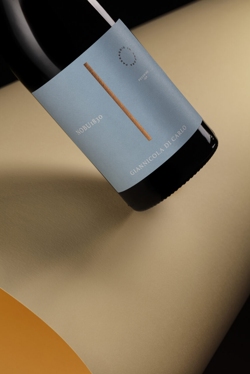
Italian producer Giannicola Di Carlo, based in the Abruzzo region of Italy, has been a key player in the organic and natural wine movement for more than 30 years, while the Di Carlo family itself has been making wine since 1830.

Di Carlo’s Nobu 1830 range includes two varieties: a Montepulciano d’Abruzzo DOC Riserva and a Pecorino IGP, each one ‘vinified with the philosophy of minimal intervention’.

This methodology is carried through to the minimalist labels Di Carlo has selected for both wines. Designed by Stefano Bracci, whose studio is in Pescara – Abruzzo’s biggest city – the labels have a quiet, simple elegance.

In keeping with ancient traditions practised by Di Carlo, the wine is made using cement tanks and amphorae and aged in oak barrels.

‘The forest is the place and the source of inspiration for this wine; a perfect ecosystem, a living and uncontaminated space of earth, water, air and sun,’ say the vintners. The idea of ‘silence and waiting in respect of nature’ is again echoed in the understated label design.

Paper: Materica Gesso Ultra WS

dicarlovini.it/nobu-1830

stefanobracci.com

‘The forest is the place and the source of inspiration for this wine; a perfect ecosystem, a living and uncontaminated space of earth, water, air and sun.’

Featured Materials

Materica

Pulp-coloured papers and boards made with 40% CTMP fibres, 25% pure environmentally friendly fibres, 20% recycled material and 15% cotton fibres. Also available in self-adhesive version.

Related articles

Inspiration 06/06/2024

Guide to the stars

The Barbanera almanac was first published in 1762 and is now in its 258th year
Graphic designIllustrationPrintingPublishing
Inspiration 11/04/2024

Bound in connubial bliss

Italian company Graphistudio has given the wedding album a high-profile makeover. By Andrew Robertson
Digital printingGraphic designPrinting
News 20/10/2022

Inner essence

Benana Studio’s packaging for Zep Torrenz’s range of perfumes is as beautiful inside as out
Graphic designPackaging
News 12/10/2023

Amalfi triangles

Italian design studio Spazio creates limited-edition modular packaging for customers of the luxury furniture store Casamica
Corporate communicationGraphic designPackagingPrinting
Pulp © 2026
Fedrigoni
Fedrigoni
COOKIE POLICY PRIVACY POLICY ACCESSIBILITY STATEMENT
Pulp © 2026