• It
Sign in Get Pulp Pulp 28
Pulp
Sign in Get Pulp Pulp 28
Pulp
  • Inspiration93
  • Stories88
  • News174
  • Pulp Archive
  • Materials Index
  • About Pulp
  • Tell Us
  • Sign in
  • Get Pulp
  • Pulp 28
  • It
Browse Themes
Corporate communicationDigital printingGraphic designIllustrationInterviewsLabelLarge formatPackagingPeople & PaperPhotographyPrintingPublishingSustainabilityInspirationStoriesNews
Pulp

Log-In

Please enter your credentials to access all Pulp contents.

Forgot your password?

New to Pulp? Register for free

New to Pulp?

Register for free to have full access to our content.

Register

2 min minutes
News

Love bites

Big type sings out loud on the packaging for Mutterland’s new Love Edition chocolates
Graphic designPackaging

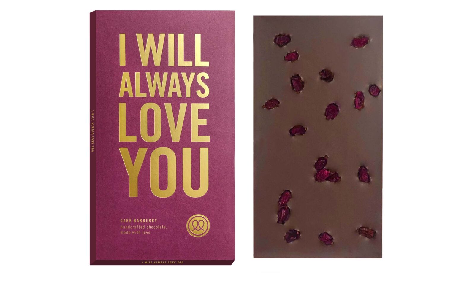
Five ‘love messages’ are incorporated into the colourful packaging of the new range from German handmade chocolate manufacturer Mutterland.

For its Love Edition range, the gold-embossed packaging puts the type-led message front and centre, with each bar referencing a famous love song. Dark chocolate with barberry is named after ‘I Will Always Love You’, the Dolly Parton song made famous by Whitney Houston, while white with strawberry is called ‘Love To Love You Baby’ (after the breakthrough hit that Pete Bellotte and Giorgio Moroder wrote for Donna Summer).

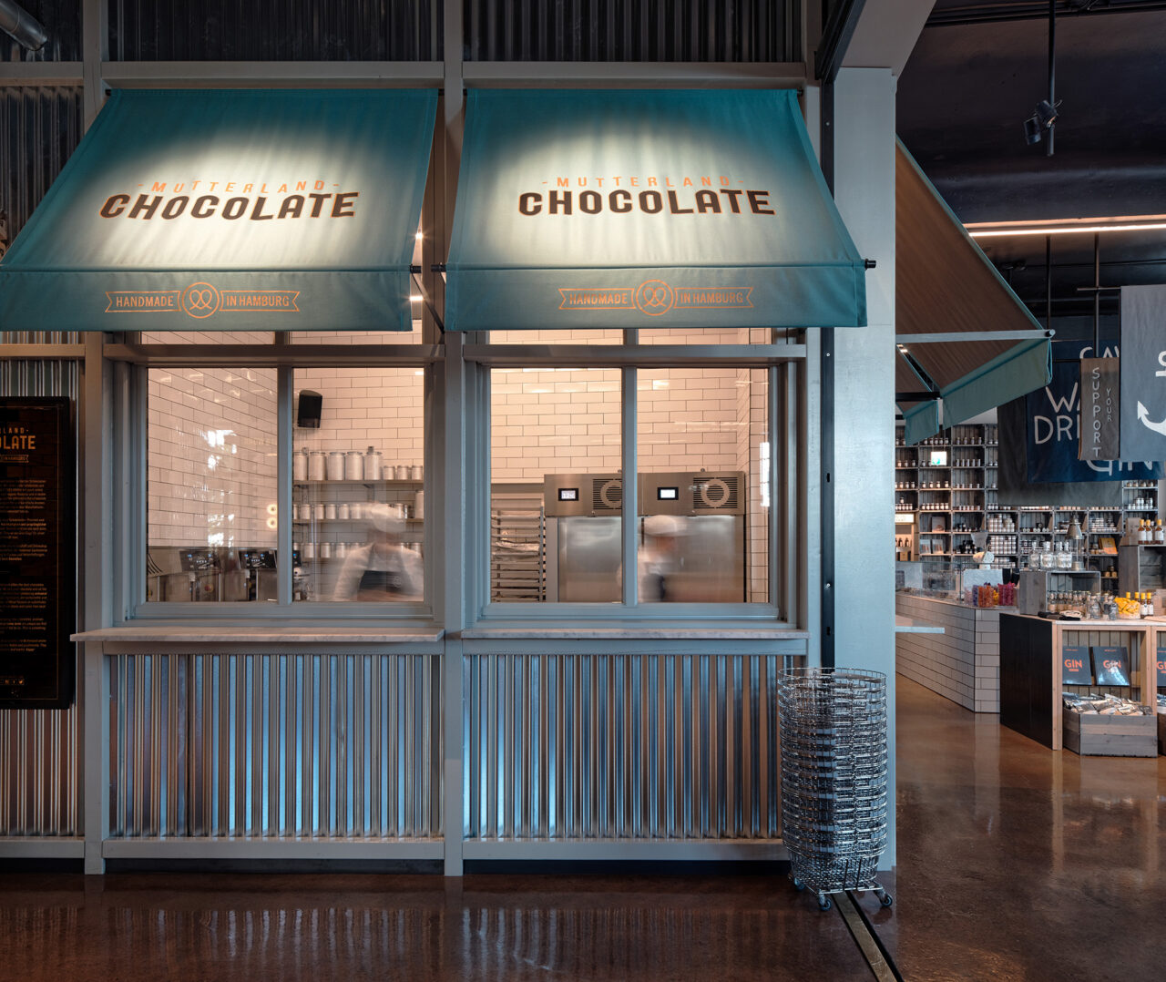
Since 2015, Mutterland has been making its own handmade chocolate, using sustainably sourced and fairly traded raw chocolate. Many of the ingredients, such as spices and nuts, come from small, regional manufacturers that Mutterland also stocks in its delicatessen shops.

The packaging was devised by Hamburg-based agency We Love Design, which has developed the entire packaging concept for the chocolate manufacturer to date, alongside designing its concept store in the city. WLD’s previous packaging designs include a neon pink box for Mutterland’s ILY (I Love You) bar and an eye-catching illustrated range created with artist duo Doppeldenk.

Paper: SymbolCard 330 g/m2

mutterland.de

welovedesign.net

Related articles

Stories 16/11/2022

Day to day data

Every copy of this calendar is different in every way – except for the paper. By John L. Walters
Graphic designPrintingPublishing
News 14/03/2024

Money in the packet

International packaging design agency Burgopak uses Sirio Color for innovative card sleeve projects
Graphic designPackagingPrinting
Inspiration 26/01/2023

Never fit in

With fierce competition between products, how does design studio Stranger & Stranger make a 10cm label on a bottle of wine or spirits stand out?
Graphic designInterviewsLabelPackagingPrinting
Stories 14/06/2022

People and paper: Steven Guarnaccia

John L. Walters talks to illustrator Steven Guarnaccia about notebooks, design-obsessed fairy tales and the wisdom of saying ‘yes’
Graphic designInterviewsPrinting
Pulp © 2026
Fedrigoni
Fedrigoni
COOKIE POLICY PRIVACY POLICY ACCESSIBILITY STATEMENT
Pulp © 2026