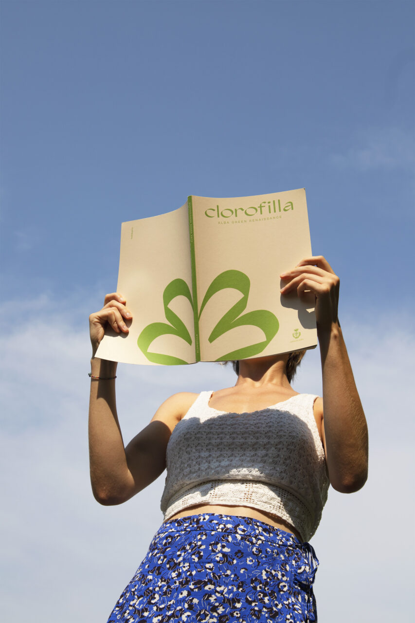
The city of Alba in northern Italy recently took part in the international competition of Communities in Bloom, a Canadian non-profit that aims to recognise environmental and sustainable initiatives in urban areas. Cities are judged on categories such as community appearance, heritage conservation and plant and floral displays.
To communicate the work that Alba has done, studio hellobarrio (see Pulp 22) designed a campaign called Clorofilla that celebrates the city’s ‘Green Renaissance’. ‘This is the dawn of a new flowering of Alba,’ says designer Andrea Viberti.
The logotype is a monogram that recalls ‘a flower that spontaneously rises in the concrete,’ he says, ‘with four petals like the letters that make up the name Alba.’ The studio chose the typeface Agentur Display (Good Type) because its ligatures evoked the ivy that envelops many of the city’s buildings and contrasted this with Obviously (from OH no) to echo the urban architecture.
Hellobarrio also designed a magazine, printed on Fedrigoni Arena Eco 50 Extra White Smooth paper; billboards printed on recycled fabrics; and tote bags. ‘The colours,’ says Viberti, ‘echo the flowerbeds of the city and the wild flowers on the roadside.’
The emphasis on sustainability informed the whole project. ‘All the papers used for the printed elements are from Fedrigoni’s Materia Viva project – in addition to the Arena we also used the Old Mill Eco,’ says Viberti.
Hellobarrio worked on the project with Asproflor, the Italian partner of Communities in Bloom and the awarding body of the Comune Fiorito environmental certification.


