• It
Sign in Get Pulp Pulp 27
Pulp
Sign in Get Pulp Pulp 27
Pulp
  • Inspiration87
  • Stories87
  • News173
  • Pulp Archive
  • Materials Index
  • About Pulp
  • Tell Us
  • Sign in
  • Get Pulp
  • Pulp 27
  • It
Browse Themes
Corporate communicationDigital printingGraphic designIllustrationInterviewsLabelLarge formatPackagingPeople & PaperPhotographyPrintingPublishingSustainabilityInspirationStoriesNews
Pulp

Log-In

Please enter your credentials to access all Pulp contents.

Forgot your password?

New to Pulp? Register for free

New to Pulp?

Register for free to have full access to our content.

Register

2 min minutes
News

Sicilian counterpoint

Mucho’s olive oil label design remixes traditional elements for a contemporary identity
Graphic designLabelPackagingPrinting
The design references the coming together of the founders, Sicilian Paolo Miceli and Barcelona-born Sergio Sensat.

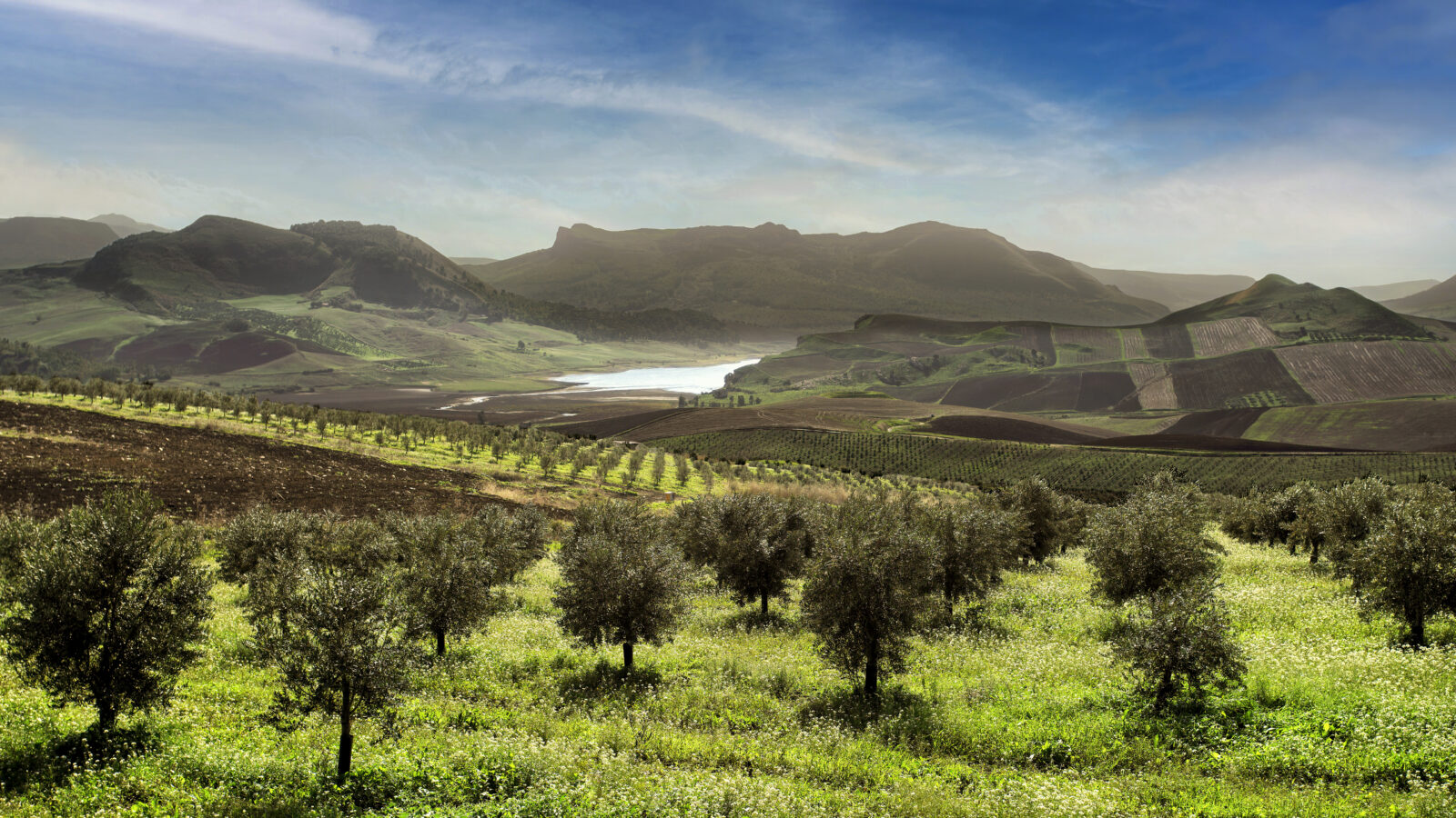
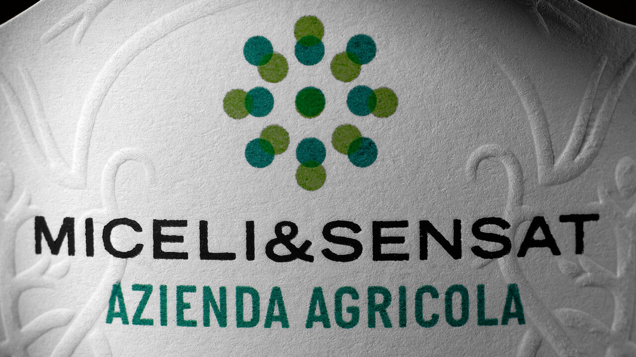
International design studio Mucho has designed the labels for a new range of olive oils produced by Sicilian brand Miceli & Sensat. The studio’s work also involved creating a new marque for the company formed of two green squares, each made from a series of nine dots and overprinted to evoke a sun symbol. The design also references the coming together of the founders, Sicilian Paolo Miceli and Barcelona-born Sergio Sensat.

The label’s main typeface is a custom font based on the elegant vernacular stencil used in some of Sicily’s villages for street names and numbers. The secondary face is based on Italian brass plates.


According to Mucho, music played a role in the development of both the identity and die-cut label design, with the resulting work echoing the use of sampling and layering techniques in the creation of something new. This approach, says Mucho’s Pablo Juncadella, evokes ‘the layers between the classic and the vernacular that live gracefully in Italian culture’. This concept also influenced the studio’s font choices. The label’s main typeface is a custom font based on the elegant vernacular stencil used in some of Sicily’s villages for street names and numbers. The secondary face is based on the letters used on Italian brass plates.

Juncadella adds that the paper texture – and the way the ink sits on it – became a crucial element of the approach, with offset printing on embossed paper, foil blocking and overprinting techniques. Barcelona-based label specialist Rotas used Manter’s Polar White Ultra WS stock for the demanding task. Taken together, the resulting project captures the intent of Miceli & Sensat and their contemporary take on traditional manufacturing processes.

Mucho

rotas.com

miceliandsensat.it

See ‘Spun silver‘.

Related articles

Inspiration 28/03/2024

Cava Portell

For the ‘first Eco cava’, designer Gerard Riu sought to highlight the ecological concept, distancing it from previous designs
Graphic designLabelSustainability
News 19/06/2025

Decant the data

Advision collaborates with tech company ArchivaGroup to create one-of-a-kind wine labels
Digital printingGraphic designLabelPackagingPrinting
Inspiration 06/06/2022

Feels like sculpture

Design agency Brighten the Corners’ books for sculptor Anish Kapoor cross the void between gallery and printed page. By John L. Walters
Graphic designPhotographyPublishing
News 01/08/2024

Threads of community

This ambitious project mixes up a diverse collection of creative and educational work from Aotearoa New Zealand and beyond
Graphic designPrintingPublishing
Pulp © 2025
Fedrigoni
Fedrigoni
COOKIE POLICY PRIVACY POLICY ACCESSIBILITY STATEMENT
Pulp © 2025