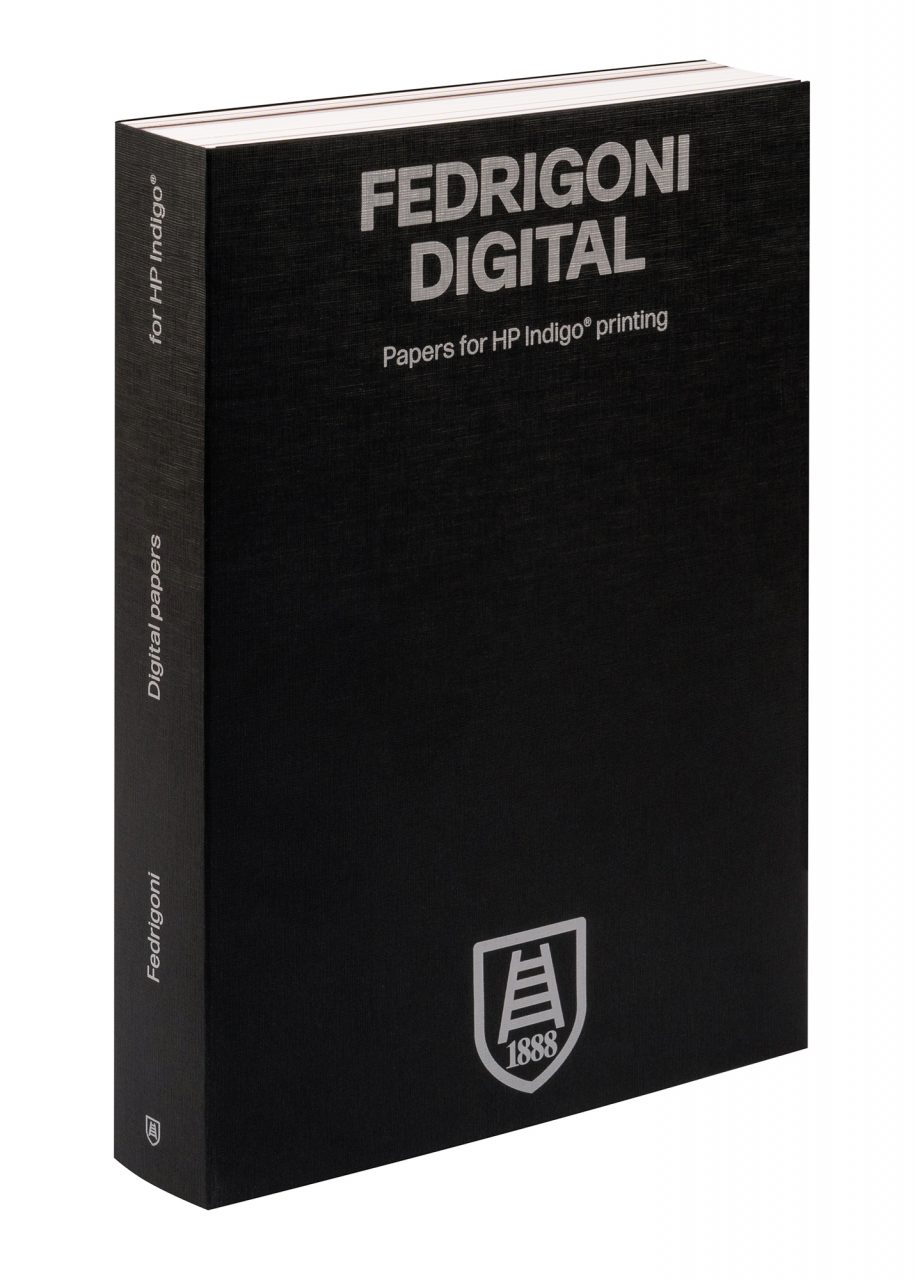
When talking to Pentagram partner Harry Pearce about the new identity his team has created for Fedrigoni, the words ‘trust’ and ‘faith’ come up several times. Their frequency reflects that this project, designed and delivered in the middle of a pandemic, was a new experience for all concerned.
Initially approached in February 2020, Pearce submitted a proposal pitch the following month and his team were commissioned to work on the identity a few weeks later. ‘It was about a change in the company’s ambitions,’ Pearce says of the intent behind the rebrand. ‘Fedrigoni was stepping up to be much more of a global player, but the parts weren’t fitting together as a single entity.’
Having continued to grow – acquiring companies such as Ritrama in the process – Fedrigoni’s identity appeared fragmented, the designer explains. This had created ‘a forever more layered, complex kind of narrative,’ he says. Pearce saw the end point of his work in terms of creating both a consistent design language and greater clarity.
For Chiara Medioli Fedrigoni, the company’s chief sustainability and communication officer, the identity reflects the new direction the group has taken since 2018. ‘Its new ownership structure and new management, together with our many existing Fedrigoni experts, put new energy into all the things we do,’ she says. A global redesign was therefore a chance for ‘collective reflection’, an opportunity to take stock and refocus, particularly with the business now based across four continents, employing 4000 people, many of whom, Medioli Fedrigoni says, are new to the group.
At Pentagram, Pearce and his team of six, which included Pentagram senior designer Richard Clarke and associate / project manager Tiffany Fenner, took their meetings online and, like millions of others around the world, reconsidered how they might work within this new environment.
The small size of Pentagram’s design teams meant that meetings and regular dialogue were still manageable. ‘You don’t need armies of people,’ says Pearce, ‘you just need space for consideration and thought, and quietly working things through. It’s been a completely virtual project. Considering the scale of it – Fedrigoni is made up of so many businesses and nearly all of them changed their identity at the same time – there was a huge amount of trust … as you couldn’t get together and build relationships as you would normally.’ Pearce was unable to visit the paper mills or dig through the company archives; elements of Fedrigoni’s long history were sent digitally, along with a lot of material in the post.
The origins of the new identity build upon much more recent work: the lauded Paper Box designed by London’s Graphic Thought Facility and launched in October 2020 (see Pulp 19). GTF’s design was structurally ambitious, containing all of Fedrigoni’s papers within a single collection of three books. Across the spines of the books, GTF set the Fedrigoni name in a redrawn uppercase of the Forma typeface originally designed by a team led by Aldo Novarese in 1968.
‘GTF wrote the word “Fedrigoni” big on the side of the box,’ says Pearce. ‘It wasn’t meant to be a Fedrigoni “logo”, but when I got into working on the identity I just thought they’d nailed it. So I rang them up and said, “Do you mind if I take what you’ve done and make it the logo?”’
Pearce saw the potential in using Forma and replacing the Peignot typeface (designed by A. M. Cassandre) which had been in use for several decades, while aligning the well known Fedrigoni Verona ladder symbol and founding date mark with the new logotype. Pearce’s team introduced a custom version of Forma DJR (by David Jonathan Ross) as the company’s principal typeface. For Pearce, Forma DJR’s suitability for the job came down to ‘foundational things – its strength, the beautiful balance of it all and its timeless quality.’

