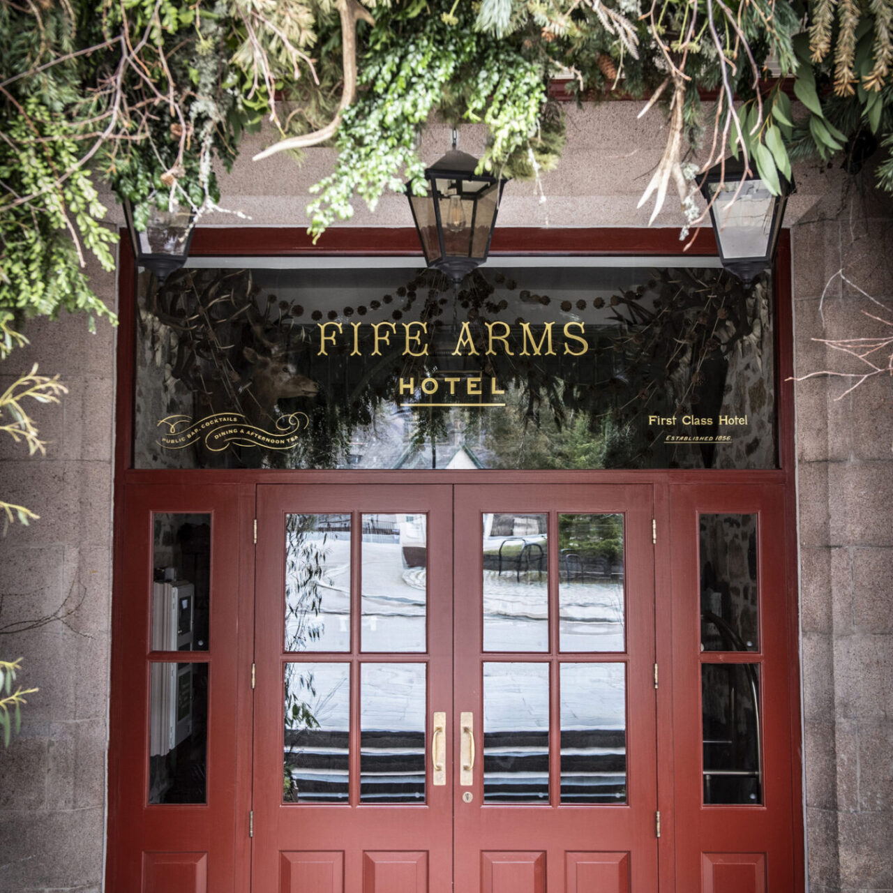

Situated in the picturesque Scottish village of Braemar, The Fife Arms is the first large-scale hospitality venture from Hauser & Wirth, the renowned contemporary art galleries. Amidst the Cairngorms National Park, the stunning 5-star boutique hotel boasts a compelling history. Originally built in 1856 by the Duke of Fife, the category ‘B’ listed building was also a nineteenth-century Victorian Coaching Inn. It was reconstructed by Hauser & Wirth and reopened in 2018 after a four-year restoration project.
When considering the identity design of the hotel, Hauser & Wirth collaborated with London-based branding agency Here (see Pulp 11). Araxie Boyadjian, the studio’s partnerships and marketing lead, describes Here’s approach as: ‘building brands with a sense of place and personality … rooted in local culture, craft and community.’
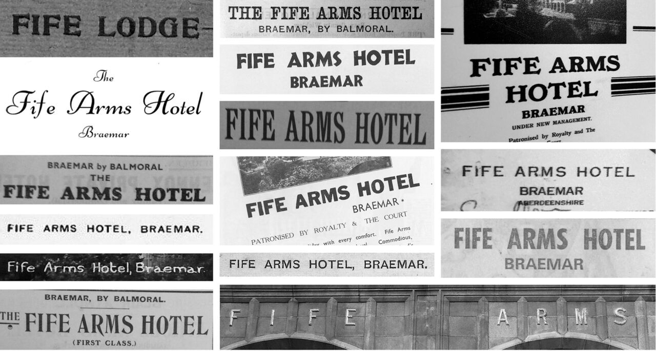
The process began with the ‘visual ecology’ of Braemar. A local historical society supplied an archive of local design references, and the Here team drew inspiration from Scottish type foundries and vernacular signage from the area, together with vintage catalogues of the Braemar Gathering, a famous annual Highland Games event.
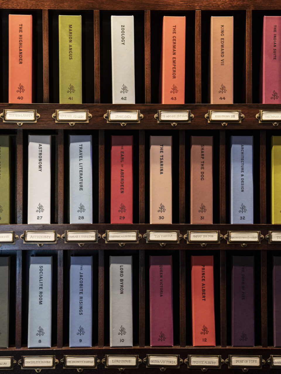
Collaboratively, the team created an identity that extended beyond the traditional hotel brand, ‘something living and layered’. The agency decided to create a family of wordmarks, as opposed to a single logo, that reflected the eclectic spirit of the hotel, which boasts an impressive collection of art from Scotland and beyond.
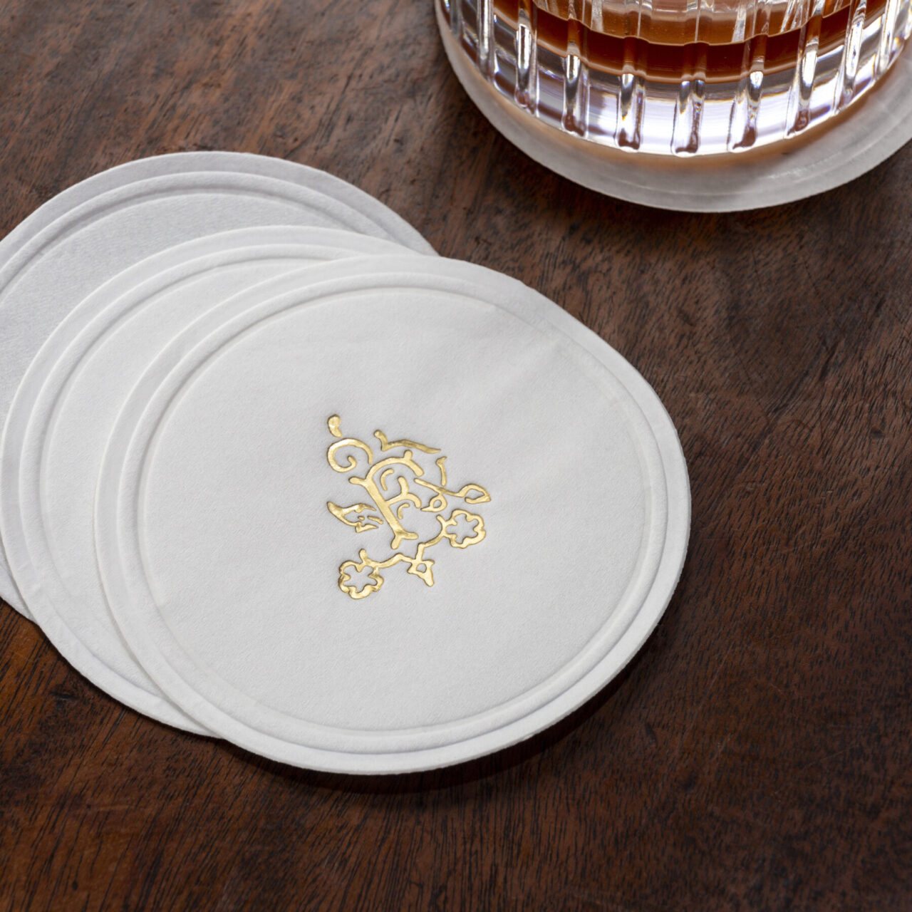
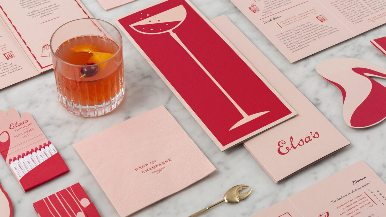
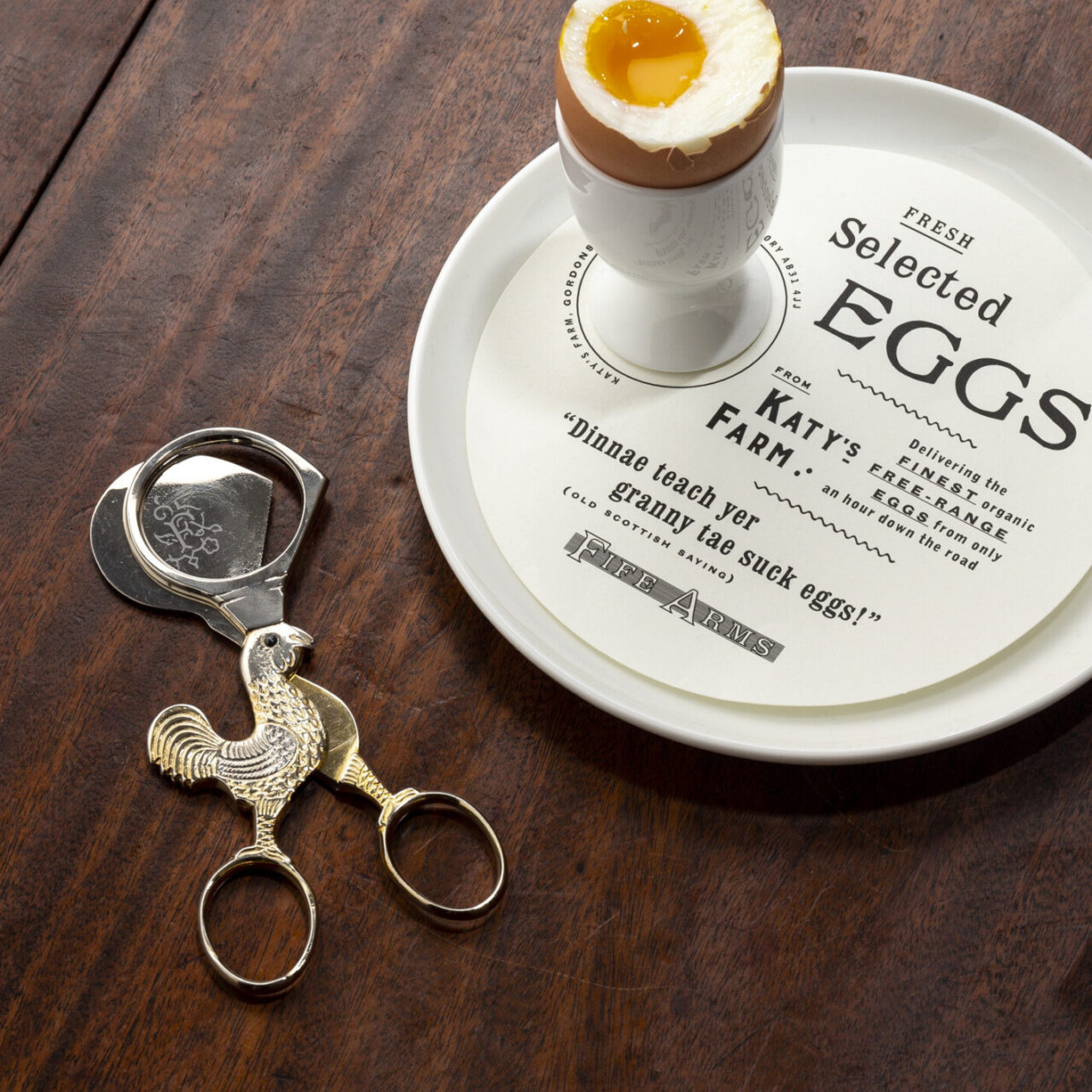
This multiplicity can be seen in the business cards for the hotel, produced by Scottish printer Piccolo Press and printed on Tintoretto Ceylon, which include foiling and blind embossing techniques. The goal was to make each piece of design feel like a treasured artefact, from ‘egg scissors’ to tactile menus and matchboxes, an unforgettable experience for hotel guests, reflecting the team’s aim to craft an ephemeral and intriguing journey to Scotland.