• It
Sign in Get Pulp Pulp 25
Pulp
Sign in Get Pulp Pulp 25
Pulp
  • Inspiration42
  • Stories53
  • News85
  • Pulp Archive
  • Materials Index
  • About Pulp
  • Tell Us
  • Sign in
  • Get Pulp
  • Pulp 25
  • It
Browse Themes
Corporate communicationDigital printingGraphic designIllustrationInterviewsLabelLarge formatPackagingPeople & PaperPhotographyPrintingPublishingSustainabilityInspirationStoriesNews
Pulp

Log-In

Please enter your credentials to access all Pulp contents.

Forgot your password?

New to Pulp? Register for free

New to Pulp?

Register for free to have full access to our content.

Register

Birrificio sul Mare.

6 min minutes
News

The alchemist

Designer Dario Frattaruolo takes a scientific approach to creating award-winning work for the drinks industry
Graphic designInterviewsPackagingPrinting

Birrificio sul Mare.

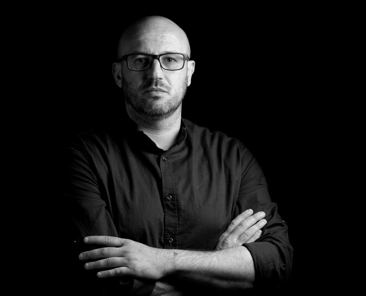
Dario Frattaruolo.

In the work of designer and illustrator Dario Frattaruolo, art and science often intertwine. Unsurprisingly, his influences come from a wide range of sources: ‘Music, painting, sculpture, cinema and literature, religion, philosophy, esotericism, alchemy,’ he says. ‘I am also fascinated by mathematics, and figures such as Nicola Tesla or Paracelsus, while for materials I take a lot of inspiration from nature – the muse par excellence.’

Frattaruolo is interested in the science of packaging, too. Since founding his own studio in Camaiore in 2005, he has made this an integral part of his practice. ‘Product packaging design influences our perceptions and changes our behaviour,’ he says. ‘Neuroscience has devoted many studies to packaging and the mechanisms that regulate its effect on the consumer, affecting the decision-making process. Interacting with packaging activates deep reactions in our brain. The perceptions we derive from interacting with a product are multi-sensory.’

Birrificio sul Mare.
Freia.
Freia.
Freia.

An open mind

In the past three years Frattaruolo’s studio has won 23 separate awards, including the HP Indigo Selection Award from Fedrigoni Top Awards for his project with Camaiore brewery, Birrificio sul Mare. ‘I prefer customers who like to invest in innovation by experimenting with materials and new forms of design.’

Frattaruolo says his exposure to a range of subjects, from anatomy, illustration and design to learning about materials and media, serves him well as a designer. He says his studies at the Academy of Fine Arts in Carrara gave him ‘an open mind to integrate the different disciplines.’ However his passion for design and illustration came from direct experience.

‘For me, record shops and bookshops were temples, places of refuge,’ says Frattaruolo. ‘I spent a lot of time studying book covers and rock, metal and punk vinyl [sleeves], where illustration and the choice of typefaces played a central role in the composition.’

Essentia.
Essentia.
Essentia.
Essentia.
Chakra Booster.
Chakra Booster.
Chakra Booster.
Chakra Booster.
Chakra Booster.

Beyond aesthetics

Many of his projects are for the drinks industry, designing packaging for craft ales and weiss beers for Birrificio Occupato and Birrificio Badala, as well as many wines and spirits brands. The packaging that Frattaruolo and studio created for Essentia, a ‘gentian amaro’ liqueur, was developed in collaboration with executive chef Fabio Valtorta of Rome’s Hespresso restaurant.

‘For Essentia, I used many innovative techniques, creating a 3D sculpture on the label with an embossed multilevel cliché,’ he says. ‘In addition, I created a special finish to recreate the tactile sensation of marble. I paid special attention not only to aesthetics, but also to the usability of the product, which, thanks to the embossed creation, guarantees a good grip by the user.’

The Essentia packaging design is harmonious, yet practical and technically innovative, integrating artistry, craft and science. Choose the right materials, he insists, and the user’s experience of a particular design can be transformed. ‘Successful, persuasive and effective packaging increases performance and reduces business risk,’ says Frattaruolo. ‘It is therefore important to use papers with specific characteristics such as embossing (“hypanema”), which creates a sensory interaction, or other care such as ultra-white cotton paper that enhances the illustration.’

Frattaruolo believes that it is no longer aesthetics alone that drive interest in a product, or create desirability. ‘There is a need to focus on the use of sustainable materials, which not only improve the perception and reputation of the company, but also create an advantage in terms of turnover,’ he adds. ‘According to market surveys, in fact, consumers are willing to spend more if the product is also entirely sustainable in its appearance.’

Related articles

Stories 19/05/2022

People and paper: Isabella Bussi

Isabella Bussi is Fedrigoni Group’s Head of Sustainability, helping to lead and guide the company’s green policies and strategies at a critical time. Interview by John L. Walters
InterviewsPrintingSustainability
Inspiration 21/06/2022

The ideal letterform

Fedrigoni’s new corporate typeface is a 1960s classic, designed by an argumentative committee of Italian design legends. By Alessandro Colizzi
Graphic designPrintingPublishing
Stories 29/05/2023

Blue horizon

This upcycling initiative combines the worlds of textile and paper production. By Gabriela Matuszyk
People & PaperPhotographyPrintingSustainability
Inspiration 28/07/2022

Artists on paper

For centuries, outstanding individuals have painted, drawn and written on Fabriano’s papers
IllustrationPeople & PaperPrinting
Pulp © 2023
Fedrigoni
Fedrigoni
COOKIE POLICY PRIVACY POLICY
Pulp © 2023