Glasgow and Edinburgh-based agency Contagious has designed the identity and packaging for the debut premium brandy from the Burnt Faith Distillery, the first commercial brandy house in the UK.
Contagious works exclusively with brands in the drinks industry and for Burnt Faith the agency’s remit included designing a bespoke bottle and shipping box, alongside interior and brand design for the distillery in East London.
Burnt Faith’s founder Simon Wright was originally inspired by a trip to the Cognac region in France – and the restrictions on the production of the area’s world-famous drink. ‘Compared to most spirit categories, there has been virtually no liquid innovation in brandy, especially as the appellation rules for Cognac keep production very traditional,’ he says.
The distillery hopes to introduce brandy to a new generation of spirit drinkers as the drink, Wright explains, is not restricted by the same laws as a cognac. Burnt Faith’s new approach includes the use of ‘more aromatic grape varieties, explorative production techniques and different ageing casks’.
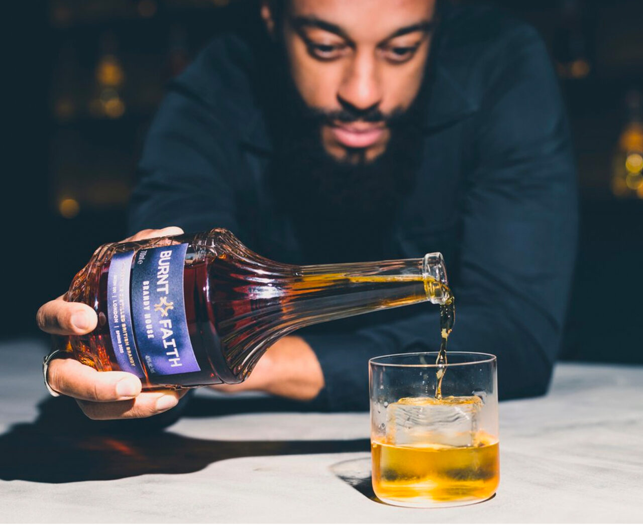
The idea of not being constrained by tradition also influenced the design of the brandy bottle and its packaging. ‘The design rationale was born from the brand name,’ says Contagious’ creative director of packaging, James Hartigan. ‘We referenced historical vessels and interpreted these through a modern lens. The branding has a quintessentially urban British visual and verbal language that echoes its audience’s creativity, style, and characteristics,’ he adds.
The result – a tall, sleek, textured bottle – is also a responsible and sustainable design solution, according to the agency. The packaging is 100 per cent plastic-free and recyclable, while the bottle is made from recycled glass and features a Vinolok cap. The label is printed (by Berkshire Labels) on Tintoretto Gesso.


Self-Adhesive: Tintoretto Gesso Ultra WS