
• It
Sign in Get Pulp Pulp 28
Pulp
Sign in Get Pulp Pulp 28
Pulp
  • Inspiration93
  • Stories88
  • News174
  • Pulp Archive
  • Materials Index
  • About Pulp
  • Tell Us
  • Sign in
  • Get Pulp
  • Pulp 28
  • It
Browse Themes
Corporate communicationDigital printingGraphic designIllustrationInterviewsLabelLarge formatPackagingPeople & PaperPhotographyPrintingPublishingSustainabilityInspirationStoriesNews
Pulp

Log-In

Please enter your credentials to access all Pulp contents.

Forgot your password?

New to Pulp? Register for free

New to Pulp?

Register for free to have full access to our content.

Register

3 min minutes
News

Paper ceramics

VZNstudio in Milan has designed the catalogues for the latest product ranges from bathroom furnishings brand Ceramica Cielo
Corporate communicationGraphic designPhotographyPrintingPublishing

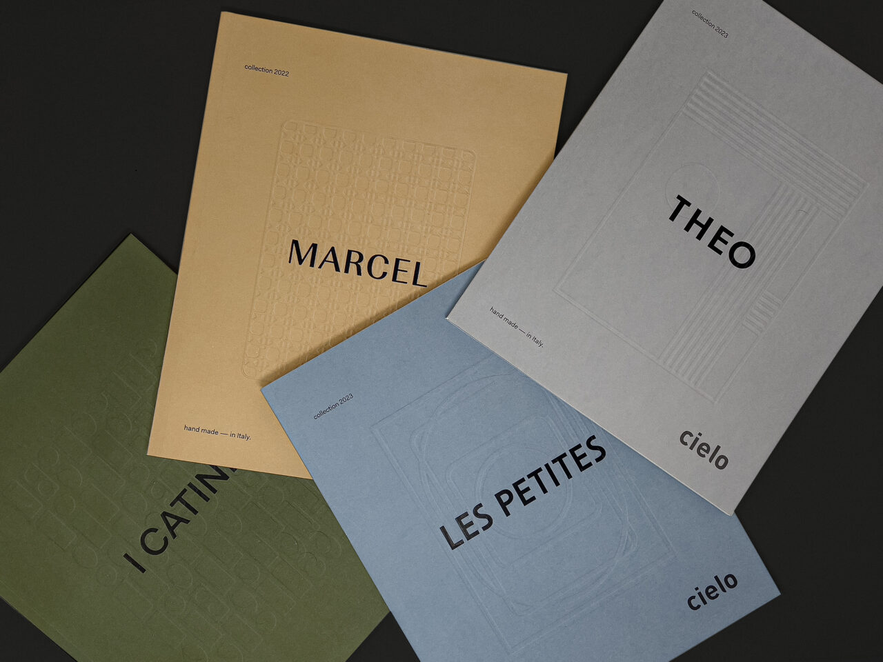
Four small publications showcase the company’s Italian-made ceramic products across its Marcel, I Cantini, Les Petites, and Theo collections.

‘Each product has its own characteristics and language [and these are] also represented through the graphics and printing techniques used,’ say VZNstudio founders Sonia Mion and Nicola Iannibello. ‘The covers, chapter openings, fonts, and colours always change to make the character and peculiarities of the product evident.’

Using a combination of printing techniques including embossing and debossing, hot foiling, and laser cutting, the catalogues also employ UV printing and a Pantone silver.

For the Marcel catalogue ‘with its rational and elegant shapes’, the punch on the cover and the laser-cut card insert ‘create a connection with the products’, the designers explain. ‘I Cantini plays on the different base shapes of the collection and on the infinite combinations of glossy and opaque colours that can be created on the same piece of furniture.’

For the Les Petites range, which is centred on a washbasin for small spaces, the catalogue design echoes the size aspect through using small images with wide margins, alongside a silver hot foil. VZNstudio explains that the design for the Theo catalogue is ‘inspired by the De Stijl movement … with a game of visual balance made up of planes and lines, told with debossed printing, in which colour and design are the main protagonists.’

The project was coordinated by Ceramica Cielo’s art director/designers Andrea Parisio, and Giuseppe Pezzano.

Papers:
Arena Rough 300g/m2
Arena Smooth 140g/m2

vznstudio.com

VZNstudio Instagram

Featured Materials

Arena

The Arena range is available in four shades: a bright Ivory, on OBA-free Natural, a warm White and a cool Extra White in a wide choice of sheet sizes, grain directions and grammages. Arena is available in three finishes: Smooth, Rough and Bulk. Also available in self-adhesive sheet version.

Related articles

News 03/11/2022

Six scents

Fourteenth’s range of numbered fragrances are enhanced by some restrained and tactile packaging choices
Graphic designPackaging
Inspiration 21/06/2022

The ideal letterform

Fedrigoni’s new corporate typeface is a 1960s classic, designed by an argumentative committee of Italian design legends. By Alessandro Colizzi
Graphic designPrintingPublishing
News 22/12/2022

Suspended in time

A new identity for a Tuscan antique shop reflects the histories of the unique objects it sources
Graphic designPrinting
News 03/10/2024

Family spirits

Spanish agency Morillas focuses on the familial narratives of Guatemalan rum distiller Botran for their latest labels
Graphic designLabelPrinting
Pulp © 2026
Fedrigoni
Fedrigoni
COOKIE POLICY PRIVACY POLICY ACCESSIBILITY STATEMENT
Pulp © 2026