• It
Sign in Get Pulp Pulp 28
Pulp
Sign in Get Pulp Pulp 28
Pulp
  • Inspiration93
  • Stories88
  • News174
  • Pulp Archive
  • Materials Index
  • About Pulp
  • Tell Us
  • Sign in
  • Get Pulp
  • Pulp 28
  • It
Browse Themes
Corporate communicationDigital printingGraphic designIllustrationInterviewsLabelLarge formatPackagingPeople & PaperPhotographyPrintingPublishingSustainabilityInspirationStoriesNews
Pulp

Log-In

Please enter your credentials to access all Pulp contents.

Forgot your password?

New to Pulp? Register for free

New to Pulp?

Register for free to have full access to our content.

Register

3 min minutes
News

Monkey magic

A new approach to ‘bitter’ production gave Saglietti studio the opportunity to create a bold label design in red and black
Graphic designLabelPrinting

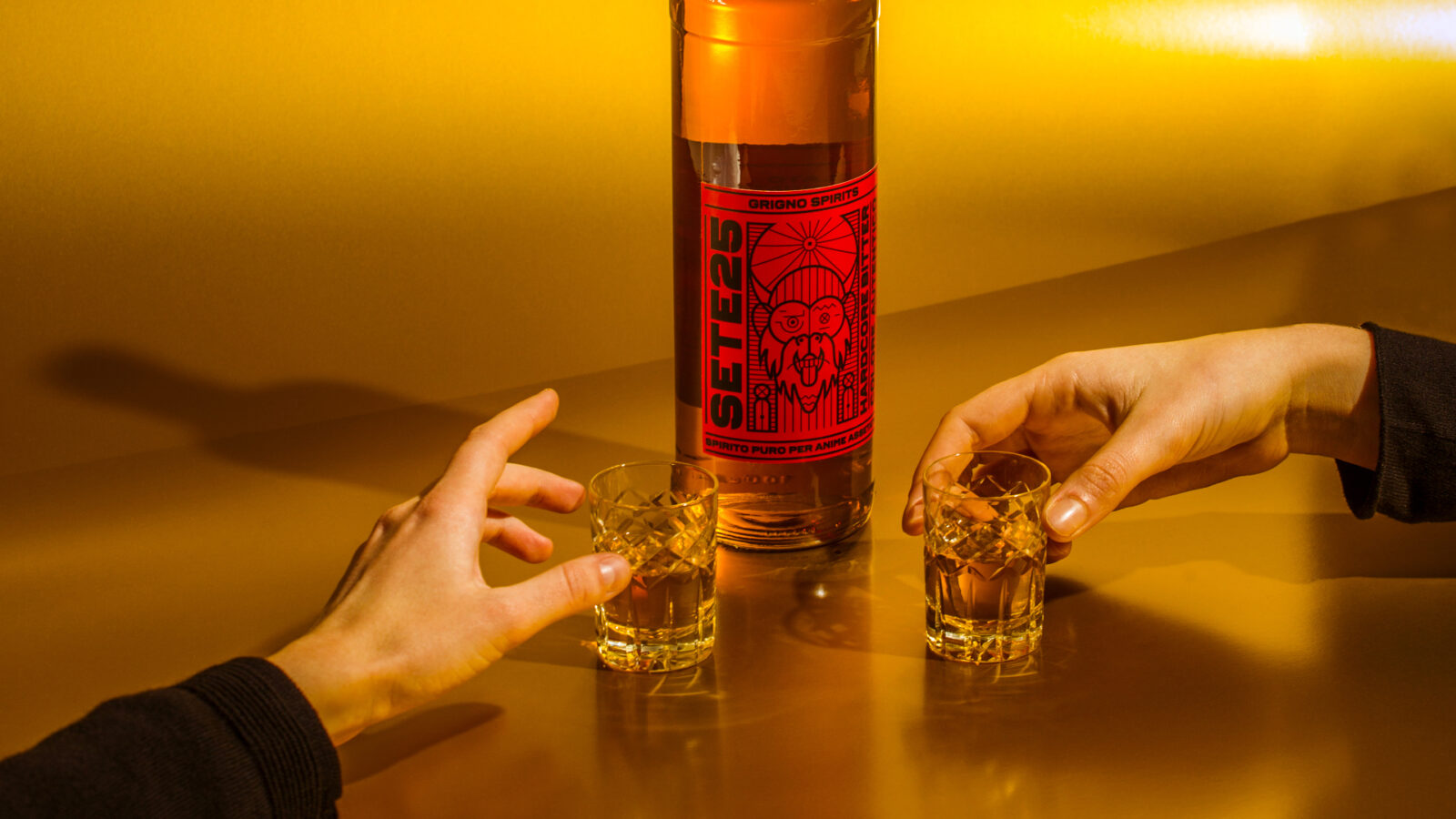
Saglietti studio in Torino has created the identity and label design for Sete25, a new bitter developed by Grigno Spirits. Traditionally, many bitters are dyed red to achieve their distinctive hue, but Sete25 contains no artificial colouring – the only red colour present is on the label of the bottle. An illustration rendered in a contrasting black depicts a demon from Japanese mythology – ‘pure spirit for thirsty souls’.

Studio founder Alessandro Saglietti says that the producers at Grigno ‘wanted to exalt the herbs in the bitter and enhance its natural colour, which is this intense yellow. From this comes the idea of bringing red – the characteristic colour of bitter – as the primary colour of the label.’

The vivid character illustration originated from a tongue-in-cheek comparison with the brand’s founders, says Saglietti, and represents ‘a demon reminiscent of the “Shōjō” – which translates as ‘monkey’ or ‘great drinker’ – in Japanese culture.’

The thick lines of the design ‘give a strong and full bodied tone just like the bitter itself,’ adds Saglietti. ‘The typography is the only element that we carried with us from the previous label; it follows the visual design with a very thick sans serif font, to further highlight the intense taste of the product.’

Self-Adhesive: COATED 90 FSC™

Photography: Federica Borgato and Umberto Costamagna.

saglietti.it

Saglietti Instagram

grignospirits.it

Sete25 Bitter Instagram

Related articles

News 18/01/2024

Ceramic playground

A collaboration between Teikna Design and ceramicists Amodino Milano enhanced an analogue game experience
Graphic designPrinting
News 08/08/2024

Food of the gods

Spanish agency Barceló Estudio ventures into the world of Olympians with the design of Cacao en Broma’s new line of chocolates
Graphic designPackagingPrintingSustainability
Stories 13/11/2025

Form and meaning in Paris

Young talents and established designers assembled at the Fedrigoni Explore Creative Summit for the Top Award prizegiving ceremony
Graphic design
Stories 29/05/2023

One green thing: Life Cycle Analysis

An LCA can play a vital role in design and manufacturing. By Michèle Woodger. Illustrations by Jorge Cuadal Calle
IllustrationPackagingPrintingSustainability
Pulp © 2026
Fedrigoni
Fedrigoni
COOKIE POLICY PRIVACY POLICY ACCESSIBILITY STATEMENT
Pulp © 2026