• It
Sign in Get Pulp Pulp 27
Pulp
Sign in Get Pulp Pulp 27
Pulp
  • Inspiration82
  • Stories79
  • News162
  • Pulp Archive
  • Materials Index
  • About Pulp
  • Tell Us
  • Sign in
  • Get Pulp
  • Pulp 27
  • It
Browse Themes
Corporate communicationDigital printingGraphic designIllustrationInterviewsLabelLarge formatPackagingPeople & PaperPhotographyPrintingPublishingSustainabilityInspirationStoriesNews
Pulp

Log-In

Please enter your credentials to access all Pulp contents.

Forgot your password?

New to Pulp? Register for free

New to Pulp?

Register for free to have full access to our content.

Register

3 min minutes
News

Joyful object

The annual graphic design journal from Centre National des Arts Plastiques (CNAP) turns thirty
Graphic designPrintingPublishing

2024 marked the 30th anniversary issue of Graphisme en France, a journal made by CNAP (Centre National des Arts Plastiques). Attached to the French Ministry of Culture in Paris, Cnap’s supports and promotes contemporary creation in all areas of the visual arts. This edition’s designer is Louise Garric, a graphic designer interested in exploring the importance of materiality in printed graphic objects and the ways they are produced, through format, paper, printing and finishing. In 2024, Garric met Véronique Marrier, head of graphic design at CNAP, and the collaboration began.

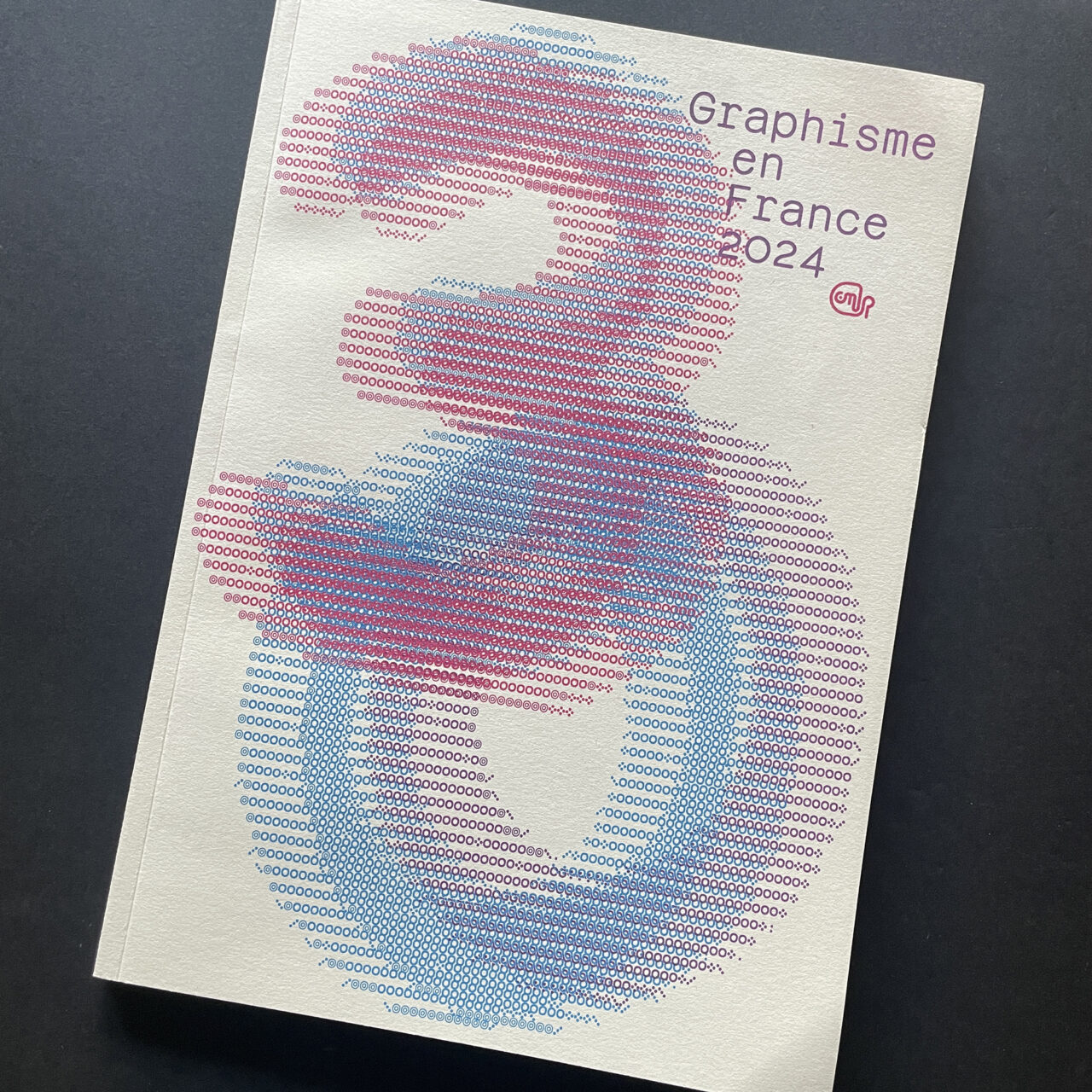
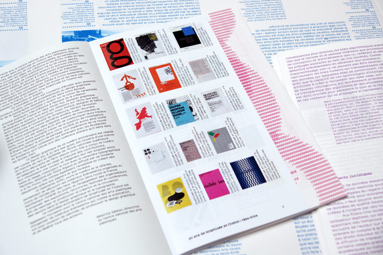
Garric imagined a ‘joyful object’ to celebrate the anniversary in which colour would play a pivotal role. The main section, printed on uncoated Arena Bulk, includes contributions by practitioners and educators Olivier Huz, Étienne Mineur and Vivien Philizot, who provide an in-depth analysis of contemporary issues in graphic design and typography.

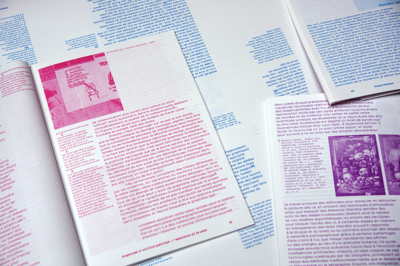
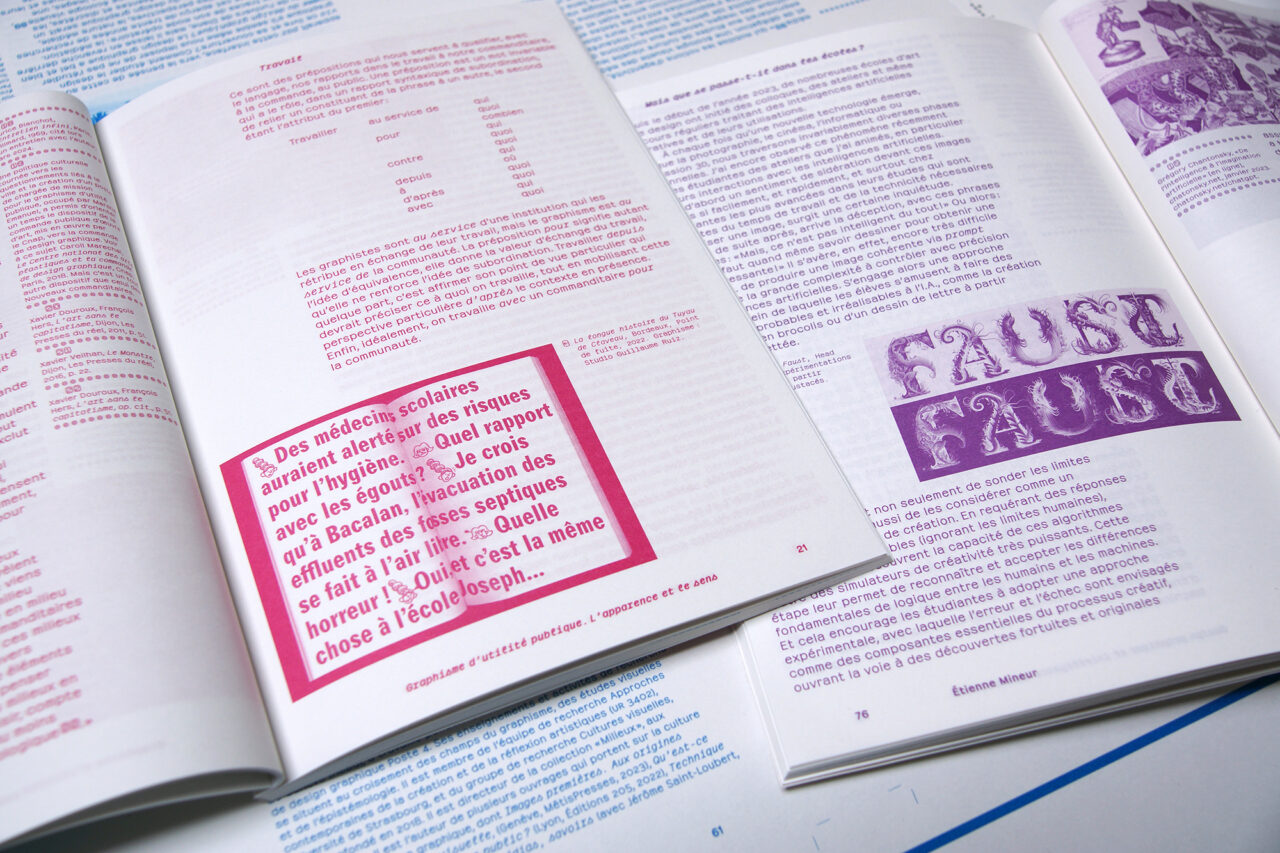
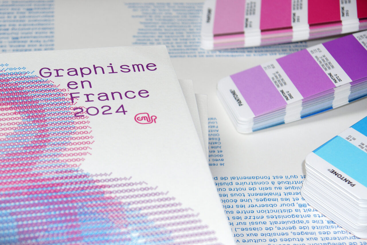
Each contribution was printed in a different specific Pantone colour; the cover combines all three colours. Graphisme en France 30 also features a calendar of annual events for CNAP, printed in full colour on Symbol Freelife, which has a gloss texture. Garric says, ‘I was particularly interested in the contrast provided by the use of these two papers, allowing me to differentiate the contributions from the calendar.’ For printing, the team chose Stipa in Montreuil.

Garric used the typeface Pachinko (A is for fonts) by Émilie Rigaud. She says the typography on the cover and opening pages was inspired by concrete poetry and ‘ascii art’, which opened up many possibilities for the composition and layout.

Papers:
Arena Bulk natural
Symbol Freelife gloss

cnap.fr/actualites/graphisme-en-france

aisforfonts.com/pachinko

stipa.fr/

@louisegarric

Featured Materials

Arena

The Arena range is available in four shades: a bright Ivory, on OBA-free Natural, a warm White and a cool Extra White in a wide choice of sheet sizes, grain directions and grammages. Arena is available in three finishes: Smooth, Rough and Bulk. Also available in self-adhesive sheet version.

Related articles

Inspiration 21/06/2022

Proud to share

Australian design studio Voice understands the language and currency of good wine. By Kay Maxfield
Graphic designInterviewsLabel
News 31/08/2023

Vote for me!

Designed by Bonita Estudio, Vótame is a ‘politically incorrect’ political manual
Graphic designPrintingPublishing
Inspiration 16/03/2023

Blind emboss vision: type without ink

‘Villalón is inspired by nature, so choosing the right paper was essential'
Graphic designPrintingPublishing
News 08/12/2022

Imagination and innovation

Pulp 24 takes readers on a journey through inspirational and innovative approaches to print, packaging and the use of quality papers and self-adhesives
Corporate communicationDigital printingGraphic designIllustrationInterviewsLabelLarge formatPackagingPeople & PaperPhotographyPrintingPublishingSustainability
Pulp © 2025
Fedrigoni
Fedrigoni
COOKIE POLICY PRIVACY POLICY ACCESSIBILITY STATEMENT
Pulp © 2025