Berlin-based designer, art director and studio founder Ariane Spanier approaches her projects with tactile experimentation, and a bit of risk. She still gets excited about print, citing ‘its tactility, its slowness, and its definitive nature’.
Spanier, a self-confessed type obsessive, began her design studies at Weißensee Academy of Art in Berlin and landed an internship at Stefan Sagmeister’s studio in New York after graduating. During this time she became hooked on type, a fascination that never let go. In 2005 she founded Ariane Spanier Design in Berlin and has done much work in the cultural sector since.
One longstanding project is Fukt, a magazine founded by Spanier’s partner Björn Hegardt in 1999, while he was studying art in Trondheim, Norway. (The word fukt means ‘moisture’ or ‘dampness’ in Norwegian, Swedish and Danish.) Spanier calls the sizeable publication a ‘bookazine’ – each edition features a distinct theme within the world of drawing. The couple met a few issues after the launch, and Spanier soon became its designer and co-editor with Hegardt.
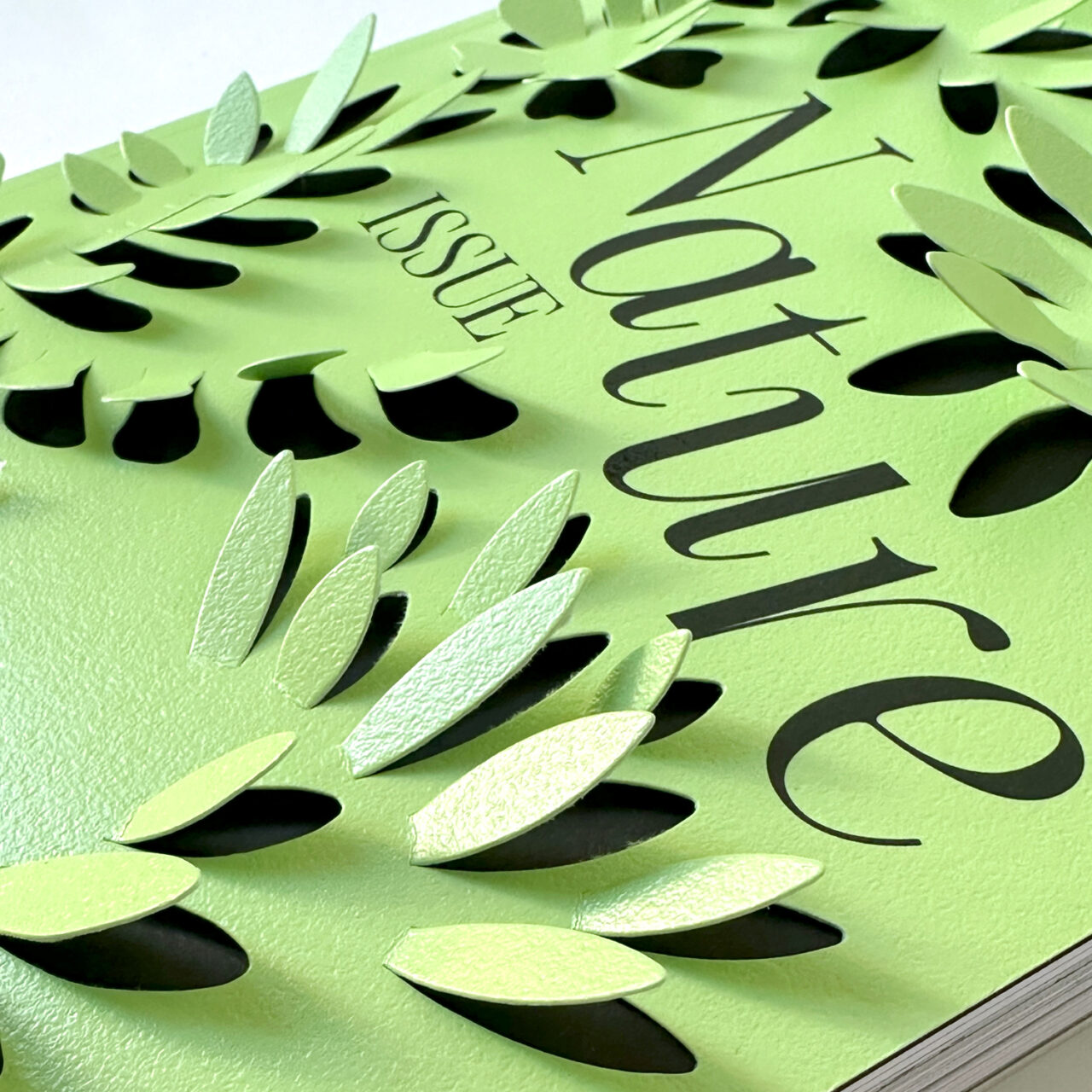
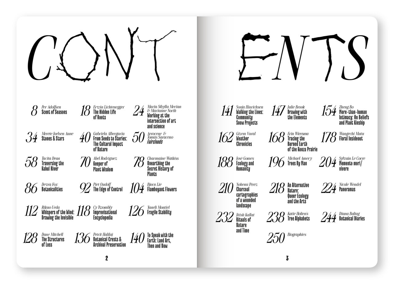
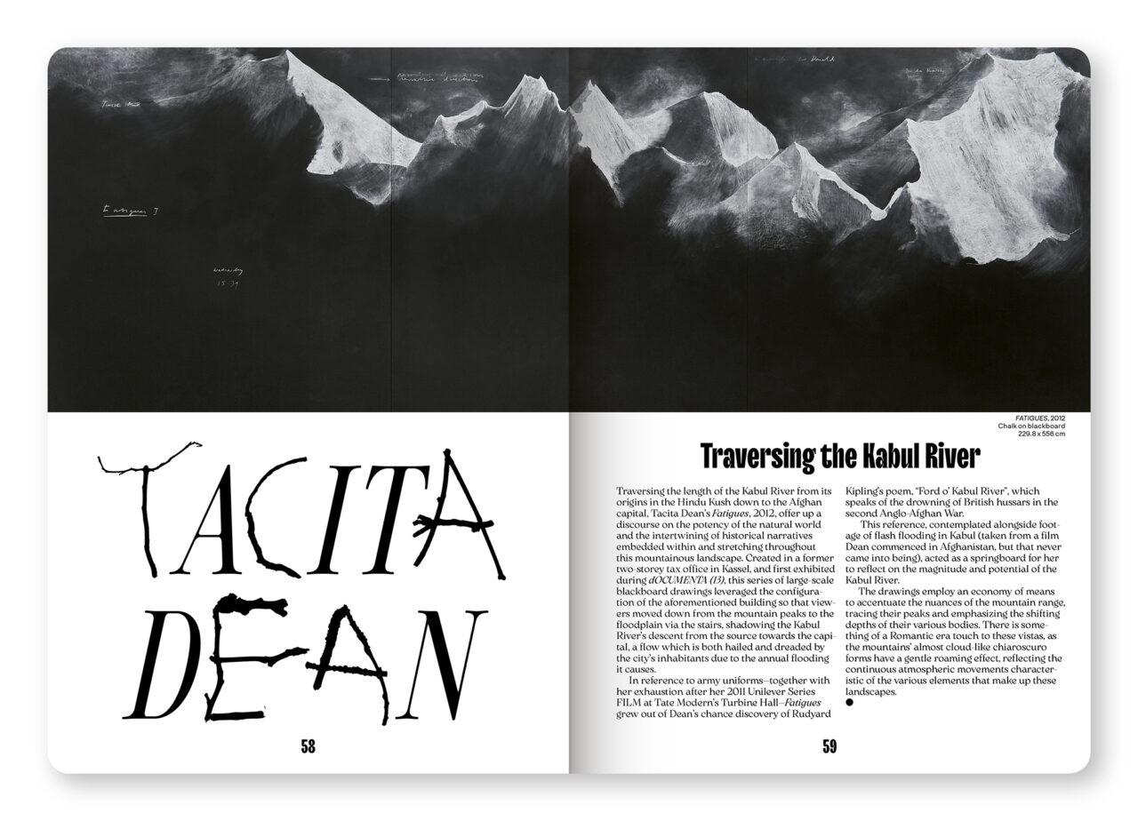
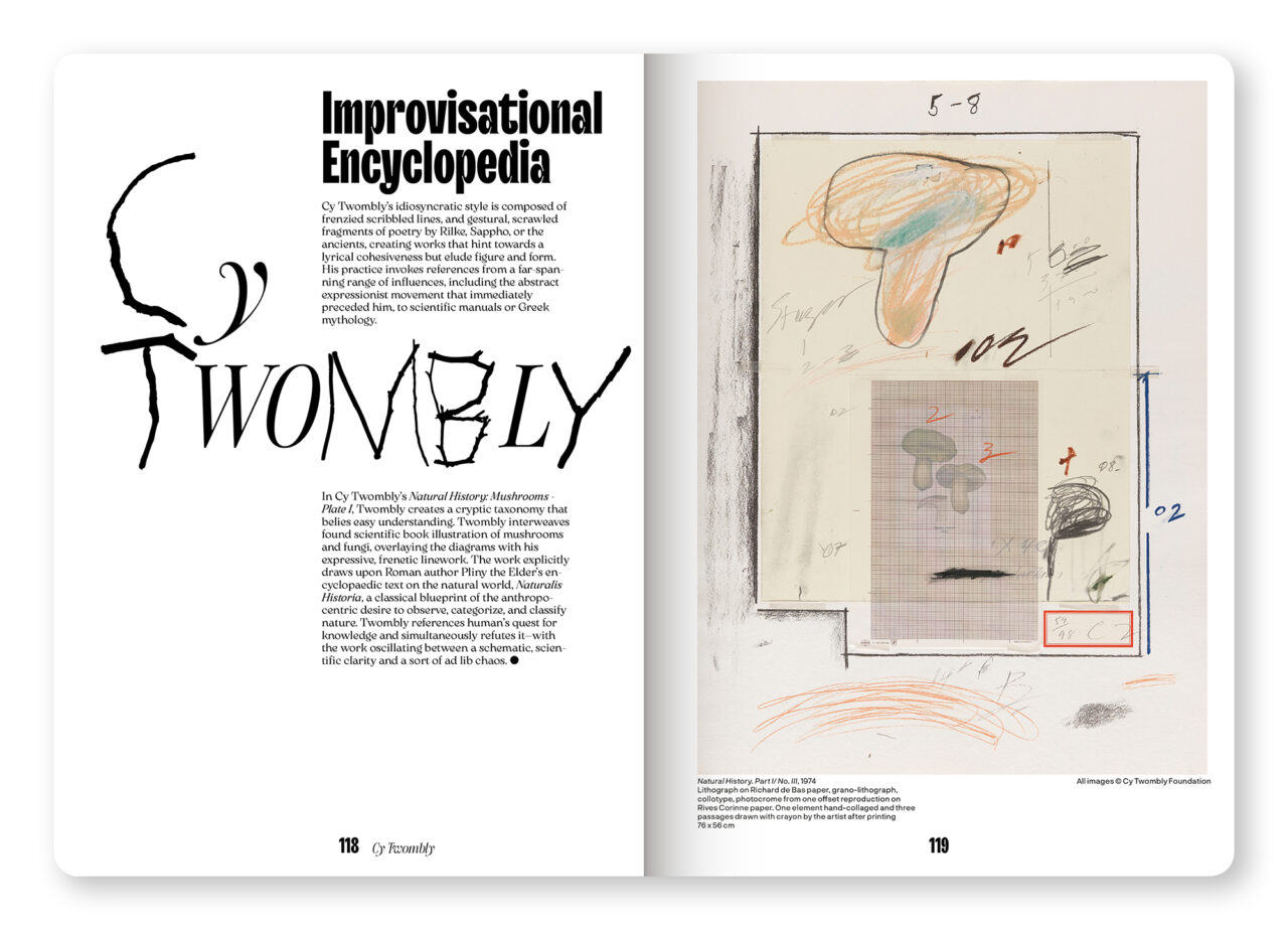
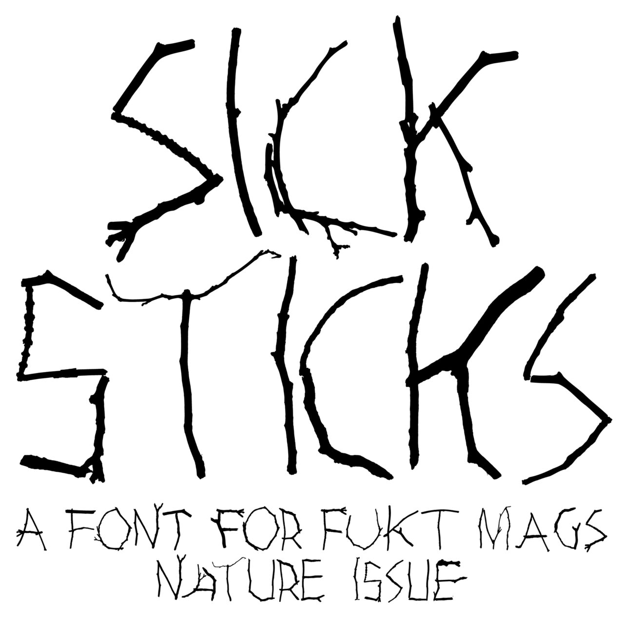
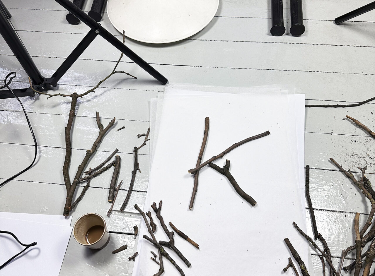
The latest offering, Fukt #22, The Nature Issue, focuses on the ‘bond between drawing and the natural world’. The 256-page publication features artists using nature to draw in different ways – in snow, soil, by burning fields to leave traces on paper and more. It also investigates memories of nature and urgencies around our ecology.
Spanier explains that she wanted the highly structural cover, ‘to become an object’. She says, ‘Nature isn’t flat – it’s dimensional, overgrowing, wild.’ She used Symbol Card Highline paper for the interactive leaf-shaped die cuts.
Released in October 2024, the Nature issue has already been reprinted due to high demand. It is available for purchase on Fukt’s website.
Paper: Symbol Card Highline
arianespanier.com/publications#/fukt-magazine-the-nature-issue/