• It
Sign in Get Pulp Pulp 27
Pulp
Sign in Get Pulp Pulp 27
Pulp
  • Inspiration82
  • Stories79
  • News162
  • Pulp Archive
  • Materials Index
  • About Pulp
  • Tell Us
  • Sign in
  • Get Pulp
  • Pulp 27
  • It
Browse Themes
Corporate communicationDigital printingGraphic designIllustrationInterviewsLabelLarge formatPackagingPeople & PaperPhotographyPrintingPublishingSustainabilityInspirationStoriesNews
Pulp

Log-In

Please enter your credentials to access all Pulp contents.

Forgot your password?

New to Pulp? Register for free

New to Pulp?

Register for free to have full access to our content.

Register

2 min minutes
News

Cool but cute

Studio Mathilda Mutant’s identity and packaging design for the Berlin-based Walter Confiserie brings the 107 year-old brand right up to date
Graphic designIllustrationPackaging

The Walter confectionery brand was established in 1915 and remained a family-owned business up until the 1970s. In 2018, the Berlin company was taken over by siblings Caroline and Philipp Thiedig.

As part of a brand strategy refresh, the Thiedigs commissioned designer Martina Miocevic of Mainz-based studio Mathilda Mutant to develop a new identity and packaging design for the company.

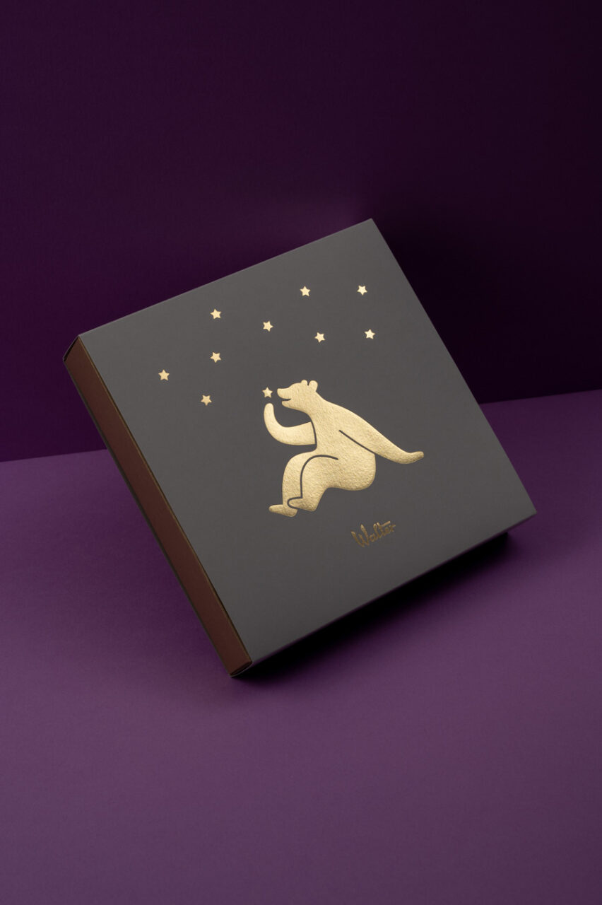
The resulting project is full of humour, from the redrawn bear logo to the punning names of the confectionery – Marzahnipan, for example, references the Marzahn district of Berlin.

Miocevic says that during an early project meeting to discuss the redesign at the Walter factory, they unearthed a sticker from the 1970s that featured the Walter bear snacking on some of the produce. Seated and reimagined in silhouette, the charming character now adorns the new packaging.

According to Miocevic, the bear motif will continue to be used in a variety of different settings across Walter’s seasonal packaging. For example at Easter, he sports rabbit ears. The sense of fun is accentuated by the pastel colours and bold type Miocevic chose for the new packaging for Walter’s range of chocolates, marzipan and nougat.

Papers:
Woodstock Verde
Tintoretto Ceylon Anice
Sirio Pearl Gold
Tintoretto Cubeba
Woodstock Pistacchio

Photography: Elisa Biscotti, Studio Biscotti

Designstudio Mathilda Mutant® Instagram

walter-confiserie.de

Featured Materials

Sirio Pearl

Sirio is a line of natural papers and cardboard with highly lightfast pigments. For packaging; for prints: Sirio Pearl, Sirio Pearl Blend and Sirio Pearl Mèrida. Also available in self-adhesive version.

Woodstock

Recycled uncoated papers and boards with 80% pre-consumer recycled waste and 20% FSC certified virgin fibre, pulp coloured. Also available in self-adhesive version.

Tintoretto

The uncoated natural papers in the Tintoretto range are made from pure ecological ECF cellulose, FSC™ certified, and felt-marked. Also available in self-adhesive version.

Related articles

News 22/09/2022

Natural minimalistic

Di Carlo’s low intervention wine-making process is reflected in Stefano Bracci’s labels for its Nobu 1830 range
Graphic designLabel
News 08/12/2022

Essence and inspiration

The packaging for Nao, a new Italian fragrance brand, evokes the land and sea of Liguria
Corporate communicationGraphic designPackagingPeople & Paper
Inspiration 15/12/2022

The beauty of understatement

The pared-back aesthetic of beauty brands has an illustrious pedigree. By Elizabeth Glickfeld
Graphic designPackagingPeople & Paper
News 22/06/2023

Hungarian quartet

An elegant packaging solution for a selection of Attila Gere wines
Graphic designLabelPrinting
Pulp © 2025
Fedrigoni
Fedrigoni
COOKIE POLICY PRIVACY POLICY ACCESSIBILITY STATEMENT
Pulp © 2025