When you meet her in person, Lora Lamm exudes the same freshness and clarity one sees in her posters. A Swiss national, Lamm has worked as a graphic designer since the early 1950s. But she is best known for her ‘glorious decade’ in Milan where, from 1953-62, she worked for the department store La Rinascente, the tyre manufacturer Pirelli and the beauty company Elizabeth Arden, among others.
The Museum für Gestaltung (MfG) in Zürich is keen to promote Lamm’s work. Curator Bettina Richter is putting together a display of Lamm’s posters entitled ‘La vita è bella’, which will be featured on the wall in the entrance hall from 24 June 2015. Lamm is actively involved in the project, rearranging the draft display of the posters in various places. ‘The sequence must have a rhythm,’ she explains, ‘it should immediately look good to the eye and not just appeal to the brain.’
Recently there has been a long overdue reappraisal of Lamm’s work. In 2007 a selection of her material was included in the MfG exhibition ‘Zürich-Milano’, and in 2013 she had a solo show of her Milan years at the Max Museum in Chiasso, Switzerland. The exhibitions brought Lamm to a wider audience. Her work, featuring an original mix of typography, photography and illustration, merits a mention in every textbook on twentieth-century graphic design. Yet until recently only a few aficionados knew of her designs.
Lamm is a reserved person, who has always refused to belong to any particular group of graphic designers or to engage in scholarly debate. ‘I enjoy doing the work,’ she explains, ‘not talking about it.’ Long ago, she also chose not to teach. ‘I express myself through my work, not through words. To teach you need to learn how to do it well. It is a big responsibility.’
Born in 1928 in Arosa in the Swiss Alps, she studied at the Kunstgewerbeschule (School of Arts and Crafts) in Zürich under the guidance of Ernst Keller, Ernst Gubler and Johannes Itten. In 1953 Lamm went to Milan on the advice of Frank Thiessing, a copywriter at Graphis (then a major agency in Switzerland). And in the early 1950s the artistic climate in Milan was sparkling. The need to rebuild a nation in disarray after the Second World War meant that experimentation was everywhere – in architecture, film, technology and fashion.
Inspiration came from the US and from Switzerland. Lamm – who already admired the work of Italian artists and designers Carboni, Fornasetti, Confalonieri, Negri, Longoni and Danese – began to work for Studio Boggeri and for the food company Motta. Later, after an introduction from Max Huber, she worked for the big store La Rinascente. At that time other well known names, such as architect Carlo Pagani and designers Albe Steiner, Max Huber, Bruno Munari and a young Giorgio Armani (‘a shy young man who worked there sometimes as a window stylist’) were also employed there.
‘A sacred fire was in the air in those years,’ says Lamm. La Rinascente’s chief executive, Cesare Brustio, and its creative director, Gianni Bordoli, had the vision to recruit the most interesting people around, no matter how young they were. Those years shaped what would become the worldwide success of Italian fashion.
Lamm gradually gained more responsibility. The environment was stimulating, with everyone discussing ideas, which Lamm would translate into images and designs. She designed the seasonal events, such as sales, home decoration, Easter, spring fashion, summer holidays, back to school and Christmas. Each event meant a poster, a fashion show, store and window displays, invitations and price tags.


There were also special exhibitions of gifts and products from foreign countries. The Japan exhibition of 1956 was a milestone in Lamm’s output. And, as a result of the buyers’ trips to foreign countries and the Rinascente’s relationship with American stores such as Macy’s in New York and Neiman Marcus in Dallas, Lamm exchanged drawings, gifts and mutual admiration notes with Andy Warhol, although they never met in person. ‘Warhol’s drawings were perfect,’ Lamm says. ‘He had a well trained eye and hand. People mostly know his pop works, with all the reproductions and photos, but he was a fantastic disegnatore.’
For Lamm, the basis of successful graphic design is good drawing: ‘One must know how to draw and how to design lettering.’ At 87, she still sketches and draws, and she currently has a plan for a book (not necessarily for children) on the daily life of a peanut.
She has an almost samurai way of working: first a lot of thinking, then a rapid and precise realisation of the idea with the brush on an A6 sheet in gouache. Then she moves on to collage, photo-composition and lettering, with copywriting developed by Swiss-Italian stylist Amneris Latis, in the Italian language, but with a five per cent Swiss twist. The images are blown up, then printed in rotogravure on a large grid. In some cases, the pencil drawing is evident underneath the colours. This gives the posters an airy, fluid feel, as if the scene is taking place in the breezy outdoors.
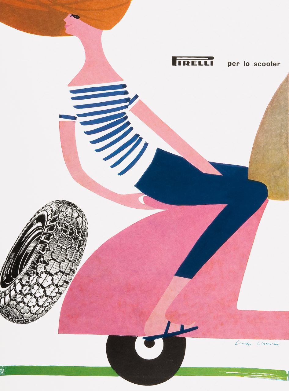
In the Milan years, Lamm also worked freelance for Elizabeth Arden and Pirelli, among others. ‘I designed for Rinascente by day, and for these other clients by night,’ she says. The Pirelli posters were meant to hang in car-repair shops.
Paper choice has always been an important part of Lamm’s design projects. ‘A small number of copies and lithography? You could specify a good, expensive paper,’ Lamm says. ‘Many copies and rotogravure? Then it was probably going to end up on cheap paper. Paper has to be like a fabric, to be felt in your hands and persuade you to turn the pages. Coated paper is cold, sometimes rigid. When possible, we would use beautiful papers from Fischer [a Swiss distributor of fine papers, including Fedrigoni’s] and Fabriano, and perhaps print at Muggiani’s.’
By 1962 things were changing at La Rinascente, and Lamm decided it was time to leave. Despite the temptations of the US, she returned to Zürich and joined Thiessing’s BSR advertising agency, serving clients in diverse fields such as textiles (Patrick Hoffel, Fischbacher, Lodenfrey), aerospace, food, fashion and pharmaceuticals, working a lot with photography and type.
‘It was fun to design for aerospace and the defence industry,’ Lamm says. ‘There, the typography and the choice of paper were important; while designing for textile companies required a feminine touch. One must deal with the client with good manners and intelligence. And the client should trust the designer. However, I guess my earlier work shows a kind of independence: this is my work and if you don’t like it – too bad! I knew the Milan years had been a unique experience,’ she says.
Knowing the right people, who believed in her at the right time, played an important role in Lamm’s life. First of all, her father who, when she was eighteen, encouraged her to leave the mountains and to study in Zürich. Then designer Max Huber; Rinascente’s creative director Gianni Bordoli; Pirelli’s head of communication Arrigo Castellani; and the late Frank Thiessing (1917-2009). Though not so famous as some, Thiessing was an elegant and cultivated professional who, in 1953, encouraged Lamm to cross the Alps; and who later, in 1962, invited her to join his studio. Twelve years ago he asked her to be his wife.