• It
Sign in Get Pulp Pulp 28
Pulp
Sign in Get Pulp Pulp 28
Pulp
  • Inspiration90
  • Stories88
  • News174
  • Pulp Archive
  • Materials Index
  • About Pulp
  • Tell Us
  • Sign in
  • Get Pulp
  • Pulp 28
  • It
Browse Themes
Corporate communicationDigital printingGraphic designIllustrationInterviewsLabelLarge formatPackagingPeople & PaperPhotographyPrintingPublishingSustainabilityInspirationStoriesNews
Pulp

Log-In

Please enter your credentials to access all Pulp contents.

Forgot your password?

New to Pulp? Register for free

New to Pulp?

Register for free to have full access to our content.

Register

3 min minutes
News

A smile in a bottle

Studio Levinsky has put joy at the heart of its new identity for beer and restaurant brand Doppio Malto
Graphic designLabelPackagingPrinting

Doppio Malto is an Italian craft beer producer and a restaurant chain with sites in northern Italy, the UK and France. It has two breweries – the first founded in Erba (2004), the second in Iglesias, Sardinia (2020).

Design studio Levinsky has developed a new visual identity for the brand to coincide with its restaurant expansion. This includes a new bottle top and label design, featuring bespoke lettering.

The studio’s Marco Bortolussi describes Doppio Malto (which translates as ‘double malt’) as ‘a happy place,’ he says, ‘where people can have fun, drink craft beer and enjoy delicious food.’

Levinsky’s desire to respect both ‘tradition and innovation’ is imbued in the labels designed for the bottles. Nine vivid hues, printed on reflective papers, are used across an old-fashioned bottle design inspired by the brew house of the company’s first brewery, embellished with the seal of Doppio Malto’s brewmasters.

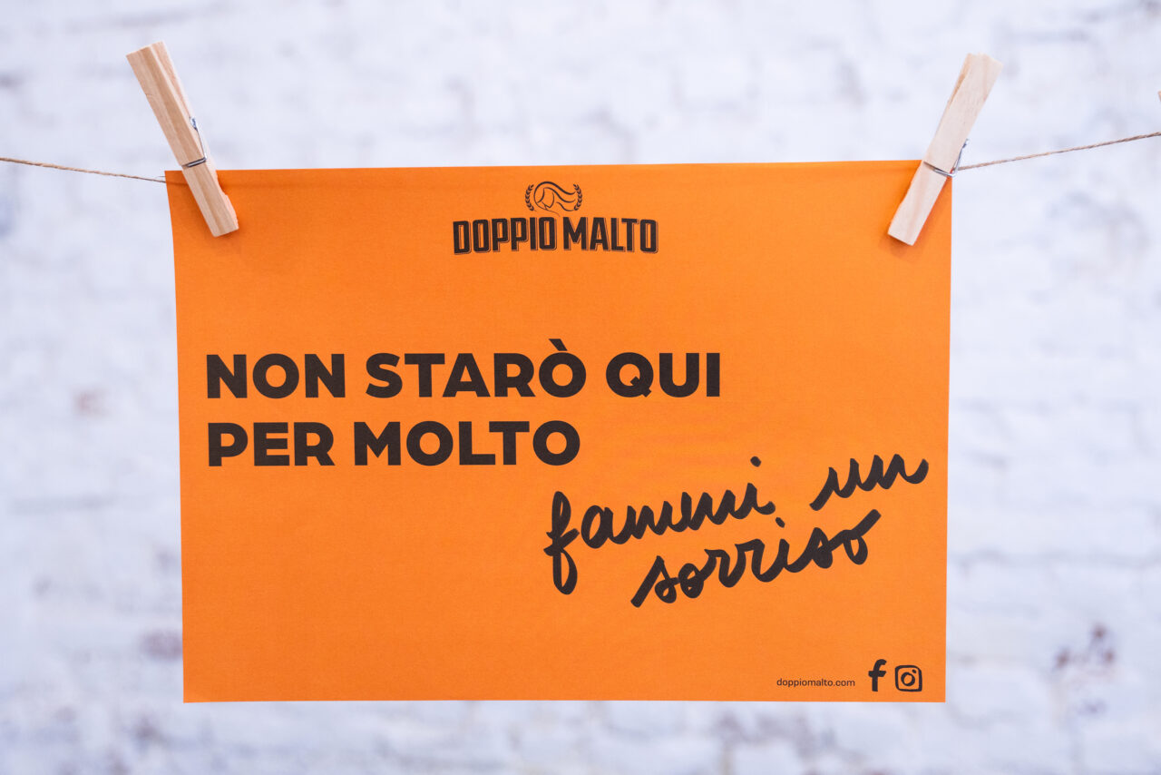
Restaurant menus feature stories of ‘food, beer, and conviviality’, says Bortolussi, while handwritten text and the beer masters’ seal are used throughout. The little details complete the approach – the smile on each bottle top complements the human touch evoked by the ‘marker pen’ type.

‘From beer bottles, a rainbow of colours flows through each piece of communication, inside and outside the restaurants,’ says Bortolussi. ‘Place mats and coasters create new and bold colour combinations. The marker pen stroke brings in an amusing and provocative tone of voice … with historical beer factory vibe.’

Papers:
Opp TC Silver Metal 50
Manter range (labels)
Arena bulk (menus)

Levinsky Design

Levinsky Design Instagram

Doppio Malto

Doppio Malto Instagram

Featured Materials

Arena

The Arena range is available in four shades: a bright Ivory, on OBA-free Natural, a warm White and a cool Extra White in a wide choice of sheet sizes, grain directions and grammages. Arena is available in three finishes: Smooth, Rough and Bulk. Also available in self-adhesive sheet version.

Related articles

News 14/12/2023

Discover the gold

The relaunch of US homeware company Georges Briard is led by Milanese design studio CRSL
Graphic designPackagingPrinting
News 23/02/2023

Unfinished business

With an affinity for print, multidisciplinary artist Dunja Jankovic reveals the power of geometric form. By Claire Mason
Graphic designPrintingPublishing
Inspiration 11/12/2025

Jacoliva olive oil

The bottle evokes the environment of the Coriana olive grove with its alluvial soil and boulders
Graphic designLabelPrinting
News 17/07/2025

Key to luxury

International design studio Mucho highlights the tactility of the Mallorcan landscape in their latest branding for the Four Seasons Formentor
Graphic designPrinting
Pulp © 2025
Fedrigoni
Fedrigoni
COOKIE POLICY PRIVACY POLICY ACCESSIBILITY STATEMENT
Pulp © 2025