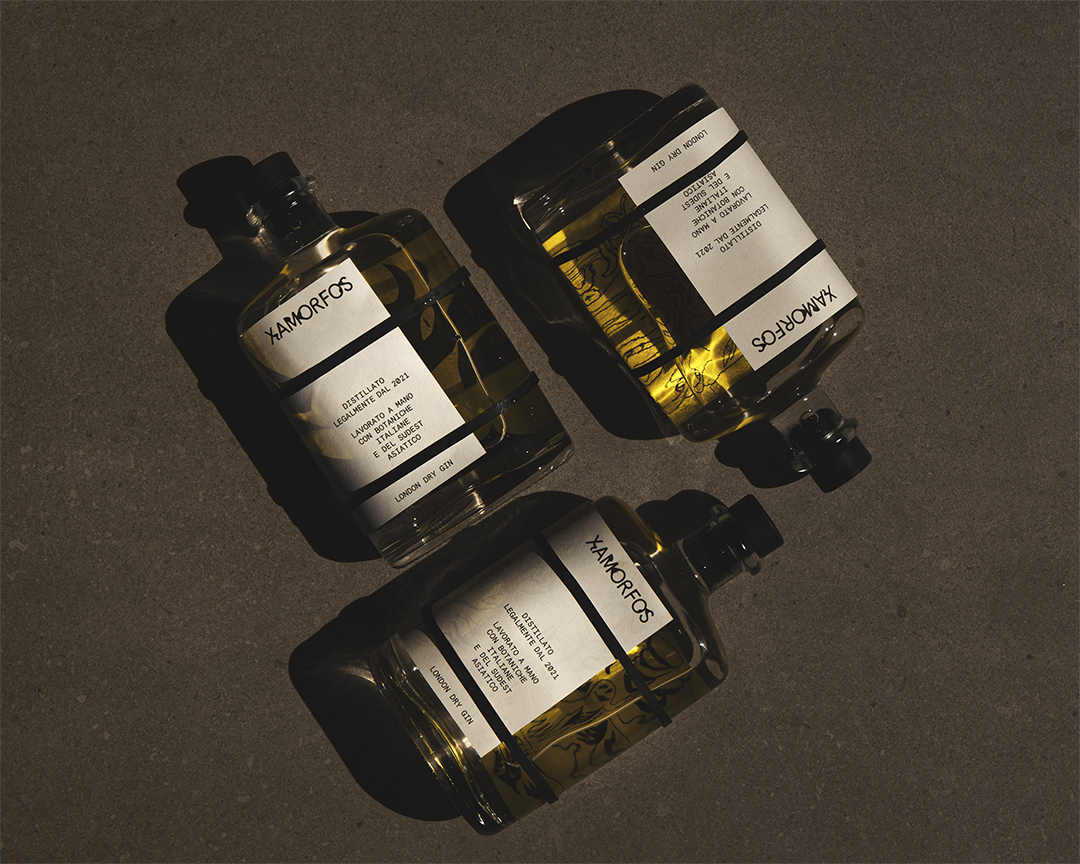
In an unusual approach to bottle labelling studio Lettera7 replaced glue with rubber bands and printed patterns on the underside its labels for gin brand Xamorfos so dream-like imagery is visible through the liquid. The project was awarded a Special mention in the Label category of the 2022 TOP Award.
The design is inspired by the idea of ‘lucid dreaming’ – ‘an elegant exercise in style which tries to alter that stage situated between consciousness and dream-like perception,’ says Lettera7’s Dario Volpe.
The label for Xamorfos’ London dry gin wraps three-quarters of the bottle, the gap revealing the label’s underside in a distinctive yellow and black illustrative style. Distortions become part of the graphic language of the design as the label plays with reflection and refraction while the logotype also features distressed lettering.
‘The label is supported by a system of rubber bands and can be removed from the bottle and framed,’ Volpe explains. ‘We designed it as an open project that could involve illustrators and artists invited to embrace the Xamorfos concepts and create periodically different artwork.’
The illustrations featured on the labels are based on sketches made by Lettera7’s creative director Dario Volpe. ‘They were made during long job calls, instinctively and without any reflection,’ says Volpe. ‘We found them an interesting link with the “lucid dream” concept.’ As the gin is produced in small batches, the label is designed to accommodate a different set of illustrations each time.
‘This combination of rationality and disorder was translated in a bottle that aims to stimulate tactile, visual and cognitive sensations,’ adds Volpe. ‘The fluidity of the gin recalls the lucid dream experience with [its] forms distorted by the movement of lights and visions destabilising and seductive at the same time.’


Paper: Old Mill Bianco 120g/m2
fedrigonitopaward.com/project/lettera7-xamorfos-sogno-lucido