• It
Sign in Get Pulp Pulp 27
Pulp
Sign in Get Pulp Pulp 27
Pulp
  • Inspiration87
  • Stories84
  • News171
  • Pulp Archive
  • Materials Index
  • About Pulp
  • Tell Us
  • Sign in
  • Get Pulp
  • Pulp 27
  • It
Browse Themes
Corporate communicationDigital printingGraphic designIllustrationInterviewsLabelLarge formatPackagingPeople & PaperPhotographyPrintingPublishingSustainabilityInspirationStoriesNews
Pulp

Log-In

Please enter your credentials to access all Pulp contents.

Forgot your password?

New to Pulp? Register for free

New to Pulp?

Register for free to have full access to our content.

Register

2 min minutes
News

Inner essence

Benana Studio’s packaging for Zep Torrenz’s range of perfumes is as beautiful inside as out
Graphic designPackaging

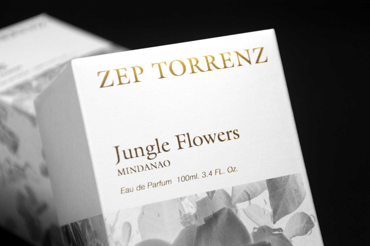
Zep Torrenz’s perfumes have an unusual starting point: they originate in a novel written by the brand’s founder Josep Torrents. In Las Fragancias Olvidadas de Ultramar (Forgotten Fragrances from Overseas), Torrents tells the story of Enrique Martí, a fragrance pioneer who sets out to discover new flora in the jungles of the Philippines, hoping to recreate and package the finest scents imaginable.

A range of three perfumes – Oud (Ultramar), Jungle Flowers (Mindanao) and Deep Sea (Mar de Sulu) – sprang from this nineteenth-century narrative and inspired Barcelona studio Benana to create the brand’s intriguing packaging with the explorer in mind.

A reimagined perfume of 150 years ago had to look elegant and discreet, explain the designers, and the exterior features black-and-white imagery with metallic printing in three colours. Inside, the box reveals a surprise, in what the studio’s Diana Núñez and Rubén Cruz describe as a ‘colour explosion’ intended to match the smell of the perfume.

‘Once you open the perfume, its true essence is inside.’

To achieve this effect the studio looked at the traditional ‘enfleurage’ technique, a centuries old method for extracting essential aromatic oils from fresh flowers. Núñez and Cruz devised a visual equivalent by placing the components of each perfume under pressure in a high-resolution scanner. The result is a glorious full-colour image of the elements that make up each perfume, ‘a balance between the conceptual and the aesthetic’.

‘With this process we obtained an infinity of textures with which to play,’ they say, ‘and these were applied to the outside of each pack in inverted black-and-white and, inside, with all its splendour of colour, simulating the olfactory process.

‘Once you open the perfume, its true essence is inside.’

Printer: Nova Era

Paper: Arena White Smooth 400 g/m2

Photography: Benana Studio & Imma Cortés

zeptorrenz.com

benana.es

Featured Materials

Arena

The Arena range is available in four shades: a bright Ivory, on OBA-free Natural, a warm White and a cool Extra White in a wide choice of sheet sizes, grain directions and grammages. Arena is available in three finishes: Smooth, Rough and Bulk. Also available in self-adhesive sheet version.

Related articles

Inspiration 23/05/2024

Dunhill

The Dunhill project was a close collaboration between Vincent Villéger, Nirvana, Fedrigoni and the brand
PackagingSustainability
Inspiration 10/04/2025

Mr Kitching in Italy

Last summer, the Tipoteca Foundation hosted an intense, four-day letterpress workshop led by Alan Kitching. By Paul Shaw. Photography by Andrea Basile
Graphic designPrinting
News 20/02/2025

Spirit reveal

Lewis Moberly creates a recyclable gift package for whisky distillery The Glenrothes
Graphic designPackaging
News 04/04/2024

Fade to blue

Graphic designer Charles Villa observes the phenomenon of fading printed imagery in his book Image Bleue
Graphic designPrintingPublishing
Pulp © 2025
Fedrigoni
Fedrigoni
COOKIE POLICY PRIVACY POLICY ACCESSIBILITY STATEMENT
Pulp © 2025