• It
Sign in Get Pulp Pulp 28
Pulp
Sign in Get Pulp Pulp 28
Pulp
  • Inspiration90
  • Stories88
  • News174
  • Pulp Archive
  • Materials Index
  • About Pulp
  • Tell Us
  • Sign in
  • Get Pulp
  • Pulp 28
  • It
Browse Themes
Corporate communicationDigital printingGraphic designIllustrationInterviewsLabelLarge formatPackagingPeople & PaperPhotographyPrintingPublishingSustainabilityInspirationStoriesNews
Pulp

Log-In

Please enter your credentials to access all Pulp contents.

Forgot your password?

New to Pulp? Register for free

New to Pulp?

Register for free to have full access to our content.

Register

1 min minutes
News

A vintage identity

French agency Partisan du Sens brands a special Champagne cuvée for Bollinger
Graphic designLabelPackaging

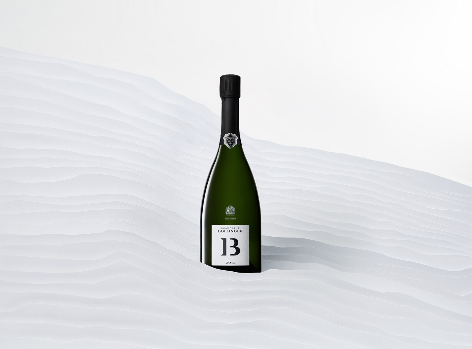
Parisian agency Partisan du Sens has designed the branding and packaging for B13, a limited-edition cuvée from Bollinger. The name ‘B13’ refers to both the famous Champagne house and the year – 2013. These elements merge together in a monochrome logotype which is embossed on the bottle label and also rendered on the exterior of the box. When the packaging is opened, the ‘B’ is split into a ‘1’ and ‘3’.

The year is significant because of the unique weather conditions that occurred in the Champagne region during 2013: a long winter, followed by a wet spring and hot summer complete with thunderstorms. Bollinger says the identity, ‘is enhanced by the contrast of white and black, echoing the snow and frost so characteristic of 2013 and the Pinot Noir grape variety.’

Rows of vines and the contours of the Reims Mountain are also referenced in the packaging design. Gérald Galdini, design manager at Partisan du Sens, says the project was the first the agency produced during the Covid-19 pandemic, and its development was driven by an eco-friendly approach. The box is 100 per cent recyclable.

Freelife Cento Extra White 120g/m2

www.partisandusens.fr/en/

www.champagne-bollinger.com/
Related articles

Inspiration 10/06/2022

Letters from Venice

Artist and designer Jake Tilson pays homage to Venice’s stencilled street signs, the nizioleti. By John L. Walters
Graphic designPrintingPublishing
News 02/11/2023

Fundamental beauty

Australian luxury-prescription line The Secret Skincare rebrands its packaging with the help of studio Paige Tuzee Designs
Graphic designPackagingPrintingSustainability
News 25/05/2023

Spirit of the age

Burnt Faith Distillery’s first brandy features identity and packaging design by agency Contagious
Graphic designLabelPrintingSustainability
Stories 29/05/2023

People and paper: Jiaying Han

One of China’s most respected designers speaks to Pulp. Interview by John L. Walters. Portrait by Orlando Gili
Graphic designInterviewsPackagingPeople & PaperPrintingPublishing
Pulp © 2025
Fedrigoni
Fedrigoni
COOKIE POLICY PRIVACY POLICY ACCESSIBILITY STATEMENT
Pulp © 2025