

We live in a world where people take typography seriously – we have dozens of fonts to choose from on our computers, and we will fuss about which typeface to choose for a CV or an invitation; we hold strong opinions about Comic Sans and we can watch a full-length documentary about Helvetica.
In 1740, when Giambattista Bodoni was born, typography – setting moveable metal type by hand – was treated as a matter of little importance. If printers were admired, it was for their way with the ornaments and illustrations around the text, for everything but the words themselves. Bodoni was one of the printers who changed that, along with the Englishman John Baskerville in Birmingham and the Didots in Paris. A page of plain text printed on fine paper in their clear, elegant typefaces can look utterly beautiful; they gave printing a new prestige. In his lifetime Bodoni was a celebrity, known throughout Europe. Since his death he has been revered (and occasionally reviled) by printers and designers.
Bodoni was born into a family of printers in Saluzzo in Piedmont. At eighteen he travelled to Rome and found a job with the Propaganda Fide, the department of the Vatican responsible for spreading the faith abroad – the young Bodoni found himself printing Coptic and Tibetan alphabets. At 28 he was taken ill while preparing to travel to England to meet Baskerville – lucky timing: he was at home when an offer came to run the official printing-house of the Duchy of Parma. He took the job and spent the rest of his life in the city.
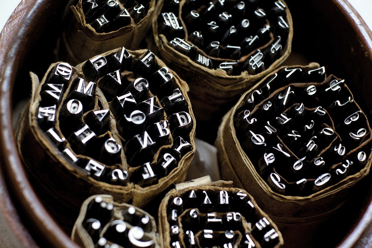
His official position – printing laws and official notices – placed him close to the heart of government; but he had contacts with literary, artistic and church circles, and became celebrated for his handsome editions of classic works such as the Iliad. In his spare time he would cut type compulsively; an individual punch, used to make the moulds for lead type, takes hours to cut, and Bodoni left behind more than 25,000. He also worked on his magnum opus, the Manuale Tipografico, a huge compendium of typefaces at different sizes, weights and styles – bold, italic and so forth. He left it incomplete, but his widow had it published a few years after his death.
Bodoni was the master of the style of type still known as ‘modern’, in contrast to the older typefaces that imitated handwritten script: letters with thick upright strokes sharply contrasting with very thin horizontal ones, and flat, thin serifs. Though it often looks wonderful in display, in headlines, title-pages or posters, in slabs of text modern typefaces can be hard to read, the strong contrasts creating a kind of dazzle for the reader. The nineteenth-century designer and printer William Morris complained of ‘the sweltering hideousness of the Bodoni letter, the most illegible type that was ever cut’. Bodoni was criticised in his lifetime, too, for sloppy proof-reading: his editions may have been beautiful objects but they were littered with misprints.

All the same, he became famous in a way few printers ever have. This was a time when printed books were spreading, when it was a matter of prestige to own books, to show off your library. Other cities and rulers tried to lure Bodoni away from Parma. Gentlemen on the Grand Tour would come to his studio to admire and buy; Napoleon visited Parma and demanded to know where Bodoni was (at home laid up with gout that day); Napoleon’s empress Josephine visited Parma, talked to Bodoni and took away copies of his work. His influence is still felt: 2013, the bicentenary of his death, saw exhibitions in his honour and the Compulsive Bodoni project, to create a complete digital version of the typefaces in the Manuale Tipografico. And imitations of his style abound – in fashion magazines, on the covers of Nirvana’s albums, and on the posters for Mamma Mia.

