IWANT, founded by designer-illustrator John Gilsenan in 2003, built its reputation working with record labels (including Buzzin’ Fly) and arts institutions such as the London Jazz Festival and Turner Contemporary. But when cultural budgets dwindled, the East London studio began exploring new sectors. Packaging design quickly became a significant part of the studio’s output and they often worked with start-ups.
Gilsenan became interested in what happened when his work was finished, so he looked for a way to become his own client. An investor friend, Chris, had been analysing growth patterns in goods where sales and distribution costs could be minimised, and selected matcha tea as a product that combined ‘logic and magic’. Growing sales brought the logic; the tea’s history and health benefits brought the magic. The two set up as a partnership to make and sell the tea they would call Ukiyo.
Matcha tea originated in China and was said to be a drink favoured by Buddhist monks and Samurai warriors. Its production is labour-intensive. Shade-grown green tea is hand-picked, stripped of stalks and ground to a fine powder – the form in which Ukiyo’s range is currently sold. In the 2010s, sales of matcha grew steadily worldwide, but the UK market was still emerging. It was stocked in vitamin and supplement shops, hidden away among the less appealing ‘health drinks’.
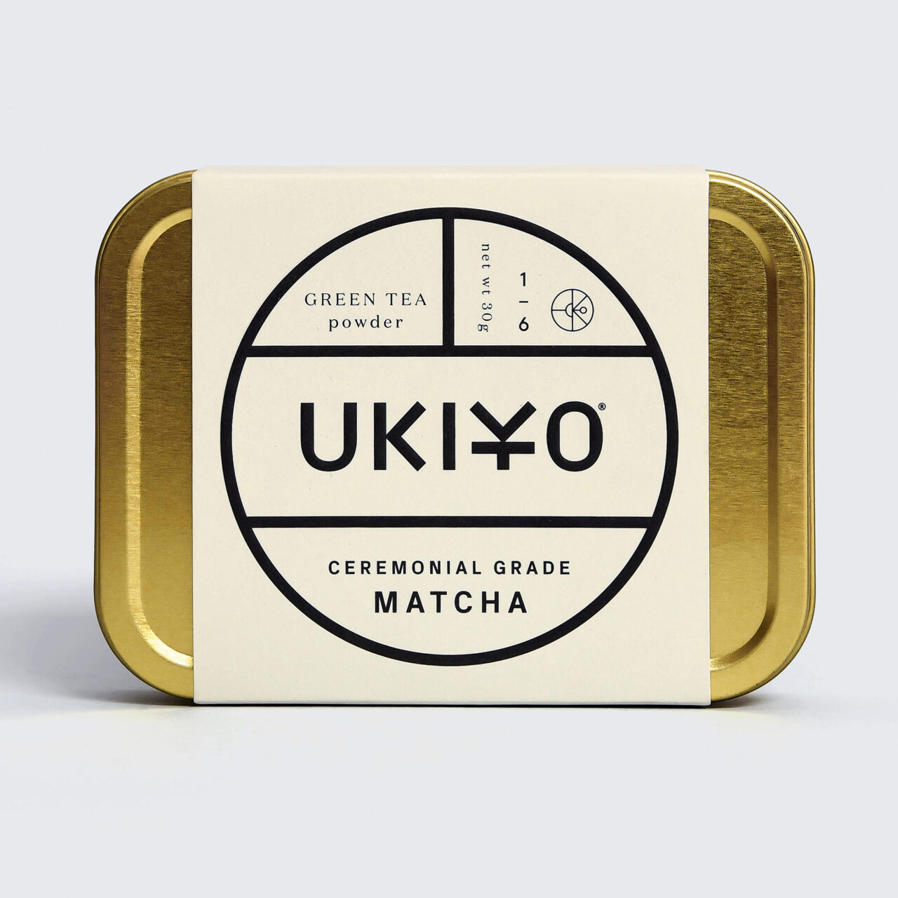
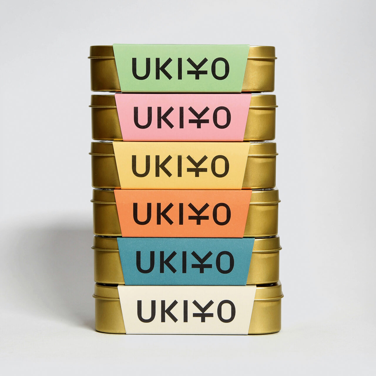
To succeed, IWANT needed to get their product into the hands of buyers and on to the shelves of aspirational retailers, such as Selfridges & Co. First came the name, ‘Ukiyo’, most commonly defined as describing a ‘floating world’ separable from the everyday with its origins in seventeenth-century Japan. Then they created and tested 30 different blends until the final range – five blends and a single ceremonial grade version – was ready for launch.
The packaging was intentionally simple – a ‘nod’ to Japanese design – and quite different to most of IWANT’s client work. The typeface Ukiyo Displace was also designed by Gilsenan, based on a Grotesk structure with decorative flourishes that echo Japanese characters.
Materiality was important, starting with the ‘tobacco tin’ that contains the tea, packaged with a paper wrap-around. Gilsenan likes the idea of re-appropriating tins that once held ‘a leaf product that could kill you’ for a ‘leaf product with health benefits’. The choice of paper label was critical. ‘We wanted our choices to add to the story of the product,’ he says, ‘so we selected Woodstock for its beauty and tactility. It was muted, softer, elegant.
Since its launch in 2018, the brand’s growth has been impressive, though for Gilsenan balancing Ukiyo’s development with IWANT’s client work is a challenge. The product is now in Selfridges & Co while new distribution outlets have opened up in northern Europe. Ukiyo is also available through online retailers. Several range extensions are in development.
Launching Ukiyo has given Gilsenan a chance to shift perceptions of his studio’s approach. ‘You have to be … brave in all the choices you make, in production and design. You have to stand out … communicating what is simple can often require the most complex thinking.’