• It
Sign in Get Pulp Pulp 27
Pulp
Sign in Get Pulp Pulp 27
Pulp
  • Inspiration82
  • Stories81
  • News164
  • Pulp Archive
  • Materials Index
  • About Pulp
  • Tell Us
  • Sign in
  • Get Pulp
  • Pulp 27
  • It
Browse Themes
Corporate communicationDigital printingGraphic designIllustrationInterviewsLabelLarge formatPackagingPeople & PaperPhotographyPrintingPublishingSustainabilityInspirationStoriesNews
Pulp

Log-In

Please enter your credentials to access all Pulp contents.

Forgot your password?

New to Pulp? Register for free

New to Pulp?

Register for free to have full access to our content.

Register

3 min minutes
News

String theory

Tradition and craftsmanship shine through in Meteorito Estudio’s handmade approach to Calcetas wine packaging
Graphic designLabelPrinting

Founded in 2013 by partners Eva Guadalupe and Fede Reyna, Valencia-base creative studio Meteorito Estudio specialises in packaging and product launches. Reyna discussed the motivations for starting the studio, saying, ‘We wanted to build up something different, a small creative boutique that would enable us to work our way, paying attention to detail and welcoming the client in the creative process.’ This approach led to packaging projects in collaboration with Calcetas winery from Bodegas Reyna.

Steeped in heritage and family-owned, Calcetas offers limited-edition, 100% organic wines with a focus on respect for the environment. At the beginning, Calcetas, was originally a single Tempranillo red wine and the range then extended to white wine offerings of Viognier and Sauvignon Blanc varieties in the years following.

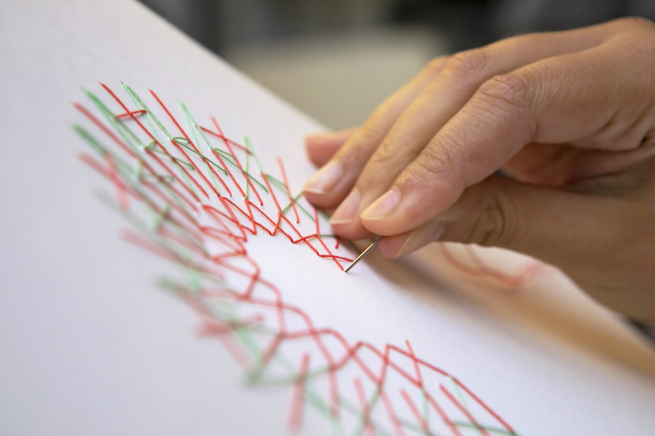
Calcetas, which translates to the traditional art of needlework, inspired the approach for the packaging. The studio used the ‘C’ of Calcetas, joining intertwined threads through stitched holes in the paper to create the handmade, embroidered design. These designs were then scanned in high resolution to be applied to the labels. Reyna states, ‘In this way, we could preserve the irregular shape of the threads and even their shadows.’

The colours of the threads are related to the product. For the Tempranillo, the green colour represents the vineyard and the red represents the wine. In the case of the white wine, the thread is gold to illustrate the brilliance of the golden liquid. A braille varnish was applied to give the sensation of touching a real dimensional thread.

The texture and touch of the papers used for the labels was highly considered by Meteorito – with a distinct importance on a material that could look stitched. Reyna states that, ‘Constellation Snow Intreccio was the best possible solution for the red wine label because of the natural look and feel.’ For the white wine, it was decided to go for the Materica Verdigris, because it ‘has a natural and special texture and touch that also helped us express the craftwork involved in this wine’s production’.

Paper:
Constellation Snow Intreccio Ultra WS FSC™
Materica Verdigris Ultra WS FSC™

meteoritoestudio.com/portfolio/packaging-vino-calcetas

calcetas.es/

Meteorito Estudio Instagram

Calcetas Wine Instagram

Featured Materials

Constellation Snow

High white uncoated papers and boards, embossed, made from pure ECF cellulose, FSC® certified and high strength. Also available in self-adhesive version.

Materica

Pulp-coloured papers and boards made with 40% CTMP fibres, 25% pure environmentally friendly fibres, 20% recycled material and 15% cotton fibres. Also available in self-adhesive version.

Related articles

Inspiration 10/06/2022

Letters from Venice

Artist and designer Jake Tilson pays homage to Venice’s stencilled street signs, the nizioleti. By John L. Walters
Graphic designPrintingPublishing
News 16/11/2023

Concentric circles of delight

Italian creative studio Nju: Communicazione focuses on textural elements for the design of the DOP signature line of Sabino Basso olive oils
Graphic designLabelPrinting
News 13/07/2023

Cinematic conception

With a unique approach to digital printing, each 2023 BAFTA Awards programme is one of a kind
Graphic designPrintingPublishingSustainability
Inspiration 14/06/2022

Morag’s Italian adventure

UK designer Morag Myerscough reflects on her time working at Michele De Lucchi’s studio in Milan – nearly 30 years ago
Graphic designInterviewsLarge format
Pulp © 2025
Fedrigoni
Fedrigoni
COOKIE POLICY PRIVACY POLICY ACCESSIBILITY STATEMENT
Pulp © 2025