• It
Sign in Get Pulp Pulp 27
Pulp
Sign in Get Pulp Pulp 27
Pulp
  • Inspiration82
  • Stories79
  • News162
  • Pulp Archive
  • Materials Index
  • About Pulp
  • Tell Us
  • Sign in
  • Get Pulp
  • Pulp 27
  • It
Browse Themes
Corporate communicationDigital printingGraphic designIllustrationInterviewsLabelLarge formatPackagingPeople & PaperPhotographyPrintingPublishingSustainabilityInspirationStoriesNews
Pulp

Log-In

Please enter your credentials to access all Pulp contents.

Forgot your password?

New to Pulp? Register for free

New to Pulp?

Register for free to have full access to our content.

Register

3 min minutes
News

Story tasting

Studio Design Associati rethinks what a publication can be with MagazWine
Graphic designLabelPrintingPublishing

MagazWine is a compelling and experimental publishing project, mixing wine packaging with short stories. Graphic designers at studio Design Associati saw it as an opportunity to experiment with different mediums, incorporating history, type design and graphics. The Treviso-based studio explains that the MagazWine format was inspired by the way we interact with wine packaging; whether when preparing a meal at home or heading out for dinner with friends and family.

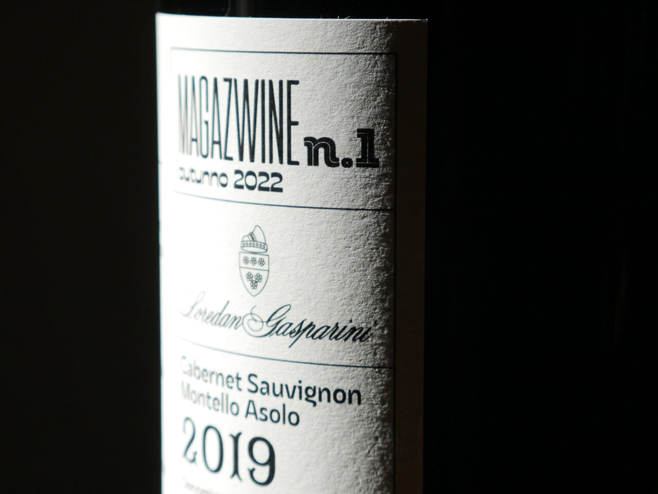
Such thoughts led them to devise a quick-read publication printed directly onto the wine label, telling ‘a story about the territory and the history of the winery’. Its design was informed by their knowledge of Italian type foundries, typographers, designers and printers, ensuring the right approach for realisation of this project.

Design Associati frequently displays its deep affection for type and design history, as shown in projects such as the calendar featured in ‘Italian type and cinema’ in Pulp 19. The designers believe the approach of ‘graphic design as a dialogue between form and content’ shines through in this project.

The collaboration features winemakers Loredan Gasparini in the Treviso hills, plus independent type foundry Zetafonts (Florence). The printing was managed by all-female printing company Tipografia Unione, based in Vicenza, Italy.

With the launch of the first ‘issue’, the studio is striving to expand the project into a series. Stay tuned for the next edition, and if you are interested in this collaboration write to Design Associati at da-editoria@design-associati.it.

Label: printed in two Pantone colours + UV coating on adhesive Tintoretto Gesso 95g/m2

Printer: Tipografia Unione

magaz.wine

design-associati.it

loredangasparini.it

zetafonts.com

tipografiaunione.com

Tipografia Unione Instagram

Featured Materials

Tintoretto

The uncoated natural papers in the Tintoretto range are made from pure ecological ECF cellulose, FSC™ certified, and felt-marked. Also available in self-adhesive version.

Related articles

News 25/08/2022

Print and planet

Read more about sustainable printing on Pulp Digital
PrintingSustainability
News 16/02/2023

Evolution of a design legend

Packed with content, Pentagram’s 50th anniversary book tells the story of an extraordinary studio
Graphic designPrintingPublishing
Inspiration 26/09/2024

Print lessons

Through her deceptively simple screenprints, Thai designer Minchaya Chayosumrit aims to increase understanding of the print process. By Sarah Snaith
Graphic designPeople & PaperPrinting
News 27/04/2023

Gourmet elixir

Based on old apothecaries, Gallén+Ibáñez promote truth and quality with Carmen del Poaig extra virgin olive oil packaging
Graphic designPackagingPrinting
Pulp © 2025
Fedrigoni
Fedrigoni
COOKIE POLICY PRIVACY POLICY ACCESSIBILITY STATEMENT
Pulp © 2025