When we meet, on a sunny Roman morning, Silvana Amato is in high spirits. She greets me from afar dressed in yellow and embraces me warmly despite the fact that we’ve never met before. ‘I’ve just found out that I’ve been invited to join the AGI!’ she tells me immediately. Our meeting couldn’t have had a more auspicious beginning – Amato is the first Italian female graphic designer to be invited to join AGI [Alliance Graphique Internationale], the association that brings together the most influential professionals in the design industry.
This is one of many accolades to have been awarded to Amato. Born and bred in Rome, she marries past and present in her work, and her passion for paper and books is complemented by the opportunities offered by technology. Proof of this openness can be seen in her range of clients, from established publishers such as Editori Laterza, to smaller companies like 66thand2nd and Nonostante Edizioni, as well as institutions such as the Accademia Nazionale di Santa Cecilia.
Amato’s workspace is a charming mix of professional studio and private living space, full of printed volumes stacked in neat piles, sections of books, punches and typographer’s tools, type, sheets of paper with sketches and proofed print-outs, all set out with care on vintage tables and wooden shelving.
I imagine that being surrounded by such harmony must make it quite straightforward to create beautiful design. But as soon as Silvana talks about her work, it becomes clear that some nebulous idea of creative freedom is not the starting point for her process. Her point of departure is the rigorous relationship between form and content; visual language and manual skill; showing and knowing. Her education at the Istituto Europeo di Design was her starting point: ‘Since there were no computers, I worked largely by hand,’ Amato tells me, ‘and that was fundamentally important, even if now I do very little manually. When you know how a book is made, you design it more sensitively’. Amato also sees graphic design as a key part of the process of writing. ‘The text and the design aren’t separate elements, they are both forms of writing. I never imagine a book concentrating only on the cover. I imagine the object as a single unit, in which the dialogue between cover and text is very powerful. Anyone doing this work has to see writing both from the point of view of form, and from that of content.’
It is precisely because of this philosophy that choosing typefaces is fundamental to every project Amato undertakes, and this becomes an integral part of many of her cover designs, as exemplified by Laterza’s series ‘Storie di questo mondo’ (‘Tales of this world’). There is a search for balance in the design, in which the interrelation between its dynamic elements wins out over the rigidity of a design grid. So how does one choose type? ‘It’s a cultural thing,’ Amato maintains. ‘Exactly the same as selecting images. My decisions are linked to taste built on knowledge. I know the origin of characters, what they refer to – their previous contexts, their history, how they print, and so on. Creativity doesn’t exist in isolation – you need expertise. It’s a matter of skill; practical understanding linked to a cultured, considered approach to what one does.’
Amato’s projects remind us that a book is just as much a concept as a physical object, and so paper is an essential factor in enabling designs to develop as whole, organic objects. ‘When you design a book, you need to take into account the structure of the paper’s fibre. The fibres of commercially produced paper align in a single direction, and the book will open more easily if its pages are designed to follow that direction. If I take this into account, the book is highly unlikely to come adrift from its spine. This brings us back to our starting point: binding books myself enabled me to understand that without these fundamental principles, the results would not be nearly so good.’
Is there a perfect paper? ‘No, there’s no such thing,’ says Amato, ‘Or rather there is a multitude of perfect papers! Let’s say that I prefer papers that fold well, I like them to be quite fine, possibly with a little texture, with a little warmth to them.’
The worlds of music and theatre are a constant in the work of Silvana Amato. Over the past twenty years she has worked on projects such as the covers for the CDs of the Concerti del Quirinale, produced by Rai Radio 3, and has also been responsible for art directing communications for the Teatro Argentina, the Teatro India and for the Nuova Consonanza festival, in addition to having designed the visual identity of the Museo degli Strumenti Musicali (Museum of Musical Instruments) at the Accademia Nazionale di Santa Cecilia.


Recently she designed the exhibition catalogue for ‘Il corpo della voce’ (‘The body of the voice’) at Rome’s Palazzo delle Esposizioni. A highly experimental exhibition, it focused on three important singers: Carmelo Bene, Cathy Berberian and Demetrio Stratos.
Graphic design wedded to sound, rhythm and time has always been a defining feature of Amato’s research, which also includes her own calendari-libro (calendar-books). Since 1999, she has produced a series of these books in collaboration with international designers; they take on a different form every year. ‘They are projects that I work on slowly in comparison with the faster-paced work that fills my day-to-day routine. The time I spend researching them is very productive, and I reap rewards from them when I have to design more quickly.’
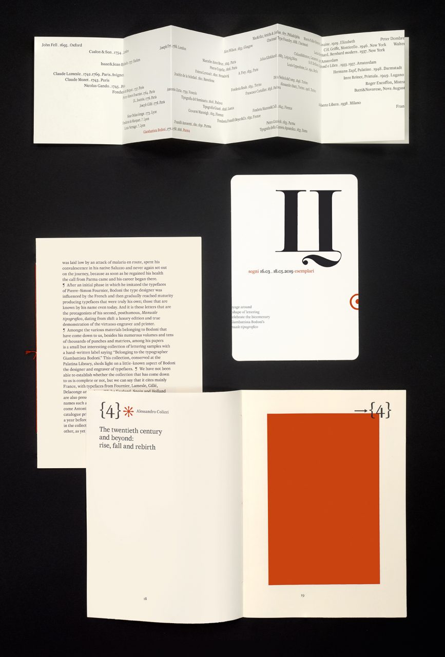
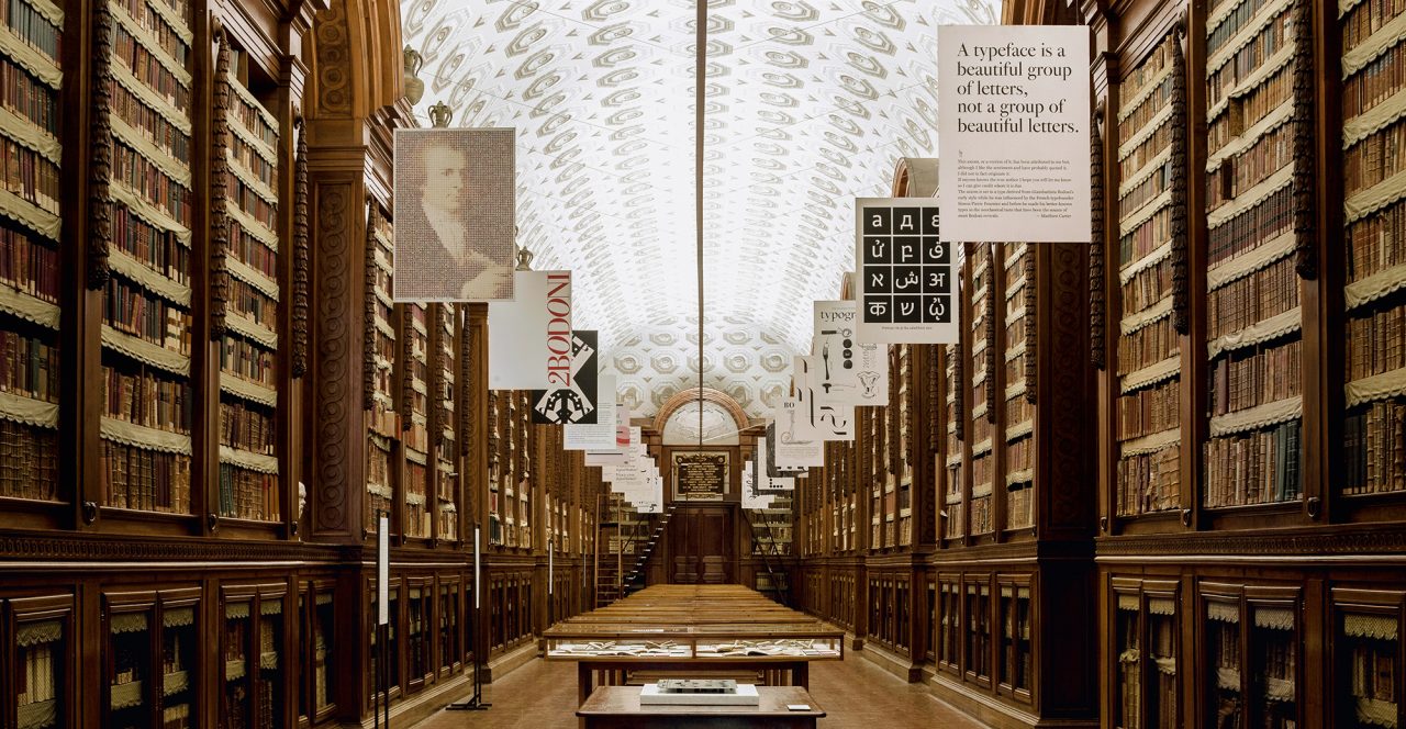
In 2019 the Bodoni Museum of Parma invited Amato to put together an exhibition in celebration of the 200th anniversary of the publication of Giambattista Bodoni’s Manual of Typography. ‘Segni Esemplari’ (‘Exemplary Characters’) was the designer’s first exhibition as curator. Not simply a nostalgic look at the great achievements of the past, it was a meditation on contemporary typography, encompassing both history and design, featuring posters produced by more than twenty type and graphic designers from all over the world including Lucille Tenazas, Majid Abbasi and Sascha Lobe. Amato asked them to transform a design principle into poster form, in their native language, in order to underline the link between Bodoni and foreign languages – emphasising anew just how much history and culture can be found in every character.