• It
Sign in Get Pulp Pulp 27
Pulp
Sign in Get Pulp Pulp 27
Pulp
  • Inspiration83
  • Stories81
  • News166
  • Pulp Archive
  • Materials Index
  • About Pulp
  • Tell Us
  • Sign in
  • Get Pulp
  • Pulp 27
  • It
Browse Themes
Corporate communicationDigital printingGraphic designIllustrationInterviewsLabelLarge formatPackagingPeople & PaperPhotographyPrintingPublishingSustainabilityInspirationStoriesNews
Pulp

Log-In

Please enter your credentials to access all Pulp contents.

Forgot your password?

New to Pulp? Register for free

New to Pulp?

Register for free to have full access to our content.

Register

2 min minutes
News

Set sail for the world

Lettera7’s packaging for Armatore’s new seafood products reflects its sustainable approach to fishing
LabelPackagingPrinting

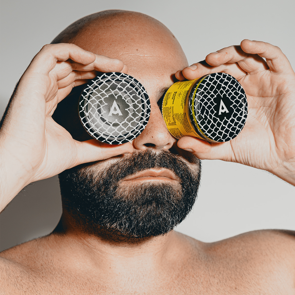
Armatore specialises in bluefin tuna and anchovies, both delicacies of the waters that surround the town of Cetara on Italy’s famous Amalfi Coast. The seafood brand’s latest range of products 4Rotte have been designed by Lettera7, based in nearby Vietri Sul Mare. Armatore translates as ‘shipowner’ and the visual language of its new 4Rotte range references sea-faring and exploration, the intention being to bring the profile of Armatore to an international audience.

‘This year Armatore turns four years old and, with the founder of the company, we thought about how to evolve the brand and broaden horizons on the international market,’ says Lettera7’s Dario Volpe.

‘After having consulted the map (metaphorically), and following in the footsteps of the great Italian navigators and explorers of the past, we have identified one great direction: the whole world. From north to south and from east to west, the goal is to raise awareness of products caught and processed with skill and respect.’

Graphic nets adorn the packaging, while the 4Rotte logotype references fishing hooks and signage, Volpi explains. Sustainability also played a key role in the direction of the packaging and reflects the ethos of the company.

‘Sustainability is a source of values and respect in general,’ says Volpi, ‘which is reflected in the approach to longevity of many factors involved: fishing only what is needed, involving and respecting workers, fishermen, placing the product on the market only when it is ready, etc. All these aspects have prompted us to create a packaging that respects the work of the company, with the hope of involving and sharing these values and eating habits with the consumer.’

Paper: Tintoretto Gesso

armatorecetara.it/4-rotte

lettera7.design

Featured Materials

Tintoretto

The uncoated natural papers in the Tintoretto range are made from pure ecological ECF cellulose, FSC™ certified, and felt-marked. Also available in self-adhesive version.

Related articles

News 03/10/2024

Family spirits

Spanish agency Morillas focuses on the familial narratives of Guatemalan rum distiller Botran for their latest labels
Graphic designLabelPrinting
Inspiration 31/05/2022

Circles of delight

A Parma-based firm has taken packaging to new dimensions. By Barbara Bosi
Graphic designPackagingPrinting
News 20/04/2023

Message in a bottle

Many Islands’s packaging for a new range of extra virgin olive oils references the founder’s name and the natural world
Graphic designPackagingPrinting
Inspiration 21/06/2022

Proud to share

Australian design studio Voice understands the language and currency of good wine. By Kay Maxfield
Graphic designInterviewsLabel
Pulp © 2025
Fedrigoni
Fedrigoni
COOKIE POLICY PRIVACY POLICY ACCESSIBILITY STATEMENT
Pulp © 2025