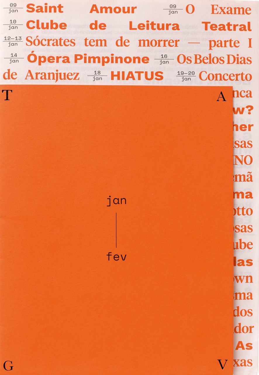
Portuguese studio Bürocratik has designed two sets of four brochures for Teatro Académico de Gil Vicente (TAGV) in Coimbra, among many other printed materials for the cultural institute. The brochures sit beautifully together with striking three-quarter-sized single colour covers that use bright and jewel-toned papers from the Sirio Color and Woodstock ranges. However the most outstanding feature of Bürocratik’s brochure design is the way it exploits show-through, establishing relationships between the type on the front and back of each thin sheet of paper.
‘Print is not dead,’ says Adriano Esteves, the studio’s creative director of branding and interaction. ‘Make it beautiful and impactful whenever possible, and people will notice and talk about it.’
Bürocratik, based in Coimbra and Porto, designed the website and brochures for TAGV, starting with the 2016-17 season, as well as the large-scale promotional materials that extend the primarily typographic identity outdoors. The studio is now working on a ‘new system’ for 2018-19. In addition, they designed printed matter for two individual events – new drama festival END and Abril Dança, a contemporary dance event – that accompany the March-April brochures. Their design for the theatre relies on the strength of the typography and the contrast between serif and sans serif typefaces – New Zealand-based Klim Type Foundry’s Tiempos paired with Google’s Work Sans (designed by Wei Huang) and Space Mono (designed by Colophon Foundry).
The theatre, financed by the University of Coimbra, set budgetary constraints from the outset. The team – including designers Sérgio Ferreira, Bruno Rodrigues and Bárbara Nogueira from Bürocratik and Catarina Pinto from TAGV – kept the theatre’s original logo, designed in the 1990s by António Barros, but updated it by hot foiling it on the brochure covers and making it responsive for the website.
Esteves says: ‘From an early stage, we decided that the budget limitations would be the starting point to achieve a vibrant and memorable piece. We chose a thin paper (Arcoprint 1 EW 70 g/m2) that allowed us to have a transparent effect, which added surprise layering overprints of type and images that give the brochures an unexpected new dimension … and [we chose] two-colour offset printing, with different colours for each edition. The hot foiling for the logo was the main stretch in terms of the budget but the printer, Lusoimpress [Porto] also believed in our project and kept it affordable,’ he adds. ‘The grid of the brochures, apparently loose, obeys a rigid grid system with detailed elements to break editorial monotony.’
The two-colour printing means that there are seemingly chaotic overlays of information in places, but these ‘breaks’ are grounded by a sober, straightforward structure. The system also makes allowances for the use of small, lower-quality imagery to promote a wide range of theatre, dance, music and cinema programmes. These are printed objects that inform and delight. But why make printed brochures when so many bookings are made online?


The studio has no doubt about the value of such printed brochures in this small city, which has a population of 144,000, of which 30,000 are students, and they have seen positive results from their approach.
‘They call for attention in a way that is much less intrusive than digital,’ says Esteves. ‘We think the brochures are a “peaceful keepsake”, which eventually remind the audience to buy tickets, whether online or offline.’ The edition of 5000 is popular among theatre-goers. TAGV reports that the brochures are often out of stock – there are frequent requests for more. Esteves says: ‘The new graphic identity, and in particular the brochures, contributed to increased visibility and acclaim.’