• It
Sign in Get Pulp Pulp 24
Pulp
Sign in Get Pulp Pulp 24
Pulp
  • Inspiration41
  • Stories47
  • News69
  • Pulp Archive
  • Materials Index
  • About Pulp
  • Tell Us
  • Sign in
  • Get Pulp
  • Pulp 24
  • It
Browse Themes
Corporate communicationDigital printingGraphic designIllustrationInterviewsLabelLarge formatPackagingPeople & PaperPhotographyPrintingPublishingSustainabilityInspirationStoriesNews
Pulp

Log-In

Please enter your credentials to access all Pulp contents.

Forgot your password?

New to Pulp? Register for free

New to Pulp?

Register for free to have full access to our content.

Register

Andy Stevens (left), designer Alex Ecob and Paul Neale of GTF in their London studio. Photographs by Angela Moore.

8 min minutes
Pulp 19Stories

Paper Box

London studio Graphic Thought Facility devised and designed the minimalist-maximalist Paper Box for Fedrigoni. By John L. Walters
Graphic designInterviewsPackaging

Andy Stevens (left), designer Alex Ecob and Paul Neale of GTF in their London studio. Photographs by Angela Moore.

‘We had to make it to know it would work. You can only design for paper on screen for so long.’
Typefaces for the Box Forma (Nebiolo). The version used for Paper Box was adapted for the job by type designer Dave Farey. Forma (1968) was originally devised by a ‘dream team’ of designers assembled by the Italian foundry Nebiolo under the direction of Aldo Novarese. The company wanted a typeface that could compete with ‘universal’ sans serif typefaces such as the popular Helvetica.

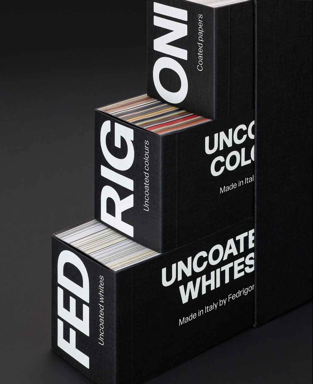
There is an aphorism attributed to Albert Einstein that ‘everything should be made as simple as possible – but no simpler!’ It’s a sentiment that applies to Fedrigoni’s new Paper Box, a box of three books of paper samples. Designed by the London practice Graphic Thought Facility (GTF), Paper Box is a Fedrigoni paper sample book with no precedent – a restrained yet quietly spectacular feat of design, print and production.

From one point of view, it is a simple tool that every designer, printer and specifier will want to have on their shelves. From another angle, it is an exquisite design object, a satisfyingly heavy black obelisk that could become a minimalist design icon for stylish photo shoots. And yet it is also maximalist and ‘completist’. The three sample books that slot into the matt black outer case (or box) demonstrate every uncoated white paper, every uncoated colour paper and every coated paper (coloured or white) in the vast range of papers manufactured by Fedrigoni in Italy. Paper Box is as simple as possible, but no simpler!

To those who have observed GTF’s work since the early 1990s, the studio seems perfect for the job. Led by principals Paul Neale, Andy Stevens and Huw Morgan, GTF’s designers have always had a keen no-nonsense relish for materials, working in sectors such as fine art, museums, retail, wayfinding and fine art publishing. (See pp.30-35.)

However this is GTF’s first commission for a paper company, and the studio has addressed the task with its customary diligence and zeal. Paper Box is the first of several new products they are designing for Fedrigoni, including swatchbooks, posters and an image library.

The commission to make Paper Box stemmed from Fedrigoni’s need to make a single item that could sit within reach of every person likely to make decisions about paper, wherever they were in the world. Previous sample books have dealt with separate paper ranges, often speaking to customers in different graphic languages, or featuring content directed at particular sectors or cultures. GTF’s approach eschews any creative ‘nudges’ or influence in favour of utility and practicality. The task of showing how different ranges and weights of paper perform when printed with text and images has been left to a big set of posters and the image library, of which more later.

Book in a box

From the beginning, GTF sought to make Paper Box like a book – something you would treasure and keep – rather than an item of marketing ephemera. The designers requested a sheet of every single paper so that they could start working with the materials. ‘The first mock-up was made from an old book that had been sitting on our bookshelves,’ says Paul Neale. ‘We took it to a local printer and got someone to guillotine it into three parts. We then did some glueing and binding tests.’ Neale explains that the most useful design tool for making Paper Box was the spreadsheet program Excel, which he and designer Alex Ecob used to organise every Fedrigoni paper into three books with 62.5mm wide spines that will fit snugly in the box. ‘There’s quite a bit of maths involved,’ says Neale. ‘Alex was king of the spreadsheet in this.’ While half their time was spent working out the selection of papers this way, the other half was taken up making models of the sample books. ‘We had to make it to know it would work,’ says Neale. ‘You can only design for paper on screen for so long.’

As simple as possible … The three sample books that slot into the matt black outer case demonstrate every uncoated colour paper, every uncoated white paper (opposite) and every coated paper (above) in Fedrigoni’s extensive range.

Restrained and robust

The GTF team was conscious that a sample book exists to sell raw materials, and that the design had to be restrained and simple. They chose the typeface Forma (a 1968 sans serif designed by a team of prominent designers for the Italian foundry Nebiolo) for its ‘strong shapes and weighty forms’. The box (case) for Paper Box is made from black-core board, lined externally with Imitlin Fiandra Nero 125 g/m².

Neale and Stevens have been enthusiastic users of Imitlin for a long time. ‘It’s a trusted “go-to” cover-lining material,’ says Neale. ‘Not only is it robust, it also feels robust.’ The designers appreciate the fact that this stock has been in Fedrigoni’s collection for at least five decades.

To help promote Paper Box, GTF, in collaboration with Studio AKA’s Kristian Andrews, has made a short animation that demonstrates the book’s beauty and utility. The 25-second video clip is underscored by a percussive soundtrack that composer Dave Pape created from the sound of paper pages being flipped – a stroke of digital marketing genius for such a tactile, analogue product.

Two examples from the dreamlike image library made by GTF – using photography, illustration, linework, texture and pattern – to demonstrate the way pictures change when printed on different paper stocks.

Dreamscape of images

To complement Paper Box, which puts the emphasis on the materiality of Fedrigoni’s entire paper range, GTF was also tasked with creating an image library. This exists to demonstrate the ways in which different images, textures and designs can be printed on different papers. ‘If I have a white uncoated paper, what do I need to demonstrate?’ asks Neale rhetorically. By showing a consistent family of images, the image library shows paper specifiers how the images reproduce on myriad papers, using different processes such as regular litho, UV and Indigo digital printing.

Neale explains: ‘We use the idea of the ladder and mash it up with printers’ colour control strips to make a family of ladders we can use for photography, and extend into illustration and other graphic representations.’ GTF eschewed computer-aided design in favour of creating a full-size ladder with coloured stripes that could function as a control card while calibrating reproduction, and placed it within a three-dimensional set with walls and a window. They also made a maquette of the set, which made it possible to create many variants: landscapes viewed through the window, geometrical objects, hands, playing cards, a cat and 3D paint blobs flying through the space, along with many variations on ladders of different colours and sizes.

The result is an engaging series of images based around the shape and outline of a ladder. The ladder symbol is seen on every Fedrigoni product, embedded in the company’s crest, and it is a symbol of Verona that dates back to the thirteenth century. These images evoke both Surrealism and Italian style, a dreamlike fusion of Giorgio de Chirico and the Memphis Group with a nod to the Renaissance. The test images can be used to demonstrate the way images change when printed on coloured or uncoated papers and the effects of overprinting, using photography, illustration, linework, texture and pattern. The GTF team had no wish to impose its tastes on paper customers – who may come from many different cultures and stylistic traditions. A range of silkscreen Sirio posters gives clients a chance to see a mix of image, ink and coloured papers in different combinations, while the new Sirio swatchbook puts the images through their litho-printed paces.

The Fedrigoni brief has confirmed GTF’s enthusiasm for the papers their Paper Box design promotes. What excites GTF about working with the company is the vertical nature of its business: both manufacturing paper and selling it. Neale says: ‘We’ve had issues with paper merchants who have suddenly changed mills, or they’ve changed the paper recipe and don’t tell you. Fedrigoni has been making paper themselves, in their mills, for years. That continuity is why we, as users, go to them all the time.’

Featured Materials

Century Cotton Laid

Soft and refined wood-free laid and watermarked paper with 75% woodfree ECF pulp and 25% cotton content, FSC® certified. Versions available with watermark.

Splendorlux

One-side Cast Coated boards high gloss and whiteness. FSC® certified and made with ECF pulp. Light matt coating on reverse side.

Woodstock

Recycled uncoated papers and boards with 80% pre-consumer recycled waste and 20% FSC certified virgin fibre, pulp coloured.

Imitlin

Embossed papers made of woodfree, high-strength FSC® certified pulp; solid light-fast colours and surface-coated with anti-fingermark treatment. High abrasion resistance, with excellent tear and folding strength.

Pulp 19 Articles

Stories 02/03/2023

The thinking person’s studio

John L. Walters on Graphic Thought Facility
Corporate communicationPackagingPrinting
Stories 05/01/2023

Living by numbers

Calendars remind us of the passing of time. Introduction by Elizabeth Glickfeld. Case studies by Sarah Snaith
Graphic designIllustrationPrinting
Inspiration 21/06/2022

Poetry in promotion

By John L. Walters
Graphic designPrinting
Stories 21/06/2022

Paper and planet: a series about sustainability

An interview with Chiara Medioli Fedrigoni, vice-president of Fedrigoni, about the challenges posed by environmental issues when choosing and using paper. By John L. Walters
InterviewsSustainability

In Pulp 19

Pulp © 2023
Fedrigoni
Fedrigoni
COOKIE POLICY PRIVACY POLICY
Pulp © 2023