• It
Sign in Get Pulp Pulp 24
Pulp
Sign in Get Pulp Pulp 24
Pulp
  • Inspiration41
  • Stories47
  • News69
  • Pulp Archive
  • Materials Index
  • About Pulp
  • Tell Us
  • Sign in
  • Get Pulp
  • Pulp 24
  • It
Browse Themes
Corporate communicationDigital printingGraphic designIllustrationInterviewsLabelLarge formatPackagingPeople & PaperPhotographyPrintingPublishingSustainabilityInspirationStoriesNews
Pulp

Log-In

Please enter your credentials to access all Pulp contents.

Forgot your password?

New to Pulp? Register for free

New to Pulp?

Register for free to have full access to our content.

Register

Packaging design for natural skincare brand C.Lavie. It is boxed in two layers of Old Mill Premium White 300g/m2.

2 min minutes
Pulp 15Inspiration

Ode to the box

Caz Hildebrand, Creative Partner at Here Design, sets the scene for an odyssey through thirteen examples of luxury packaging
Graphic designPackaging

Packaging design for natural skincare brand C.Lavie. It is boxed in two layers of Old Mill Premium White 300g/m2.

Whether the paper and card covers chocolates, cosmetics, sweets or skincare – or essentials such as Champagne and kitchen knives – the details tell stories that everyone can understand.
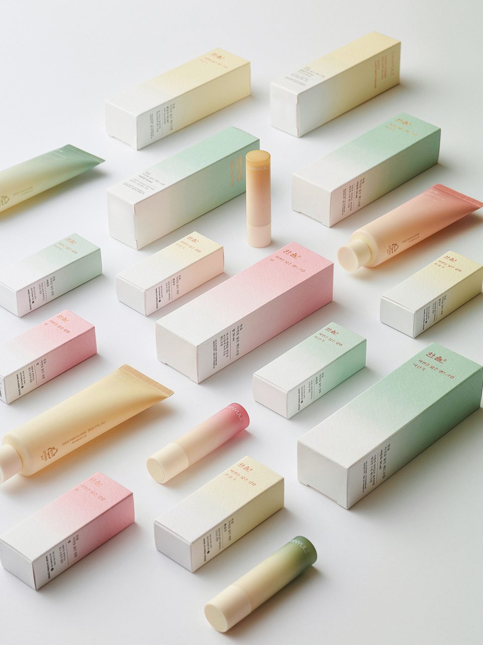
Korean tradition. The painterly packaging for Hanyul’s ‘Nature in Life’ range – printed on Tintoretto Gesso 300 g/m2 – uses a watercolour bleed that softens in intensity as it descends down the sides of the packs. Product designer Bitnuri Kim says that the ‘texture and uneven surface of the paper gives a natural and comfortable feeling … it matches well with our brand identity, which is “Traditional naturalism in Korea”. We wanted to give our customers a warm and comfortable feeling as if they were touching Korean traditional paper when they touch the package.’

No matter whether they are big or small, subtle or flamboyant, the details of packaging tell stories that everyone understands.

Great things sometimes do come in small packages, and those packages can do a lot to carry the message of whatever is contained within. They enclose and protect their contents and they pave the way for us to begin a little journey of discovery, at best, and I suppose, disappointment at worst. If the outside is beautifully crafted, we naturally expect the objects inside to be at least as well made and considered as their packaging.

As so much of our experience is disseminated through a screen now, we are deprived of the haptic or the sensory. We miss out on the sensations that help us to make a connection to things and we are cut off from some of the unconscious messages that can offer us more information about the things we are interested in.

An important part of our work as designers is telling stories, not just literally with words and images, but also with a direct appeal to our other senses. We firmly believe that unconscious messages can be powerfully communicated through sensorial experiences, things you touch, smell and hear.

When we design packaging, we are trying to create an evocation of a feeling, or a place, or a time, or an experience. To do this, we consider how colour, texture, familiarity or rarity can help us with these unspoken narratives. Paper can truly tell a story, of place, of craft, of pleasure or utility, or even make a virtue out of a compromise; paper can be many things, it can stand in for other things and represent ideas.

We can make the ordinary extraordinary, make the imaginary real, demonstrate quality, show care and craftsmanship. We can do a lot with a little. The package and the materials a designer chooses can change the fortunes of brands and their products, and the right packaging can have a profound effect on the lives of everyone who interacts with it.

See it glisten. Estudio Rosa Lázaro developed the identity and packaging for Pastisseria Callís, a patisserie and chocolatier that has its nineteenth-century origins in the Catalan city of Olot. The Christmas campaign uses Sirio Black and Sirio White with a delicate ‘gold dust’ foiling effect that glistens and spreads across the box’s surface. Photography: Xabier Mendiola.
Decadent delights. Amouage, based in Oman, is a fragrance brand led by Hong Kong-born, London-based creative director Christopher Chong. The packaging design, by UK design studio Trigger, uses four-colour process with sealer on Xper Premium White 120 g/m2 and two-colour foiling. For the men’s and women’s eau de parfum Figment, Trigger created an imaginary garden of embroidered flowers set against a deep navy background appropriate to the midnight blooming tuberose that is the ‘heart note’ of the women’s range (the heart note of the men’s range is sandalwood). The packaging extends to a bath collection.
Marbled gold. Milan-based design agency Carosello Lab re-branded the Roman cosmetics brand Caracalla and looked to Trajan’s column, the mosaic floors at the Baths of Caracalla and the swirls and veins of marble for inspiration. The packaging for the luxury organic brand is printed on Tintoretto Gesso; on some packaging in the range the floor tile motif features alongside a marble vein foiled in gold. Carosello Lab’s approach is subtle and elegant. Creative Director: Enrico Caputo. Graphic design: Andrea Mastroluca, Silvia Argenziano. Photography: Enrico Caputo.
Touched by the sea. Italian cosmetics brand Biosalis bases its range upon Mediterranean ingredients from the salt marshes of the Saline di Margherita di Savoia – ‘pure sea salt and precious mud’. Matteo Modena from designers We Meet Brands says: ‘The choice of Splendorlux Metal Argento 350 g/m2 aims to enhance the exclusivity of the Biosalis brand and its premium positioning in addition to the natural content of the product. But the sensory experience evoked by this paper is much deeper. Its smooth texture reflects an intense tactile pleasure – like the products – while the silver tone recalls the bright effects of the sun on the salt pans.’
Paper and blade. Czech Republic design studio Calico created a sophisticated custom box for the young cutler brand EMKnives using Sirio Color Nero 80 g/m2 and Materica Kraft 250 g/m2. The knife is secured with an ingenious use of perforated Sirio Color Nero 80 g/m2 within a die-cut box made with Materica Kraft 250 g/m2. The box features a magnetic closure and is further secured by a printed sleeve that combines the certification card and instructions, all of which fit snugly into the tube. Calico’s Ondřej Zatloukal says: ‘The aim was to create simple packaging in colour and shape that will protect this special and expensive tool.’

Featured Materials

Tintoretto

The uncoated natural papers in the Tintoretto range are made from pure ecological ECF cellulose, FSC™ certified, and felt-marked.

Sirio Color

An extensive range of pulp-dyed uncoated papers and boards with light-fast colours, available in weights ranging from 80 to 700 gsm. Pure ECF and FSC® certified.

Old Mill

Old Mill is a range of uncoated papers and boards made with FSC certified, environment-friendly ECF (Elemental Chlorine Free) pulp, felt-marked on both sides.

Splendorlux Metal

High gloss one-side cast-coated pulp coloured boards. Light matt coating on reverse side. The cast-coated side is surface dyed with metallic pigments and a protective water-based gloss varnish. FSC® certified made with ECF pulp.

Materica

Pulp-coloured papers and boards made with 40% CTMP fibres, 25% pure environmentally friendly fibres, 20% recycled material and 15% cotton fibres.

Pulp 15 Articles

Stories 17/06/2022

People and paper: Juan Mantilla

Juan Mantilla’s packaging design for Kiko Milano is bold and experimental; like a fashion brand, it changes seasonally. Profile by Sarah Snaith. Photographs by Lee Funnell
Graphic designInterviewsPackaging

In Pulp 15

Pulp © 2023
Fedrigoni
Fedrigoni
COOKIE POLICY PRIVACY POLICY
Pulp © 2023