Designer Paul Shaw and Alta Price run ‘Legacy of Letters’, an annual summer school in which a group of enthusiasts investigate lettering – inscriptions, manuscripts, books, etc. – while on a tour of northern Italy. This year, the centrepiece of the twelve-day tour was a letterpress printing workshop at the Tipoteca Italiana Fondazione in Cornuda. Paul Shaw reports.
The 2015 workshop was led by English designer Alan Kitching of The Typography Workshop, an innovator in contemporary letterpress printing for more than a quarter of a century. During the months of preparation, Kitching kept the brief for the workshop secret. He finally revealed it after lunch on the day we arrived in Cornuda.
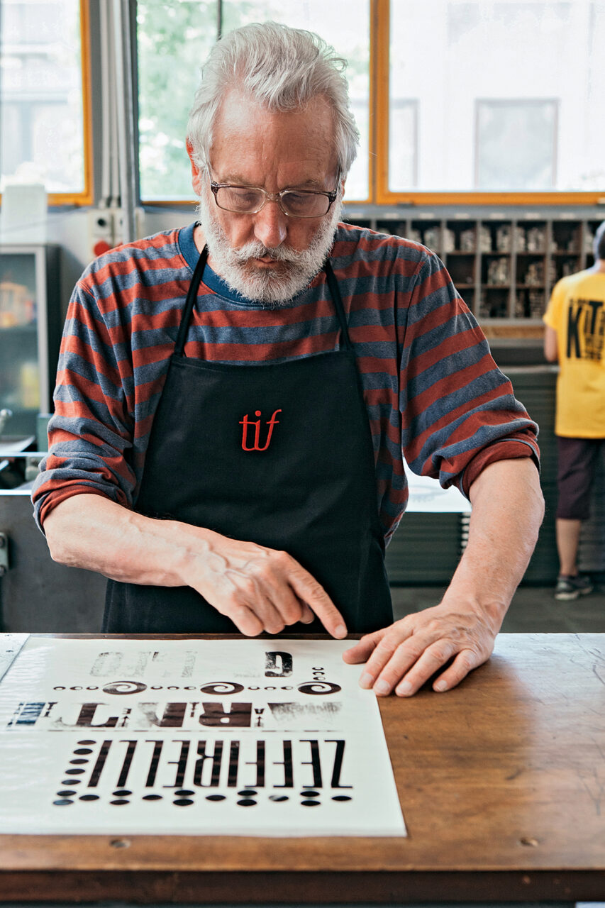
What he had in mind was fiendishly complicated. Each participant had to create a typographic ‘collage’ – the equivalent of layers of weathered posters on a hoarding – using six borders, six typefaces and six colours. Furthermore, within the group, a typeface could only be used once. Kitching’s idea was that the portfolio of prints would do double duty as a type specimen for the Tipoteca. The ‘text’ was a list of famous Italians. Each of the eleven participants (who came from as far afield as the US, Australia and Russia as well as Italy) was given a section of the list from which they had to choose six names.
Kitching blocked out the schedule: day one would be devoted to composition and design; days two and three to printing; and day four to collation and assembly. Knowing that it was a tight schedule, he announced that lunch would only be 25 minutes. But this was untenable. Not only were we printing in Italy, but the Tipoteca had recently opened its own restaurant, Le Corderie, across the street. Food – good food – was an essential part of the workshop and Kitching had to bend. In the end, the participants managed to get the portfolio of prints completed on time, despite spending an hour each day eating a delicious lunch.
The success of the project was due not only to Kitching’s ability to art direct, counsel and oversee everyone, but to the presence on the tour of five printers and four others with printing experience – and the invaluable assistance of the Tipoteca’s technicians, Lucio Botteselle and Daniele Facchin. For the first time ever at the Tipoteca, five presses – three proofing presses and two Dell’Orto hand presses – were simultaneously in operation. Ray Tomasso and John Risseeuw got the hand presses up and running. While the eleven participants printed their typographic collages, the apparatus of the portfolio was being prepared.
Kitching designed the title page, which was printed by Laura Dal Maso and Botteselle. Another team (Celene Aubry, Tahlia McBride, and Andrea Herstowski – a designer from the University of Kansas who was visiting the Tipoteca) set the colophon which was proofed ‘in the metal’ by Sandro Berra of the Tipoteca and on paper by my colleague Alta Price. I set the cover title which Aubry and Alice Buda printed. Pam Galvani did the folding of the portfolio covers. Collation was handled by Price, Naomi Games (daughter of British poster designer Abram Games), Linda Risseeuw and Diane Tomasso.