• It
Sign in Get Pulp Pulp 27
Pulp
Sign in Get Pulp Pulp 27
Pulp
  • Inspiration83
  • Stories81
  • News166
  • Pulp Archive
  • Materials Index
  • About Pulp
  • Tell Us
  • Sign in
  • Get Pulp
  • Pulp 27
  • It
Browse Themes
Corporate communicationDigital printingGraphic designIllustrationInterviewsLabelLarge formatPackagingPeople & PaperPhotographyPrintingPublishingSustainabilityInspirationStoriesNews
Pulp

Log-In

Please enter your credentials to access all Pulp contents.

Forgot your password?

New to Pulp? Register for free

New to Pulp?

Register for free to have full access to our content.

Register

3 min minutes
News

Message in a bottle

Many Islands’s packaging for a new range of extra virgin olive oils references the founder’s name and the natural world
Graphic designPackagingPrinting

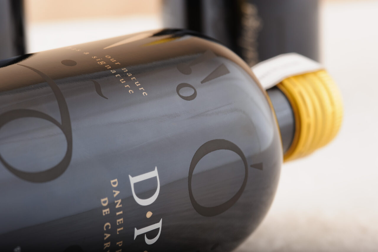
Ana Freitas’s Many Islands studio has designed the packaging for D.P.C., a new range of extra virgin olive oil products from Portuguese lawyer, former minister and musician, Daniel Proença de Carvalho.

Freitas, whose Lisbon-based studio is profiled in the forthcoming issue of Pulp, oversaw the creative direction of the project and designed the packaging with três agá studio.

Proença de Carvalho’s family-owned grove features Galega, Cobrançosa, Frantoio and Cordovil olive varieties – the names of each inform the visuals used on the different bottles: Galega, ‘the false nomad’; Cobrançosa, ‘the susceptible’; Frantoio, ‘the Italian mermaid’; and Cordovil, ‘the candid’, Freitas explains.

‘We used the narrative for each variety to create a visual for each bottle, using only typographic elements in a contemporary and minimalist manner,’ she says. ‘The visual system we developed mimics elements of nature – olives, leaves, birds.’

The identity word mark features Proença de Carvalho’s initials, D.P.C., set in Portrait (Commercial Type) and uses a colour palette inspired by the landscape of the Alentejo region in southern Portugal.

‘We screen-printed a typographic landscape for the Special Blend Edition, mixing the olive varieties’ names and abstract representations of olives and other elements,’ she adds. ‘The outer case of the bottle, which is wrapped in tissue paper with the image of an olive tree from D.P.C.’s grove, replicates the design with an embossed finish.’

Freitas chose Freelife Merida White paper because its environmental credentials align with D.P.C.’s values, she says. ‘The felt marking also gives it a natural but premium look.’

Paper: Freelife Merida White

many-islands.com

Many Islands Instagram

Featured Materials

Freelife Merida

The range Freelife Merida includes felt-marked papers in different pulp-dyed colors, made with 55% pure environmentally friendly certified FSC™ fibres, 40% recycled fibres, and 5% cotton fibres. Also available in self-adhesive version.

Related articles

Stories 15/05/2025

The book of the look

A London studio finds that digital inks are ideal for photography-heavy publications. By Alex J. Todd
Graphic designPrintingPublishing
Stories 18/05/2023

The green printer

Gareth Ward looks at what it takes to be a genuinely sustainable printer
People & PaperPrintingSustainability
News 02/02/2023

Magazine in the mountains

Forestis hotel produces a printed journal to tell its guests the story of this unique destination
Graphic designPrintingPublishing
Stories 17/06/2022

People and paper: Juan Mantilla

Juan Mantilla’s packaging design for Kiko Milano is bold and experimental; like a fashion brand, it changes seasonally. Profile by Sarah Snaith. Photographs by Lee Funnell
Graphic designInterviewsPackaging
Pulp © 2025
Fedrigoni
Fedrigoni
COOKIE POLICY PRIVACY POLICY ACCESSIBILITY STATEMENT
Pulp © 2025