• It
Sign in Get Pulp Pulp 28
Pulp
Sign in Get Pulp Pulp 28
Pulp
  • Inspiration90
  • Stories88
  • News174
  • Pulp Archive
  • Materials Index
  • About Pulp
  • Tell Us
  • Sign in
  • Get Pulp
  • Pulp 28
  • It
Browse Themes
Corporate communicationDigital printingGraphic designIllustrationInterviewsLabelLarge formatPackagingPeople & PaperPhotographyPrintingPublishingSustainabilityInspirationStoriesNews
Pulp

Log-In

Please enter your credentials to access all Pulp contents.

Forgot your password?

New to Pulp? Register for free

New to Pulp?

Register for free to have full access to our content.

Register

3 min minutes
News

Life in the cabaret

Cabaret Typographie reveals its devotion to craft through hands-on letterpress
Graphic designPeople & PaperPrinting
‘The final result needs to have aesthetic quality, but it should also be a tangible object.’

Cabaret Typographie is a graphic collective founded in 2010 by graphic designers Laura Dal Maso, Mauro De Toffol and Tommaso Pucci. The group’s name was inspired by the birthplace of the Dada art movement in Zurich, called Cabaret Voltaire, where provocative performances took place. The addition of ‘Typographie’ to their name reflects the passion for their craft.

The trio met while attending a master’s programme in Visual Communication at IUAV (Università Iuav di Venezia). ‘We became passionate about traditional printing,’ they say. ‘We needed to engage physically with the tools of the trade.’

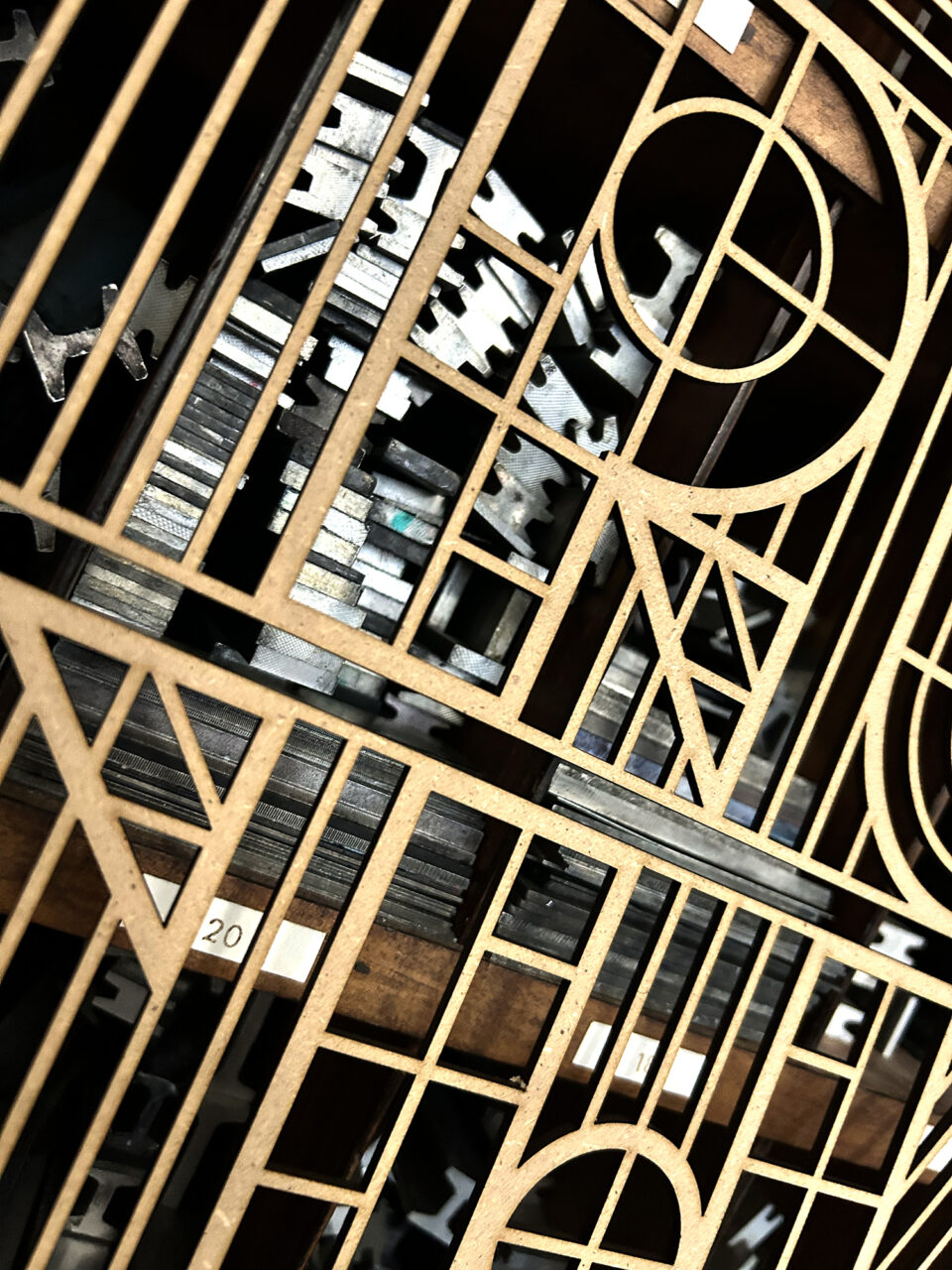
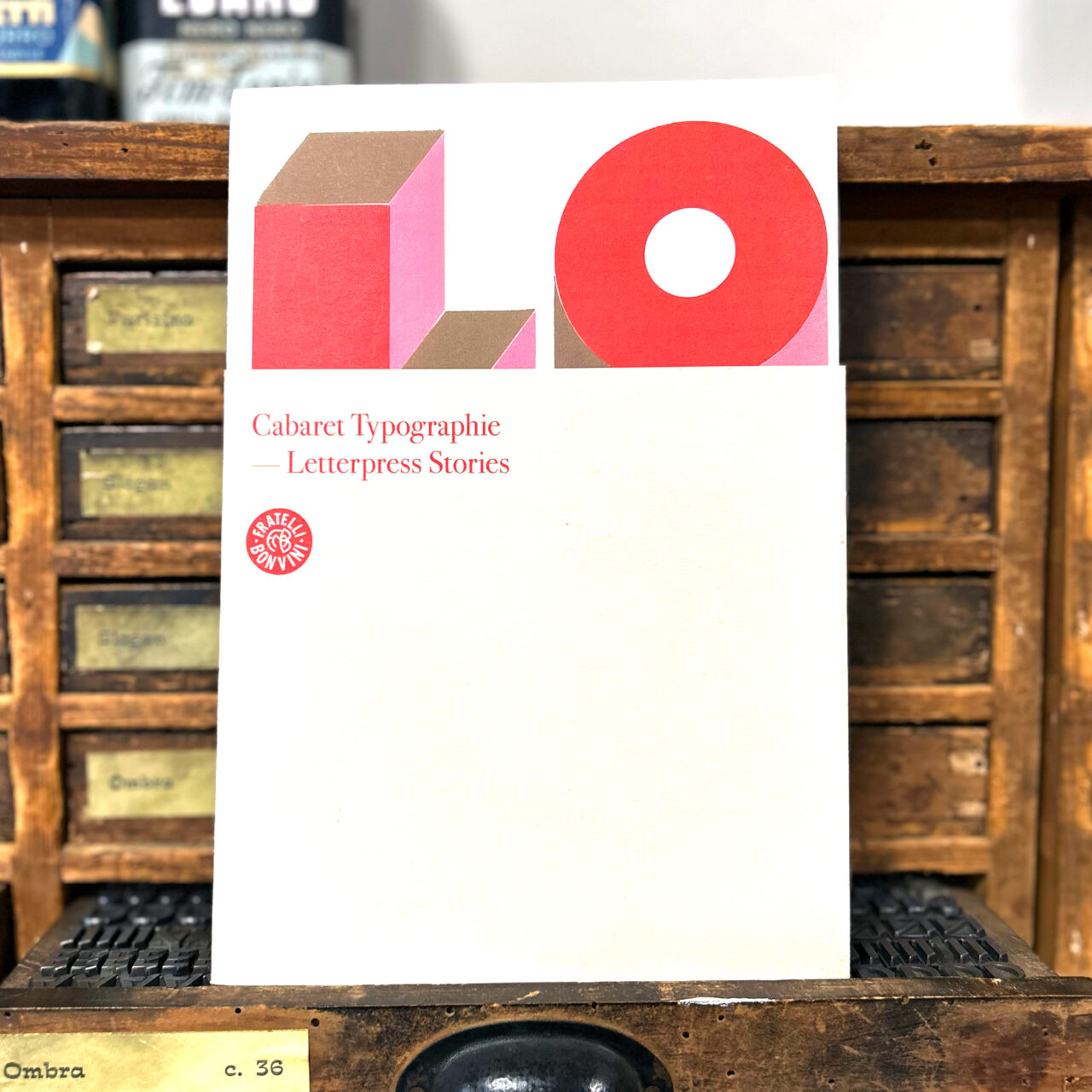
Cabaret Typographie is based at the historic Milanese Atelier Bonvini 1909 – a perfect home for their presses, inks and type cases. ‘Letterpress Stories’, a 2021 exhibition covered their first ten years of work, telling the stories, inspiration and methods behind each poster. The accompanying catalogue was designed by Milanese XxY Studio.

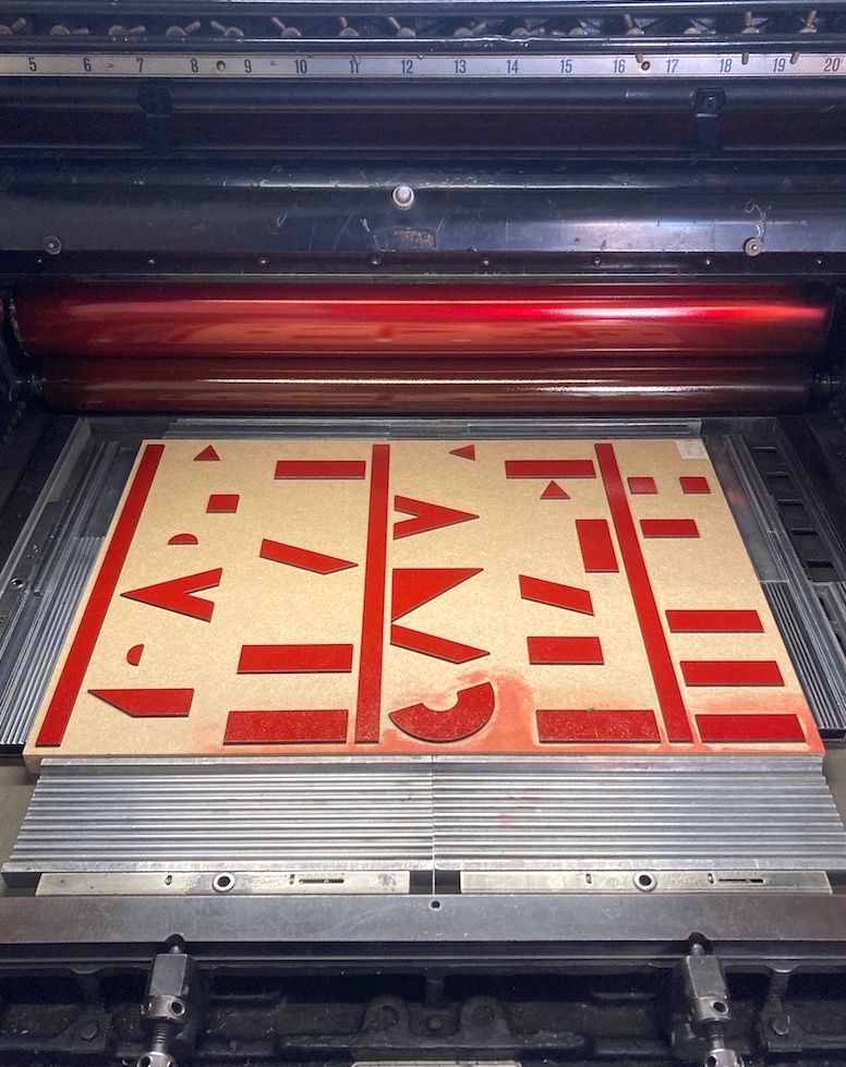
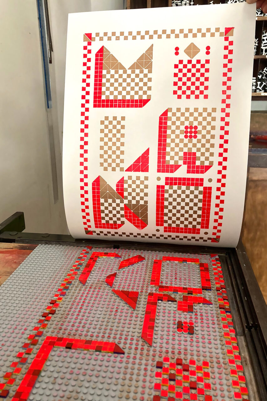
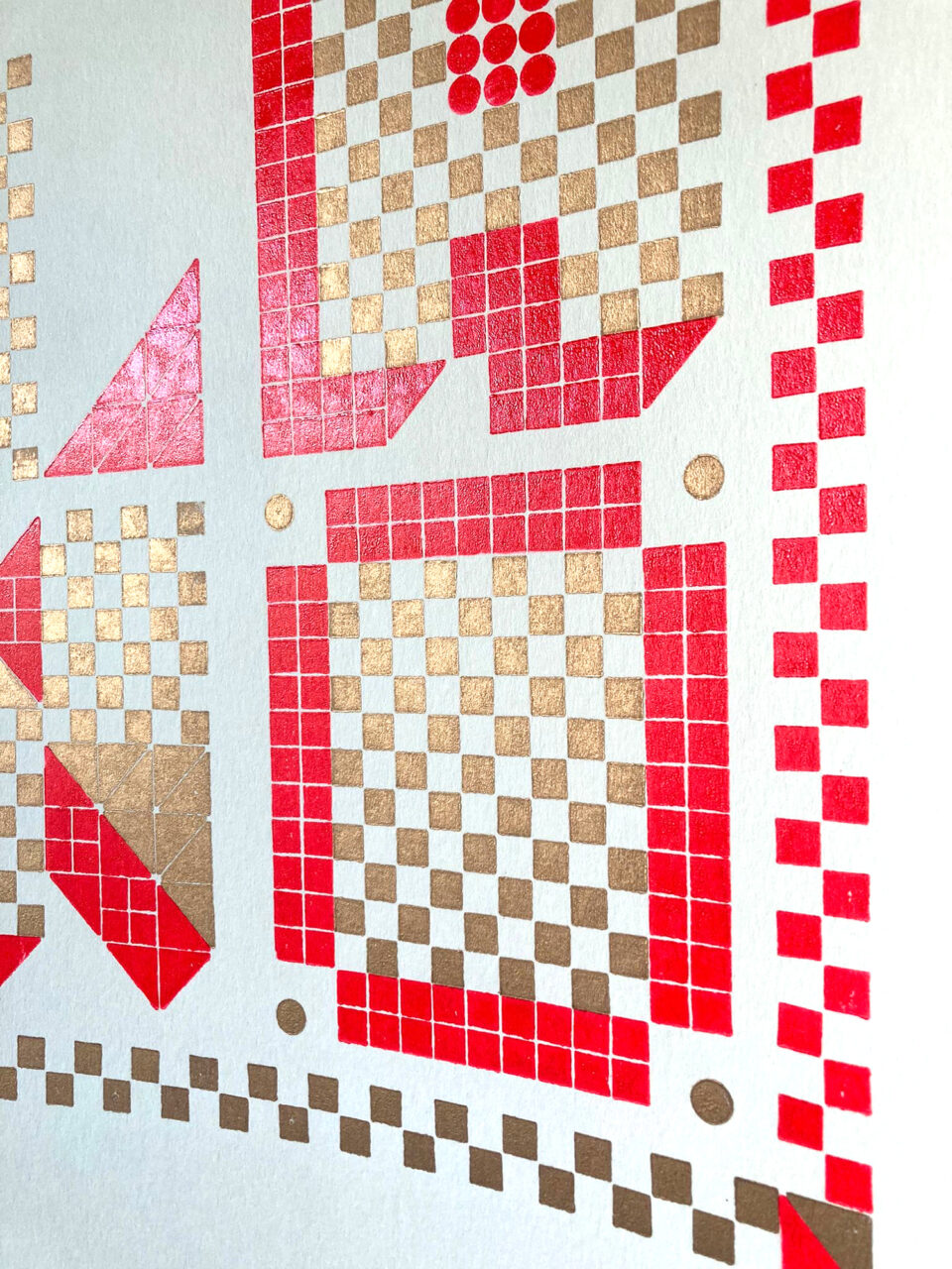
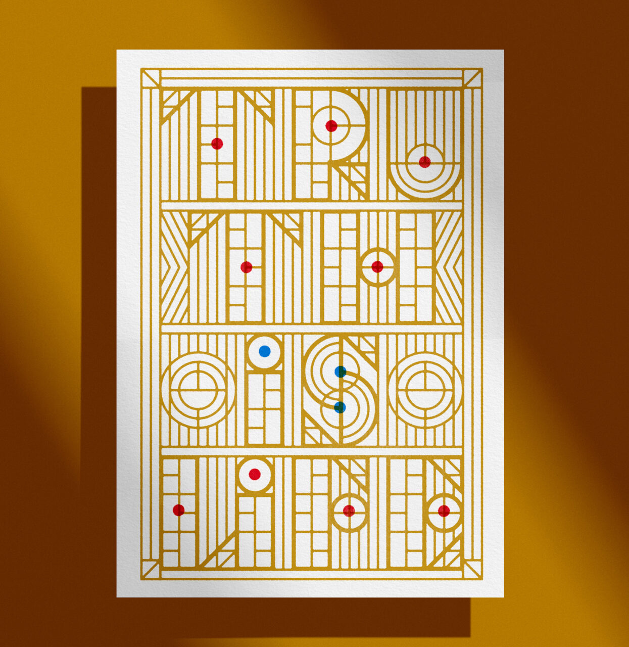
The processes used by the collective to create their work have evolved over time. At the beginning they worked mainly with wooden type, while incorporating elements of engraving or linocut. Currently, they work almost exclusively using laser-cut shapes, an approach that allows them to design posters digitally before printing on their presses.

With many of their posters printed on Materica Gesso, Masso, Toffol and Pucci say, ‘Understanding and managing every stage of the printing process led us to focus on details, including paper selection. The final result needs to have aesthetic quality, but it should also be a tangible object. Paper is a fundamental part of that.’

‘Presi il Bitter Campari fra le nuvole’ is part of a series of posters Cabaret Typographie designed and printed as a tribute to Italian painter and designer Fortunato Depero’s typographic work.
Plate for the poster ‘Presi il Bitter Campari fra le nuvole’ on press.
‘Kiss’ is a poster inspired by 1960s graphic design. For the design phase, Cabaret Typographie took inspiration from Op Art, linking the letters and composing them with stripes.
Photo showing the process of the ‘Milano Lego’ poster on press.
‘Milano Lego’ poster.
The ‘Truth is Life’ poster was inspired by the work of American architect Frank Lloyd Wright and the phrase engraved on the fireplace of his 1899 Oak Park home.
Laser-cut plate from the ‘Truth is Life’ poster.
Letterpress Stories catalogue.

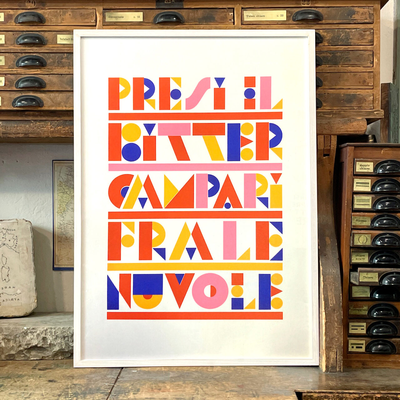
Paper: Materica Gesso 250g/m2

cabarettypographie.com

Cabaret Typographie Instagram

bonvini1909.com

eyemagazine.com/blog/post/letterpress-celebration

Featured Materials

Materica

Pulp-coloured papers and boards made with 40% CTMP fibres, 25% pure environmentally friendly fibres, 20% recycled material and 15% cotton fibres. Also available in self-adhesive version.

Related articles

Inspiration 26/12/2024

Florentine waves

D’Apostrophe is a Florence-based design and visual communication studio founded in 2009
Graphic designPrintingPublishing
Stories 14/06/2022

People and paper: Élodie Boyer

Profile of Éditions Non Standard’s Élodie Boyer, publisher and brand consultant. By Anne Miltenburg
Graphic designInterviewsPrintingPublishing
News 02/02/2023

Magazine in the mountains

Forestis hotel produces a printed journal to tell its guests the story of this unique destination
Graphic designPrintingPublishing
News 20/04/2023

Message in a bottle

Many Islands’s packaging for a new range of extra virgin olive oils references the founder’s name and the natural world
Graphic designPackagingPrinting
Pulp © 2025
Fedrigoni
Fedrigoni
COOKIE POLICY PRIVACY POLICY ACCESSIBILITY STATEMENT
Pulp © 2025