The property brochure, designed to encourage buyers to invest in a new apartment before it has even been completed, has become a distinctive brief for graphic designers. As with the annual report or the share prospectus, there is a format to follow and technical information to be conveyed – and there are plenty of glossy precedents, not all of which are successful.
But the most important requirement for a property brochure is to convey a sense of what somewhere that does not yet exist will be like when it is finished. The brochure is part of the courtship ritual of high-value salesmanship, to be placed in the hands of potential purchasers. Of course, the information could be presented on an iPad or online, but a physical, tactile object acts as an affirmation; it is a statement about design and placemaking, much as the building itself is. The physical object is designed to uplift and inspire, to make anyone who holds a copy feel they have joined an exclusive club.
An apartment in One Park Drive is an investment, but it is also a home. There is money involved, but there are also dreams of domesticity. For this new residential tower in London’s Canary Wharf, designed by starry Swiss architects Herzog & de Meuron, the design practice Construct was commissioned to realise this dream in print, not just to reflect architectural brilliance, and what was on offer in terms of space and amenities, but to produce something of a quality that would signify the value of the project.
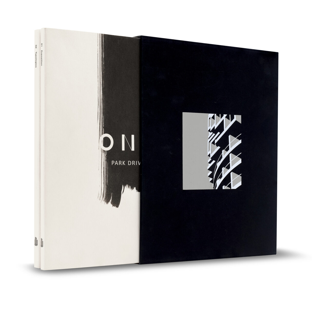
As a result, One Park Drive, a considered, two-volume architectural monograph worthy of display in any specialist bookshop, is not so much a brochure, more a vision statement. The matt black slip case features Henrique Folster’s graphic representation of a detail of the tower’s façade in black, white and grey. The graphic brush stroke on the textured, translucent dust jackets reflects the craftsmanship of the design; the exquisite calligraphic marks indicate that each page will have been as thought-through as the apartments in the building.
Overlaid on top of this mark is the embossed logo for the property itself – the E of ‘ONE’ reduced to three horizontal bars. Already, one’s perception is of an Art Book fit for a high-networth coffee table. The content, according to the ritual of salemanship, conveys the specifics: to introduce potential new residents to Canary Wharf. This area is best known as London’s new financial district, now adding homes to the mix, and this is Herzog & de Meuron’s first residential building in Britain.