• It
Sign in Get Pulp Pulp 27
Pulp
Sign in Get Pulp Pulp 27
Pulp
  • Inspiration87
  • Stories84
  • News170
  • Pulp Archive
  • Materials Index
  • About Pulp
  • Tell Us
  • Sign in
  • Get Pulp
  • Pulp 27
  • It
Browse Themes
Corporate communicationDigital printingGraphic designIllustrationInterviewsLabelLarge formatPackagingPeople & PaperPhotographyPrintingPublishingSustainabilityInspirationStoriesNews
Pulp

Log-In

Please enter your credentials to access all Pulp contents.

Forgot your password?

New to Pulp? Register for free

New to Pulp?

Register for free to have full access to our content.

Register

2 min minutes
News

Hidden depths

The labels of ecological winery Šuran Petar highlight the importance of micro-organisms in its products
Graphic designLabelPackaging

In an interesting twist on clear and legible labelling, Croatian winery Šuran Petar has produced a label for its biodynamic wines on which the text can only be read with the aid of a magnifying glass.

In designing the labels for Šuran Petar’s La Calandra and Vero wines, Studio Tumpić / Prenc, based in the coastal town of Rovinj, Croatia, sought to reference ‘the invisible process of increased soil activity caused by microorganisms’ found in the winery’s biodynamic cultivation techniques.

‘The idea behind our label is based on this most important characteristic of biodynamic agriculture – enriching the soil with natural preparations that significantly increase the microbiological activity of the soil,’ they say. ‘For this reason, we chose to present this activity on our label with a cross section of the soil.’

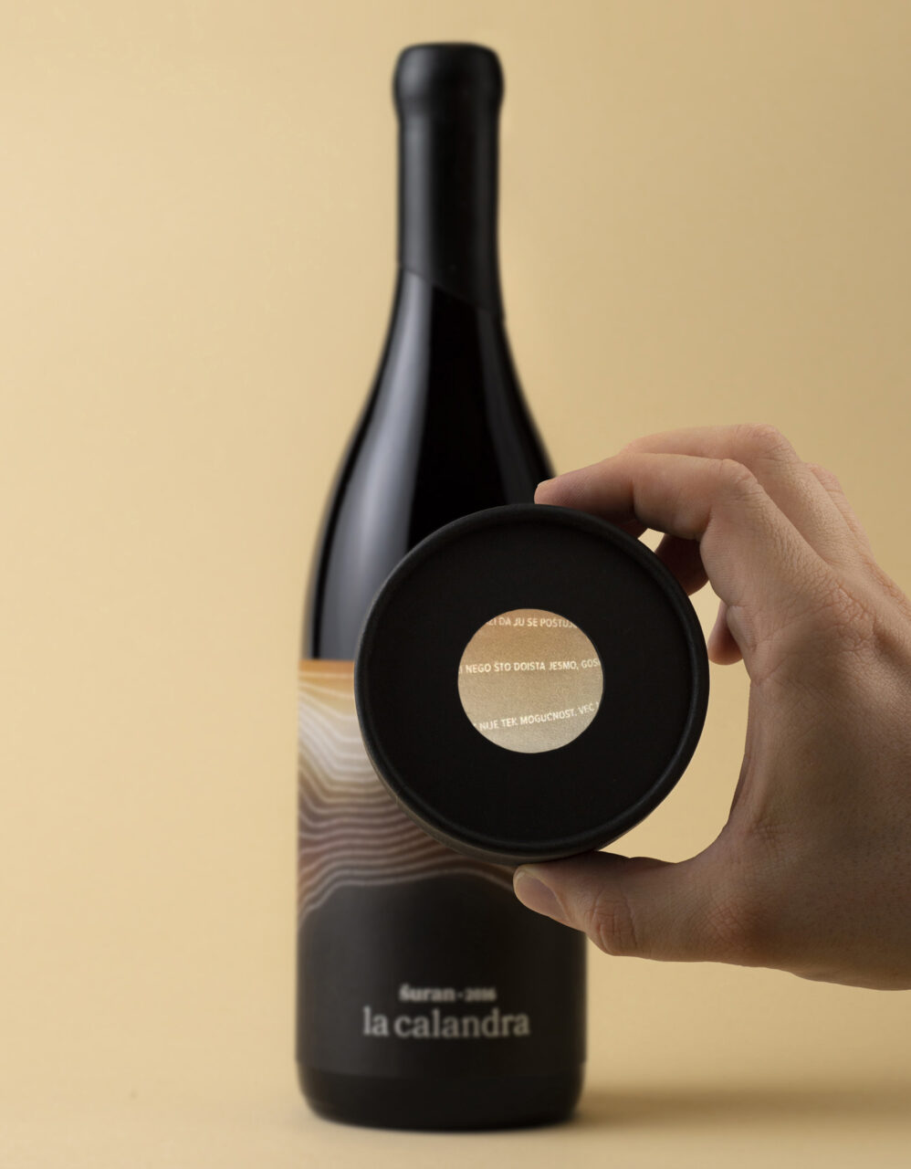
The micro-organisms are represented by tiny letters, which appear like contour lines across the bottle. This micro-writing is in fact a quote by the Italian scientist, activist and Slow Food founder, Carlo Petrini, in which he calls for more environmental awareness and criticises the mass production of food.

To read the quote, a built-in magnifying glass is included in the lid of the wine bottle packaging. ‘This way, the lid instantly becomes a simple tool that invites the consumer to interact,’ say Studio Tumpić / Prenc. ‘It turns them into a curious explorer discovering important, exciting, but also hidden truths and values of biodynamic farming.’

The label is printed on Modi White WS Barrier FSC™, a water-resistant paper with a natural felt texture.

tumpic-prenc.hr

Related articles

Stories 05/01/2023

Slow perfume

Perfume is a living experience
Graphic designPackagingPrinting
News 17/11/2022

TOP Award in Paris

Winners and jurors assemble for the 2022 prize-giving ceremony
Corporate communicationDigital printingGraphic designIllustrationLabelLarge formatPackagingPeople & PaperPhotographyPrintingPublishingSustainability
News 13/03/2025

Life in the cabaret

Cabaret Typographie reveals its devotion to craft through hands-on letterpress
Graphic designPeople & PaperPrinting
Stories 20/03/2025

Fedrigoni Top Award 2021

Simon Esterson, chair of the Award jury, sets the scene for a selection of the 2021 winners
Graphic designIllustrationLabelPackagingPrintingPublishing
Pulp © 2025
Fedrigoni
Fedrigoni
COOKIE POLICY PRIVACY POLICY ACCESSIBILITY STATEMENT
Pulp © 2025