• It
Sign in Get Pulp Pulp 27
Pulp
Sign in Get Pulp Pulp 27
Pulp
  • Inspiration82
  • Stories81
  • News165
  • Pulp Archive
  • Materials Index
  • About Pulp
  • Tell Us
  • Sign in
  • Get Pulp
  • Pulp 27
  • It
Browse Themes
Corporate communicationDigital printingGraphic designIllustrationInterviewsLabelLarge formatPackagingPeople & PaperPhotographyPrintingPublishingSustainabilityInspirationStoriesNews
Pulp

Log-In

Please enter your credentials to access all Pulp contents.

Forgot your password?

New to Pulp? Register for free

New to Pulp?

Register for free to have full access to our content.

Register

3 min minutes
News

Fundamental beauty

Australian luxury-prescription line The Secret Skincare rebrands its packaging with the help of studio Paige Tuzee Designs
Graphic designPackagingPrintingSustainability

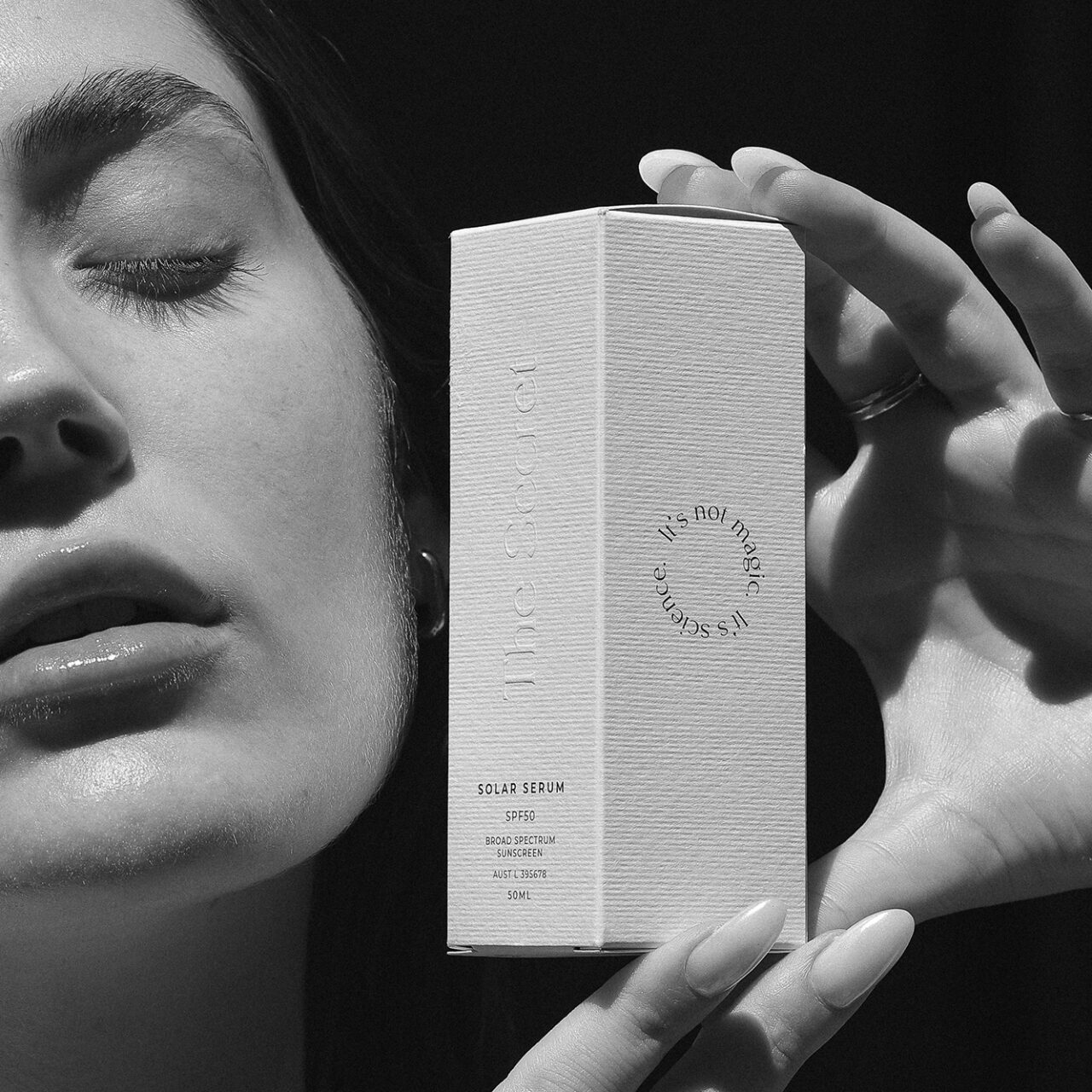
Australian studio Paige Tuzee Designs was founded in 2014 with a keen focus on stationery and branding. Having worked with The Secret Skincare team for years, founder Paige Tuzee recently collaborated with the beauty-focused company to rebrand their range of retail packages, along with assistance from Porter Packaging, a custom packaging solution business. Tuzee states that she has ‘a passion for print, with an emphasis on specialty print techniques, textured paper stocks and monochrome details.’

The Secret Skincare is Australia’s first prescription skincare brand. The Perth-based company began when Dr Clara Hurst and Dr Deb Cohen-Jones, both cosmetic-medical professionals, were introduced and found they had a shared vision to offer the best custom skin solutions to the everyday individual.

When helping to create the updated brand and packaging, Tuzee kept in mind important aspects of the company’s aesthetic – minimalism, timelessness and luxury. Along with this, the design process included sampling a range of papers to ensure that the final packaging was aligned with the team’s shared vision.

There was a large focus on sustainability and all parties involved understood the mission. The Secret Skincare states that, ‘Sustainability is considered in each and every one of our decisions, from our minimalistic regimes, through to our packaging and processes’. This focus informed the use of FSC™-certified paper for the outer packaging, along with the paper texture that complements the simplicity of the design. Tuzee states, ‘It is in beautiful paper stocks and specialty print that I believe the character and personality of a design can really shine.’

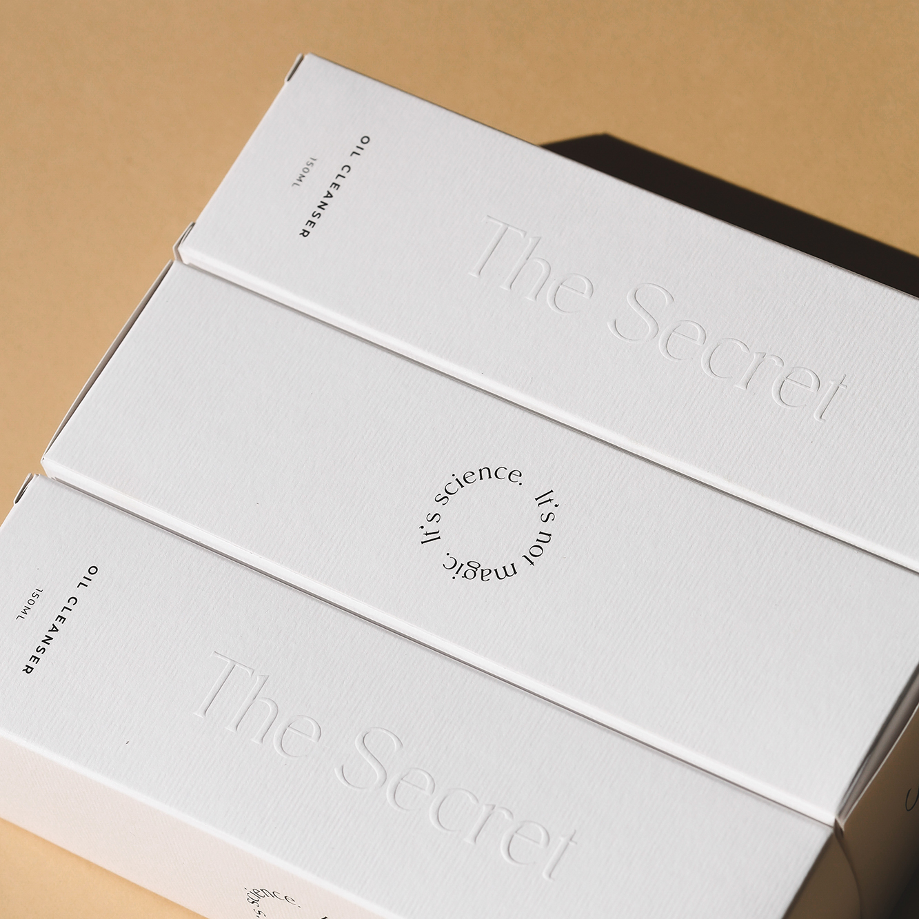
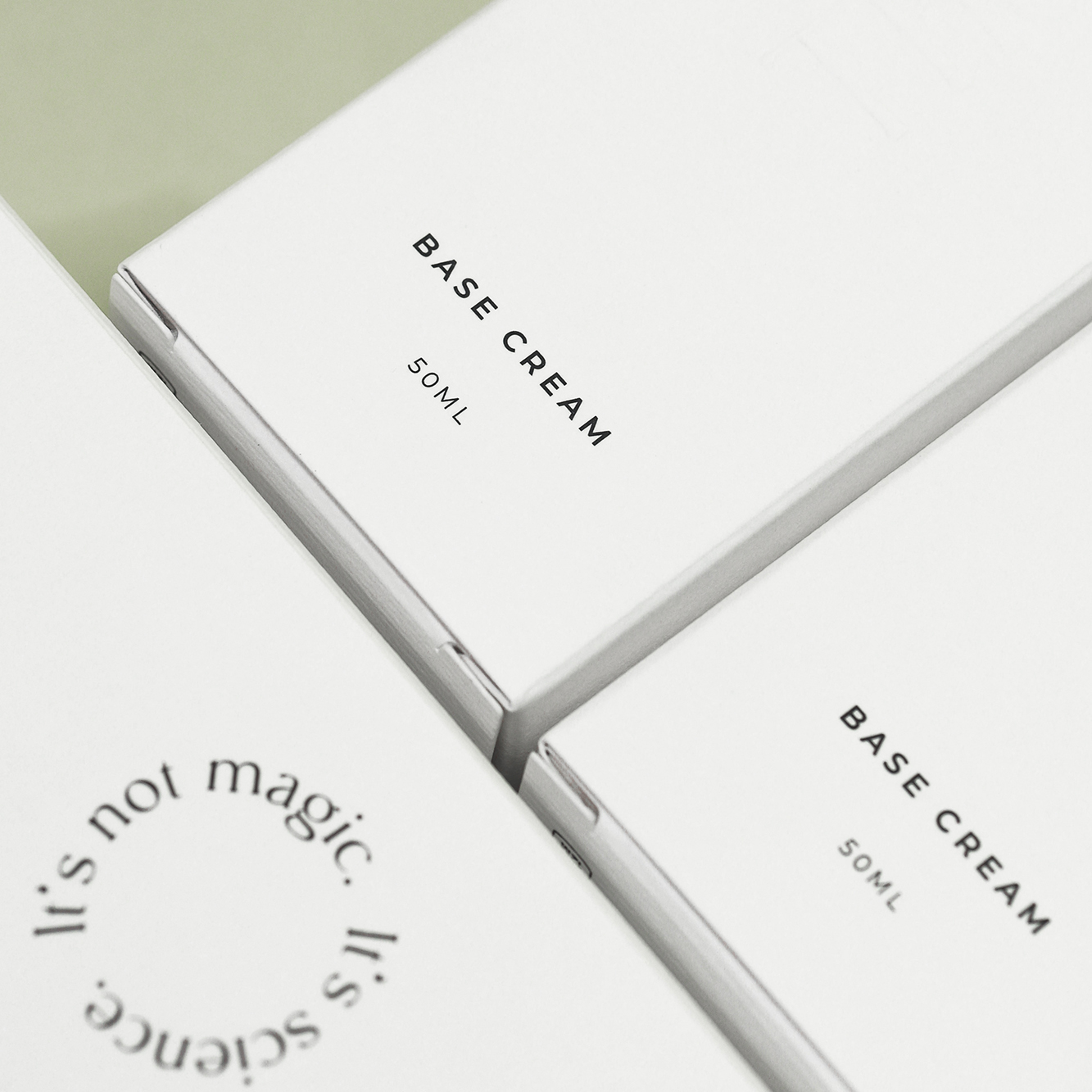
Paper: Nettuno Bianco Artico 280g/m2

Photographer: Bianca Tuzee

thesecretskincare.com

paigetuzeedesigns.com

The_Secret_Skincare Instagram

Paige Tuzee_Designs Instagram

Porter_Packaging Instagram

porterpackaging.com

Featured Materials

Nettuno

Papers and boards FSC® certified, made with environment-friendly ECF pulp. Uncoated and felt-marked on both sides and pulp-dyed with light-fast colours.

Related articles

Stories 20/03/2025

Fedrigoni Top Award 2021

Simon Esterson, chair of the Award jury, sets the scene for a selection of the 2021 winners
Graphic designIllustrationLabelPackagingPrintingPublishing
Inspiration 25/07/2024

Simes Bell

Simes created a demo box for Bell
Graphic designPackagingPrinting
News 01/12/2022

Kombucha in Cardiff

Cardiff-based agency Kutchibok has created labels for a premium-aged kombucha line for Peterston Tea
LabelPackagingSustainability
Stories 27/02/2025

Need to know: Beneath the surface

From atmospheric conditions to adhesives and paper, there are myriad factors that affect drinks labels. By Henry Miles
Graphic designLabelPrinting
Pulp © 2025
Fedrigoni
Fedrigoni
COOKIE POLICY PRIVACY POLICY ACCESSIBILITY STATEMENT
Pulp © 2025