• It
Sign in Get Pulp Pulp 27
Pulp
Sign in Get Pulp Pulp 27
Pulp
  • Inspiration82
  • Stories80
  • News163
  • Pulp Archive
  • Materials Index
  • About Pulp
  • Tell Us
  • Sign in
  • Get Pulp
  • Pulp 27
  • It
Browse Themes
Corporate communicationDigital printingGraphic designIllustrationInterviewsLabelLarge formatPackagingPeople & PaperPhotographyPrintingPublishingSustainabilityInspirationStoriesNews
Pulp

Log-In

Please enter your credentials to access all Pulp contents.

Forgot your password?

New to Pulp? Register for free

New to Pulp?

Register for free to have full access to our content.

Register

Cover of Homage to the Circle.

2 min minutes
News

Dark materials

A striking art catalogue uses heavy type and deep black paper to document the work of two US painters
Graphic designPrintingPublishing

Cover of Homage to the Circle.

Atelier Dyakova was commissioned by Maison d’Art in Los Angeles to design the catalogue for an exhibition of the work of two American artists: Kenneth Noland’s circle paintings of the late 1950s and early ’60s, alongside Steven Parrino’s ‘misshapen’ paintings of the 1990s and 2000s.

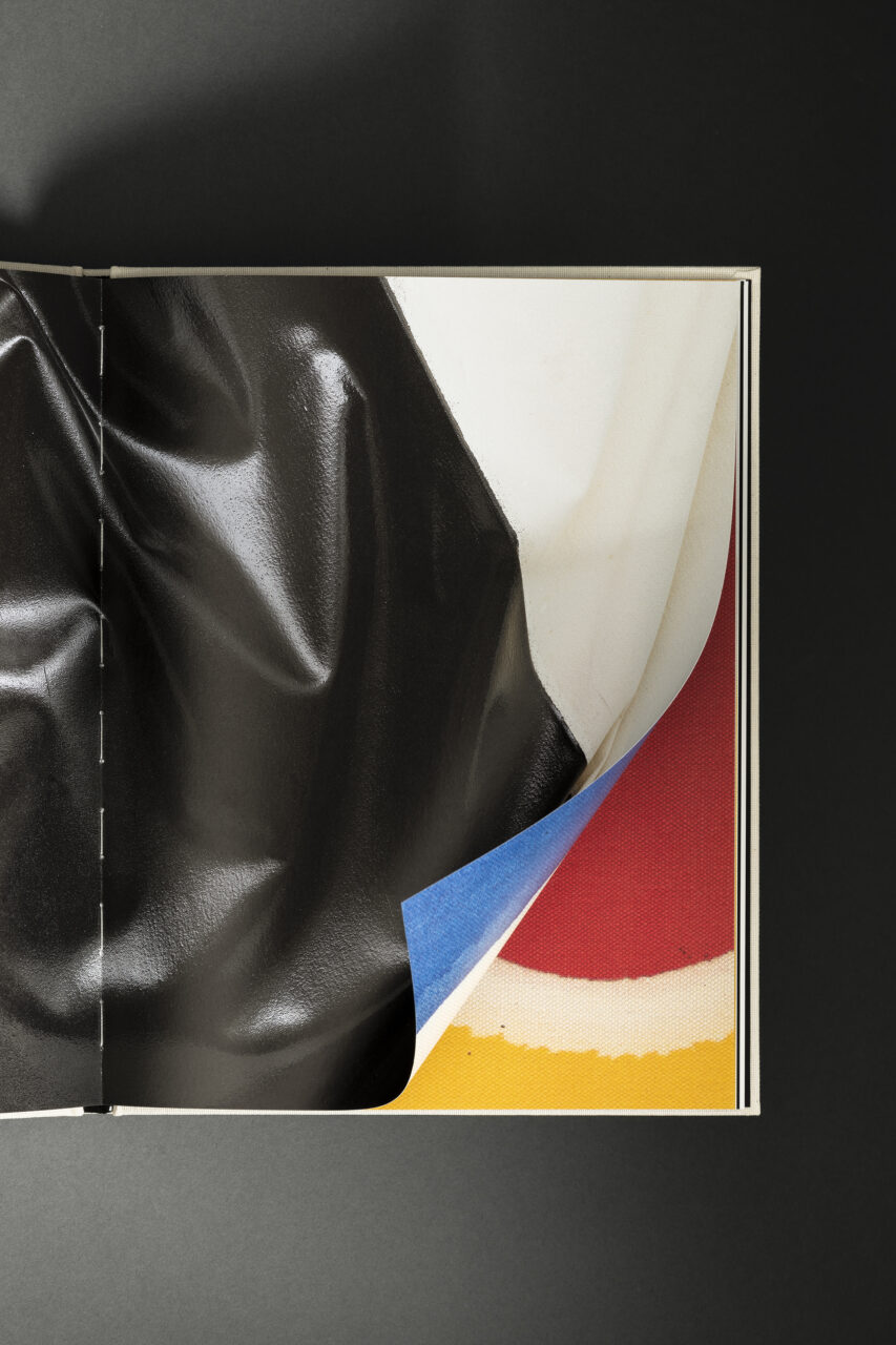
The design of the accompanying cloth-bound hardcover publication, Homage to the Circle, was inspired by the themes of deep space, black holes and gravitational forces. ‘Every design decision was connected to the key concepts in the book,’ says principal Sonya Dyakova, ‘such as unprimed canvas material for the cover and the typography choices.’

The heavy, compressed forms of typeface ABC Gravity (by Dinamo) were selected for their ‘pull-you-into-the-vortex’ quality, she adds. The decision to run texts by Gardar Eide Einarsson and Rachel Vitna Oh in silver on a deep black stock makes reference to the vastness of space.

‘We were looking at images of the universe, black holes – spaces where there is heavy blackness,’ says Dyakova. ‘The paintings by Steven Parrino used heavy, almost latex in black paint, which informed the choice of deep black pre-dyed paper. The artist’s metallic paint gave the idea for the vivid silver used for the text. It worked well to contrast this blackness with the ethereal feel of bible paper which we used for drawings and references.’

Homage to the Circle, a catalogue designed by Atelier Dyakova and made for an exhibition of work by artists Kenneth Noland and Steven Parrino, makes uses deep black paper stock in reference to black holes.

Homage to the Circle is published by Maison d’Art 

maisondart.com

Text pages and endpapers: Sirio Ultra Black 115 g/m2

atelierdyakova.com/

Images © Ed Park

Featured Materials

Sirio Color

An extensive range of pulp-dyed uncoated papers and boards with light-fast colours, available in weights ranging from 80 to 700 gsm. Pure ECF and FSC® certified.

Related articles

News 23/02/2023

Materials and metamorphosis

With sustainable issues at the heart of invention, Fedrigoni introduces a new volume of Materia Viva
People & PaperPrintingSustainability
News 22/09/2022

Natural minimalistic

Di Carlo’s low intervention wine-making process is reflected in Stefano Bracci’s labels for its Nobu 1830 range
Graphic designLabel
Stories 15/12/2022

Black magic

Big brands and creative directors choose Lorenz Boegli for his 21st-century approach to screenprinting. By Simon Esterson. Photography by Philip Sayer
Corporate communicationInterviewsPeople & PaperPrinting
Stories 28/07/2022

Follow the line

Designer Paola Fortuna and illustrator Giulia Orecchia talk about Fabriano’s Festival del Disegno 2022
Corporate communicationGraphic designIllustrationLarge formatPeople & Paper
Pulp © 2025
Fedrigoni
Fedrigoni
COOKIE POLICY PRIVACY POLICY ACCESSIBILITY STATEMENT
Pulp © 2025