• It
Sign in Get Pulp Pulp 28
Pulp
Sign in Get Pulp Pulp 28
Pulp
  • Inspiration90
  • Stories88
  • News174
  • Pulp Archive
  • Materials Index
  • About Pulp
  • Tell Us
  • Sign in
  • Get Pulp
  • Pulp 28
  • It
Browse Themes
Corporate communicationDigital printingGraphic designIllustrationInterviewsLabelLarge formatPackagingPeople & PaperPhotographyPrintingPublishingSustainabilityInspirationStoriesNews
Pulp

Log-In

Please enter your credentials to access all Pulp contents.

Forgot your password?

New to Pulp? Register for free

New to Pulp?

Register for free to have full access to our content.

Register

3 min minutes
News

The red planet

Multidisciplinary designer Clément Cases explores the outer reaches of design, type and finishing in his project for Fedrigoni France
Graphic designPrinting

Clément Cases loves to experiment. His multifaceted practice focuses on branding and typography, designing fonts, lettering and logos for various projects.

He began his career in the finishing department of French luxury printer Atelier Bulk, near Bordeaux. A move to the UK landed him at the London Centre for Book Arts, followed by collaborations with Dot Studio, a London-based print and finishing specialist. Now he works as a freelance designer focused entirely on typography related projects.

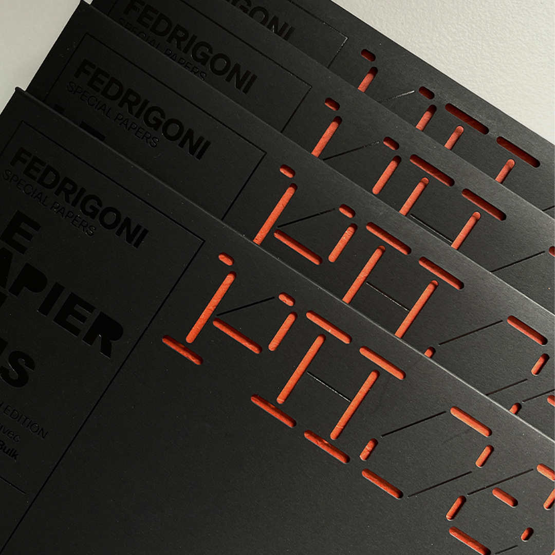
Cases’ type-driven mindset came into play with his latest Le Papier du Mois (‘Paper of the Month’) project for Fedrigoni. Designers have complete freedom within this regular monthly format. When he was assigned the month March (Mars in French), he decided explore an idea relating to the planet Mars.

The project became a two-part object: one a dark soft touch Inspira Nero Mistero envelope featuring a stencil typeface designed by Cases that displays the die-cut word ‘Phoenix’, the name of a robotic NASA space probe sent to Mars in 2008. The second part of the printed object – a card representing the red planet itself, in Materica Terra Rosa paper with embossing and silver hot foil stamping – can be seen through the die cuts. The mix of rust-toned card and dark envelope creates a striking contrast.

The project also brought Cases full circle, as it was his first time collaborating with Atelier Bulk since he moved to London. He says, ‘Yann Cloutier, the founder, has an incredibly sharp eye for printing techniques, so our collaboration involved a lot of idea exchanges to push the project as far as possible.’

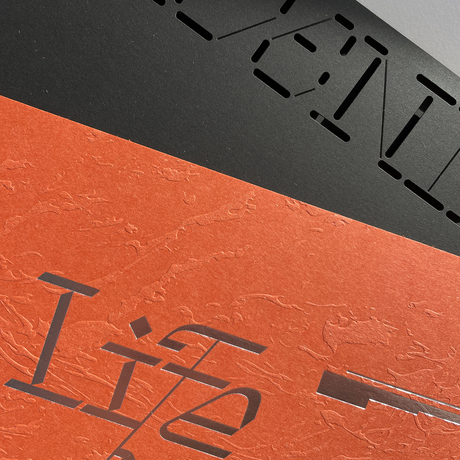
Paper: Materica Terra Rosa and Inspira Nero Mistero

clementcases.com

Fedrigoni France Instagram

Clément Cases Instagram

atelierbulk.com

londonbookarts.org

dotstudio.xyz

Featured Materials

Ispira

Environmentally-friendly ECF papers and boards FSC® certified. The special soft touch finish on the surface allows a pleasant effect and high printing performances. The 120 gsm is only one-side treated. Also available in self-adhesive version.

Materica

Pulp-coloured papers and boards made with 40% CTMP fibres, 25% pure environmentally friendly fibres, 20% recycled material and 15% cotton fibres. Also available in self-adhesive version.

Related articles

Stories 01/05/2025

The long game

Since the 1990s, Harry Pearce has shown a flair for big identity design projects, with a track record of clients that include retailers, cultural institutions and not-for-profits. By John L. Walters
Graphic designLabelLarge formatPrinting
News 02/03/2023

Golden greetings

Yves Saint Laurent welcomed the new year with a subtly embossed card designed by Résidence Secondaire
Graphic designPrinting
News 10/11/2022

Merry and type

Michelle Dwyer’s letterpress studio Nice & Graphic spreads festive cheer with hand-printed cards
People & PaperPrintingSustainability
News 01/06/2023

Imagination in motion

Wanderlust Vision has a collaborative viewpoint and a mission to promote culture. Interview by Amy Henry
Graphic designInterviewsPhotographyPrintingPublishing
Pulp © 2025
Fedrigoni
Fedrigoni
COOKIE POLICY PRIVACY POLICY ACCESSIBILITY STATEMENT
Pulp © 2025