• It
Sign in Get Pulp Pulp 27
Pulp
Sign in Get Pulp Pulp 27
Pulp
  • Inspiration83
  • Stories81
  • News166
  • Pulp Archive
  • Materials Index
  • About Pulp
  • Tell Us
  • Sign in
  • Get Pulp
  • Pulp 27
  • It
Browse Themes
Corporate communicationDigital printingGraphic designIllustrationInterviewsLabelLarge formatPackagingPeople & PaperPhotographyPrintingPublishingSustainabilityInspirationStoriesNews
Pulp

Log-In

Please enter your credentials to access all Pulp contents.

Forgot your password?

New to Pulp? Register for free

New to Pulp?

Register for free to have full access to our content.

Register

4 min minutes
News

Catalogue of feeling

Berlin practice HIT designed the catalogue for a Tate Britain exhibition by Ed Atkins
Graphic designPrintingPublishing
Photo by Stephen Belcher.

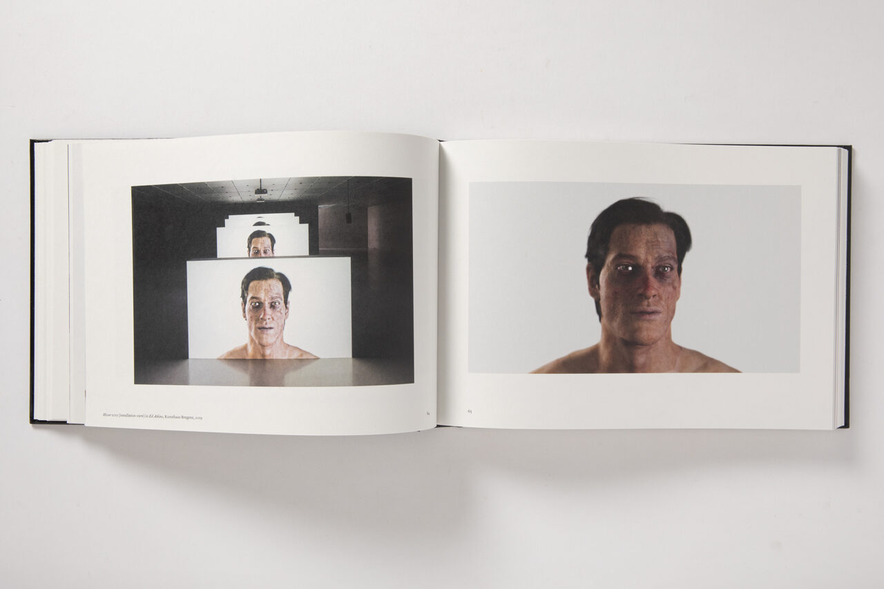
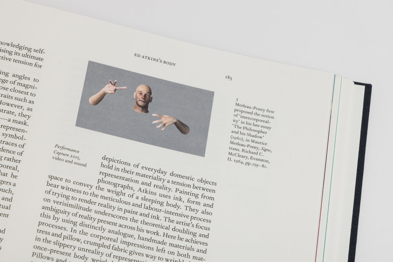
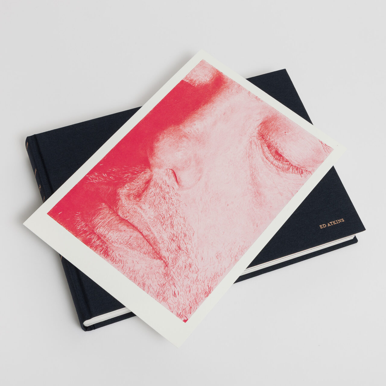
British contemporary artist Ed Atkins is known for his computer-generated videos and animations that examine the space between digital technology and human emotions. Atkins’ current exhibition at Tate Britain features multiple galleries of work that draw on his experiences and emotions, ranging from detailed, sometimes disturbing self-portraits, created with a brilliant red coloured pencil, to short films such as Hisser, an unsettling three-screen projection from 2015 that stars a male avatar who is swallowed up by a sinkhole. This is based on a true story that became an obsession of Atkins’.

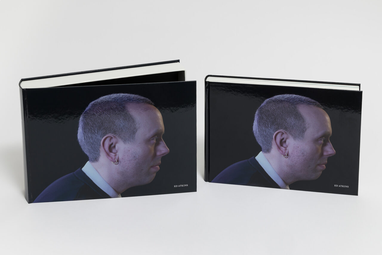
For the Tate catalogue he collaborated with HIT, the Berlin graphic design practice of Lina Grumm and Annette Lux, who graduated from Leipzig’s Hochschule für Grafik & Buchkunst (the Academy of Fine Arts) in 2005, then went to London and founded the studio there in 2008. Now based in Berlin, the designers first worked with Atkins in 2019 when they designed an artist’s book for his show at Kunsthaus Bregenz (Austria) that year. In late 2023, Atkins connected HIT with the Tate team, including curator Polly Staple, co-curator Nathan Ladd and Tate publishing commissioning editor Emilia Will.

HIT’s Grumm and Lux then met with Atkins and the curatorial team to decide on print parameters and the selection of works to feature. They chose the landscape format for its ability to represent film stills and installation views. The pages of the casebound book are uncoated Arena Bulk Natural, which, they say, ‘makes the book surprisingly lightweight’. The serif typeface selection came from Atkins, who favours the font Fournier.

The special-edition publication consists of a dark blue fabric hardcover catalogue featuring hot foil stamping in a faux book storage box, along with a special-edition print of the artist’s pencil self-portrait Untitled (2023).

‘Ed Atkins’ continues at Tate Britain until 25 August 2025.

Photo by Mark Blower.

Papers:
Hardback Catalogue: Arena Bulk Natural
Special Edition Print: Arena Natural Rough
Envelope for Art Print: Arena Natural Smooth

hit-studio.co.uk

tate.org.uk/whats-on/tate-britain/ed-atkins

Featured Materials

Arena

The Arena range is available in four shades: a bright Ivory, on OBA-free Natural, a warm White and a cool Extra White in a wide choice of sheet sizes, grain directions and grammages. Arena is available in three finishes: Smooth, Rough and Bulk. Also available in self-adhesive sheet version.

Related articles

Stories 31/05/2022

Personal digital

This digital project used youthful creativity to make thousands of unique catalogues for a children’s clothing company. By Andrew Robertson
Digital printingGraphic designIllustrationInterviews
News 03/11/2022

Set sail for the world

Lettera7’s packaging for Armatore’s new seafood products reflects its sustainable approach to fishing
LabelPackagingPrinting
News 19/10/2023

A manifesto for Plastic to Paper

As brands, manufacturers, designers and producers plan for a more circular, sustainable future, Pulp editor John L. Walters introduces the theme of this issue. Illustration by Ryan Gillett
Graphic designIllustrationPeople & PaperPrintingPublishingSustainability
Stories 14/06/2022

Surprise effect

Canadian by birth but Milanese by choice, Ginette Caron defies convention with designs shaped by her unique perspective. By Silvia Sfligiotti
Graphic designLarge formatPrinting
Pulp © 2025
Fedrigoni
Fedrigoni
COOKIE POLICY PRIVACY POLICY ACCESSIBILITY STATEMENT
Pulp © 2025