• It
Sign in Get Pulp Pulp 27
Pulp
Sign in Get Pulp Pulp 27
Pulp
  • Inspiration83
  • Stories81
  • News166
  • Pulp Archive
  • Materials Index
  • About Pulp
  • Tell Us
  • Sign in
  • Get Pulp
  • Pulp 27
  • It
Browse Themes
Corporate communicationDigital printingGraphic designIllustrationInterviewsLabelLarge formatPackagingPeople & PaperPhotographyPrintingPublishingSustainabilityInspirationStoriesNews
Pulp

Log-In

Please enter your credentials to access all Pulp contents.

Forgot your password?

New to Pulp? Register for free

New to Pulp?

Register for free to have full access to our content.

Register

2 min minutes
News

Balancing queen

Giulia Garbin’s first beauty brand designs are minimal and fun
Graphic designLabelPackagingPrinting

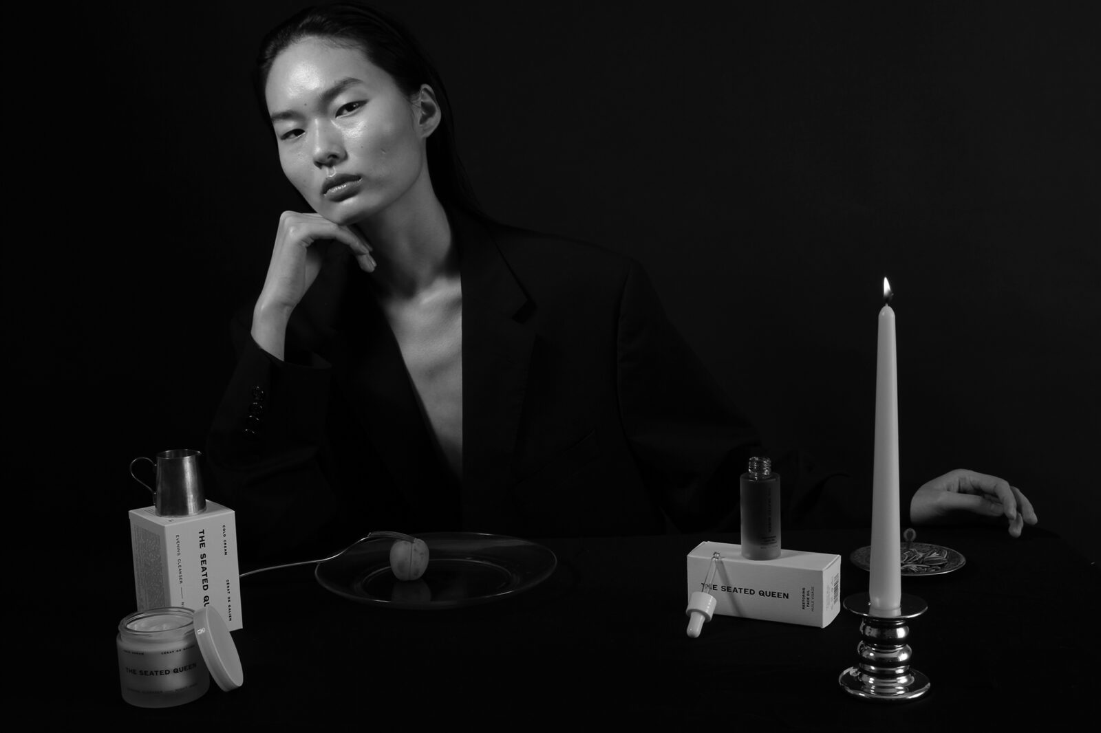
The Seated Queen is the first beauty product brand that Giulia Garbin (see Pulp 6) has designed and art directed. For the firm’s plain cardboard packs of natural creams and serums she chose Fedrigoni Acquerello Bianco 390g/m2, using a restrained sans serif typeface and a marque she originally made as a linocut, a craft Garbin has employed in several other projects. The monochrome monogram represents Cassiopeia, also known as the Seated Queen, a title that sisters Libby and Josephine Banks chose for their skincare brand when they founded the company in 2020.

Cassiopeia, a star constellation in the northern sky, shares its name with a figure from Greek mythology, a beguiling character who liked to boast of her unrivalled beauty. ‘The sisters liked the idea of someone who is strong,’ says Garbin, ‘but who is also imperfect and unpredictable.’

‘Libby Banks contacted me in 2018 about creating a beauty brand for smart, busy women using natural ingredients,’ says Garbin. ‘I didn’t realise how different it was to design packaging for small products like creams or serums. Some tests looked really nice on screen, but then quite bad when printed at the actual small size. For example, I had to choose and source a type that was very legible in 3 or 4pt.’ For the bottles and jars the type was screen-printed directly on the glass.

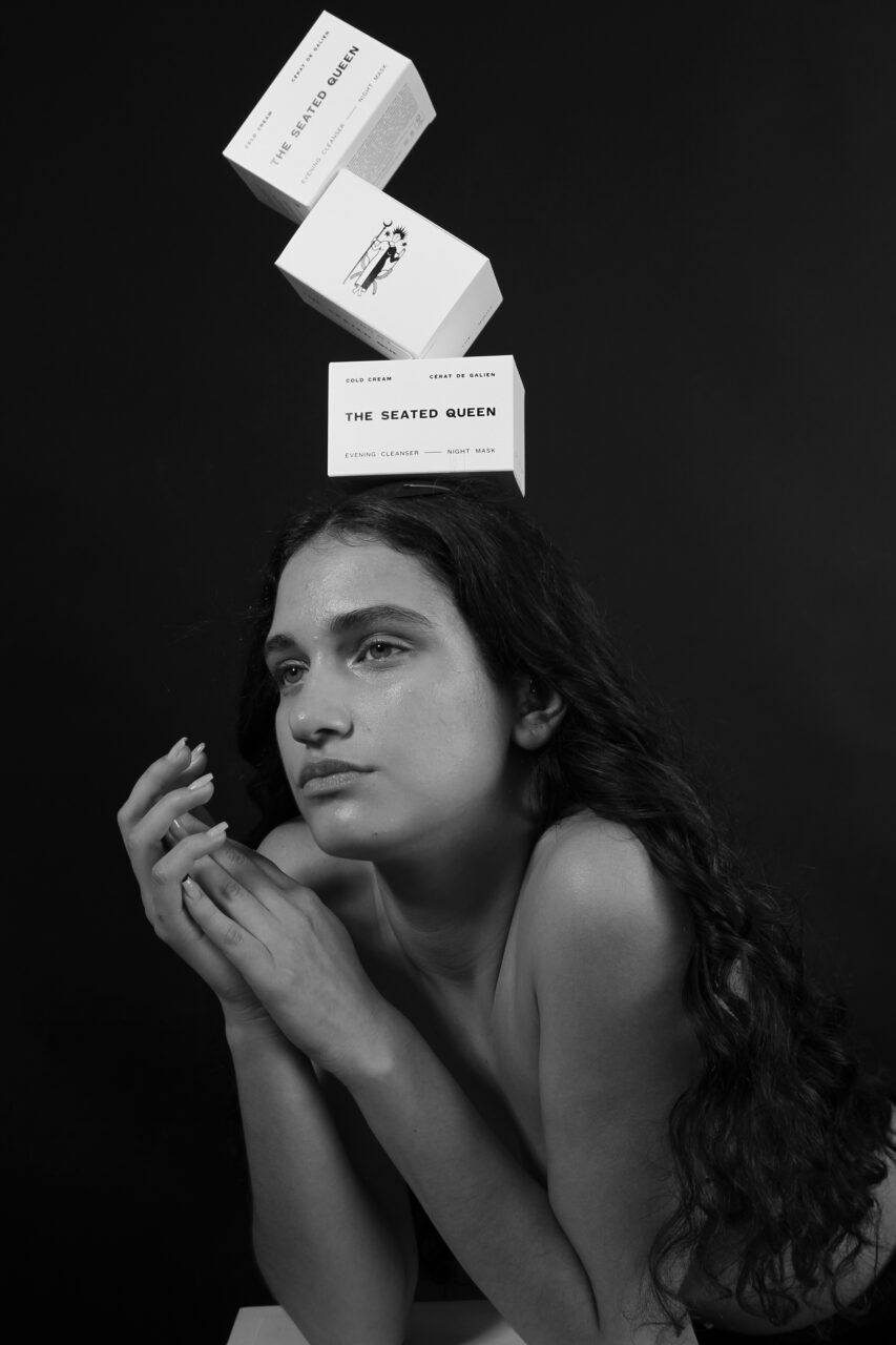
Kimberly Hawmmond’s lighthearted, slightly surreal photographs were intended to play with the concept of the ‘balancing act’ that affects our everyday lives, explains Garbin. ‘It’s been real fun to work with Kimberly, Libby and her sister Josie.’

theseatedqueen.com

bark.com

Featured Materials

Acquerello

Uncoated papers and boards made with E.C.F. pulp, certify FSC®. Felt marked on both sides. Substances over 240 gsm are multi-ply laminated in the formation stage. Available in three shades: Bianco, Avorio and Camoscio. Also available in self-adhesive version.

Related articles

Inspiration 06/06/2024

Perpetual motion

The multi-layered, die-cut Perpetuo! calendar has ‘no beginning and no end’, and places focus on days
Graphic designPrintingPublishing
News 18/04/2024

Tunnel vision, baby!

Swiss designer and letterpress printmaker Dafi Kühne discusses his Tunnel poster series
Graphic designPeople & PaperPrinting
News 06/10/2022

Wishing bell

A unique identity design project for a Slovenian hotel includes the creation of a box of chocolates inspired by a local legend
Graphic designPackagingPrinting
News 13/02/2025

The Kraken returns

London studio NB rethinks spiced rum packaging … with help from a mythical monster
Graphic designIllustrationLabelSustainability
Pulp © 2025
Fedrigoni
Fedrigoni
COOKIE POLICY PRIVACY POLICY ACCESSIBILITY STATEMENT
Pulp © 2025