• It
Sign in Get Pulp Pulp 27
Pulp
Sign in Get Pulp Pulp 27
Pulp
  • Inspiration84
  • Stories81
  • News167
  • Pulp Archive
  • Materials Index
  • About Pulp
  • Tell Us
  • Sign in
  • Get Pulp
  • Pulp 27
  • It
Browse Themes
Corporate communicationDigital printingGraphic designIllustrationInterviewsLabelLarge formatPackagingPeople & PaperPhotographyPrintingPublishingSustainabilityInspirationStoriesNews
Pulp

Log-In

Please enter your credentials to access all Pulp contents.

Forgot your password?

New to Pulp? Register for free

New to Pulp?

Register for free to have full access to our content.

Register

3 min minutes
News

Back to the roots

Lisbon studio RitaRivotti helps D’Eyras build an authentic brand story with their olive oil and fruit spirit packaging
Graphic designLabelPrinting

Rita Rivotti has a passion for storytelling – she has been working in the world of branding and packaging across wines, spirits, olive oils and gourmet products for the past twenty years. After graduating with a degree in agronomic engineering, Rivotti decided to change her career path to graphic design following the birth of her three daughters and in 2004 founded RitaRivotti, her Lisbon-based studio.

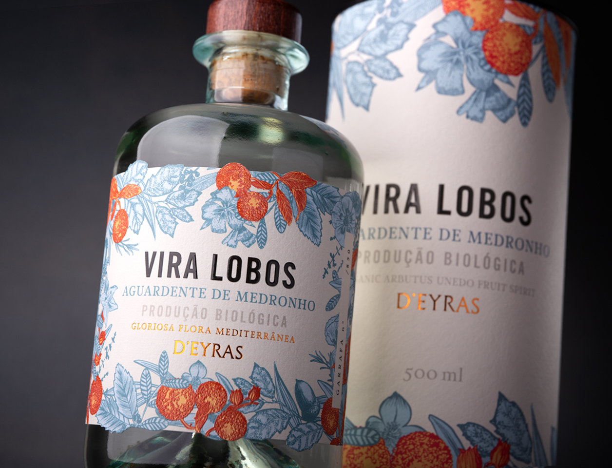
The ethos of the studio is about ‘building authentic identities rooted in the stories and people behind each product – from concept to final label’. This was instilled in their package design for the D’Eyras extra virgin olive oil and Vira Lobos arbutus craft spirit, also known as ‘medronho’, a traditional beverage in Portugal made from the berries of the strawberry tree (known as ‘arbutus unedo’ or ‘medronheiro’ in Portuguese).

RitaRivotti approached the branding and packaging of both olive oil and arbutus fruit spirit with the same vision – ‘to honour the family’s origins and their connection to the land where they’ve lived for more than eight generations’.

The D’Eyras family has carried out a commitment to respect the land and its flora. Both the olive tree and strawberry tree are native to Portugal. Due to their dense structures, both have fire-resistant properties and an ability to create natural firebreaks, useful in the region’s dry, hot summers.

The RitaRivotti team created illustrations of olives and arbutus fruits in the same style for each label to maintain cohesion throughout the brand. They aimed to evoke the tradition and artisanal care of the small-batch distillery and olive oil manufacturing, which led to the choice of delicate, pharmacy-style bottles. VOX, a printing house based in Vila Nova de Gaia with extensive knowledge of label production, printed the labels.

Paper:
D’Eyras Extra Virgin Olive Oil: Greaseproof FSC™
Vira Lobos Arbutus Spirit: Cotone Bianco Ultra WS

ritarivotti.pt

RitaRivotti Instagram

deyras.pt

VOX Instagram

vox.co.pt

Featured Materials

Cotone

The Cotone range includes treefree papers with a precious felt-marked texture a different nuances including black pulp-dyed versions, which make it one of the must-have self-adhesive papers preferred by label designers all over the world.

Related articles

News 01/09/2022

Welcoming type

Callin Mackintosh designs a wide variety of printed objects for Arusha Gallery, revelling in colour and typography
Graphic designPrinting
Stories 24/08/2022

Part of the solution

Gareth Dinnage, MD of B Corp printer Seacourt, says that business should be a force for good. Interview by Simon Esterson
InterviewsPrintingSustainability
News 21/07/2022

Sicilian counterpoint

Mucho’s olive oil label design remixes traditional elements for a contemporary identity
Graphic designLabelPackagingPrinting
News 01/09/2022

Colours of nature

An illustrated children’s book uses overprinting to evoke our closeness to the natural world
Graphic designIllustrationPublishing
Pulp © 2025
Fedrigoni
Fedrigoni
COOKIE POLICY PRIVACY POLICY ACCESSIBILITY STATEMENT
Pulp © 2025