
• It
Sign in Get Pulp Pulp 28
Pulp
Sign in Get Pulp Pulp 28
Pulp
  • Inspiration93
  • Stories88
  • News174
  • Pulp Archive
  • Materials Index
  • About Pulp
  • Tell Us
  • Sign in
  • Get Pulp
  • Pulp 28
  • It
Browse Themes
Corporate communicationDigital printingGraphic designIllustrationInterviewsLabelLarge formatPackagingPeople & PaperPhotographyPrintingPublishingSustainabilityInspirationStoriesNews
Pulp

Log-In

Please enter your credentials to access all Pulp contents.

Forgot your password?

New to Pulp? Register for free

New to Pulp?

Register for free to have full access to our content.

Register

3 min minutes
News

Amalfi triangles

Italian design studio Spazio creates limited-edition modular packaging for customers of the luxury furniture store Casamica
Corporate communicationGraphic designPackagingPrinting

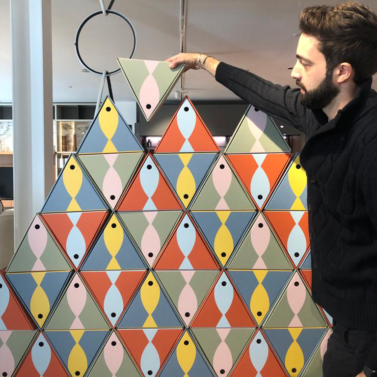
Located in the Campania region of Italy, Spazio, a multidisciplinary design studio, was founded in 2011. During the festive season of 2022, Spazio was commissioned by the Italian luxury design furniture store Casamica to create a limited-edition package to gift to their customers. The triangular packaging the studio created includes a triptych of fish products from a leading company in Cetara – a picturesque seaside village on the Amalfi coast.

Anchovies, tuna and colatura are included in the box and the graphics on the outer packaging are a nod to this marine reference. When asked about the project, Spazio’s art director Emiliano De Masi stated, ‘Ottagono was born for fun. Perhaps as the greatest masters taught us, it is often the game itself that offers unique works that can leave an indelible mark over time. From here we started to imagine a creative path based on form and modularity’.

De Masi continues, ‘The triangular packaging evokes the art of all times, from harmony to proportion, as a symbol of the human and divine relationship.’ The packaging was produced by Italian printer Grafica Metelliana.

With packaging printed in three different colours of Materica paper, the aim was to build a trilogy of meanings pertaining to the local geographical features through the colours used. The Materica acqua blue colour was used to ‘represent the beautiful Amalfi coast’. The Verdegris green is a nod to the Monti Lattari mountains and the Terra Rossa red representing the hot, volcanic land in the surrounding area.

Paper:
Materica Acqua
Materica Verdegris
Materica Terra Rossa

Printer: Grafica Metelliana

Spazio Instagram

Casamica Store Instagram

casamicastore.com

Grafica Metelliana Instagram

graficametelliana.it

Featured Materials

Materica

Pulp-coloured papers and boards made with 40% CTMP fibres, 25% pure environmentally friendly fibres, 20% recycled material and 15% cotton fibres. Also available in self-adhesive version.

Related articles

News 01/12/2022

Kombucha in Cardiff

Cardiff-based agency Kutchibok has created labels for a premium-aged kombucha line for Peterston Tea
LabelPackagingSustainability
Stories 11/04/2024

Digital craft

Barney Cox talks to three different companies about the way they use digital printing. Photographs by Graham Morgan
Digital printingPrinting
News 18/04/2024

Tunnel vision, baby!

Swiss designer and letterpress printmaker Dafi Kühne discusses his Tunnel poster series
Graphic designPeople & PaperPrinting
News 01/09/2022

Colours of nature

An illustrated children’s book uses overprinting to evoke our closeness to the natural world
Graphic designIllustrationPublishing
Pulp © 2026
Fedrigoni
Fedrigoni
COOKIE POLICY PRIVACY POLICY ACCESSIBILITY STATEMENT
Pulp © 2026