The great Italian typeface designer Giambattista Bodoni (1740-1813) never set foot on Manhattan island. At least not to my knowledge. The maestro behind the Bodoni typeface family and the Manuale Tipografico (1818) spent most of his later years in Parma, Italy, where today a dark, secluded cathedral-esque museum contains many of his original punches. Nonetheless, his modern typographic masterpiece, Bodoni, is viewed by many as the ersatz official typeface for New York City. This is not because it is ubiquitous, like Helvetica is throughout the labyrinthine subway system, on all the city’s Department of Sanitation trucks, or as the default face for hundreds of businesses and institutions from Staten Island to Westchester. But because Bodoni underscores the city’s sense of style – its pride.
Bodoni is the jewel of typefaces (though, admittedly, neither the Fifth Avenue jewellers Tiffany nor Cartier have used Bodoni in their logos). And contrary to first glances, CBS, New York’s former champagne TV and radio network, used its own version of Didot rather than Bodoni – although the typeface, with the same thick and thins of Bodoni, is still beautiful.
Bodoni has a history in New York. It was introduced to New York City printers during the late-nineteenth century in the bastardised form called Ultra Bodoni. In 1929, Chauncey H. Griffith designed a fat variation: Poster Bodoni. With its pyramid-like serifs and heavier thicks and thins, it was one of many popular ham-fisted hybrids of classic faces in the average printshop’s typecase. It was commonly used as headlines or pull-quotes on attention-grabbing advertisements and handbills.
In the early twentieth century a form closer to the original was released by American Type Foundry, which issued the first US revival of the Bodoni family with Morris Fuller Benton’s 1909 version, followed by his italics, bolds and shaded through to 1914. Between 1909 and 1933, Bodoni was commonly available through the city’s print shops and type houses and specified for newspaper and magazine advertisements, while Bodoni Book, also designed by Benton, was used for book text.

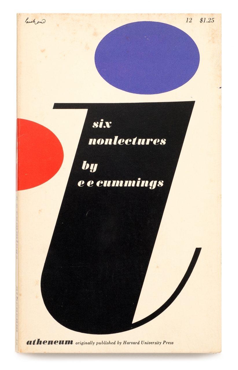
For designers who were not slavishly beholden to modern sans serifs, Bodoni was modernity with personality, a viable alternative to Akzidenz and Helvetica’s relentless darkness and Futura’s machine-age geometry. Those elegant thicks and thins brought style to a page without imposing the vintage look of more decorative times. In the late 1930s and 40s Paul Rand used it for, among other clients, Frazer Automobile and Disney Hats advertisements, and he was not the only advertising designer to play with its sensual form. Rand famously used a huge Bodoni ‘D’ on the cover of the left-leaning culture magazine Direction, to commemorate the D-Day Normandy invasion. The ‘D’ with a grave embedded in it marked the end of Nazi hegemony in Europe.
In his delightful book, Visual Persuasion: The Effect of Pictures on the Subconscious (McGraw Hill, 1961), Stephen Baker measured the impact of Bodoni in contemporary graphic design. Bodoni Book, he wrote, is ‘light, rich, beautiful, expensive, meaningful, graceful, tight, formal, soft, good, clean, harmonious and honest.’ It sounds like the Boy Scout Oath. Bodoni Book Italic is, ‘soft, plain, feminine, expressive and the rest of the same Bodoni Book attributes.’ But he admonished Bodoni Ultra as ‘Active, ugly, hard, strong, dark, masculine and rugged.’
No matter what the New York graphic designer needed, Bodoni served a rational purpose. But the function that has made it most New York-centric, has not been the logos or advertisements (many of which are not Bodonis but very similar Didots), but rather the magazine type for Harper’s Bazaar covers and interiors, and the book jacket type for Observations: Photographs by Richard Avedon (1959) used by Alexey Brodovitch, which are so New York. Thick and thin typefaces – especially Bodoni – seem to scream (exquisitely) ‘FASHION’. And it was in the hands of Brodovitch that Bodoni had its most prodigious usage – until Massimo Vignelli flew into town from Milan.
Vignelli stayed in New York on a fellowship from 1957 to 1960, and in 1966, he returned for good. He made Bodoni one of his five signature typefaces, choosing it almost as a personal logo. His last word is the best word about the face: ‘Bodoni is one of the most elegant typefaces ever designed. When I talk about elegance, I mean intellectual elegance. Elegance of the mind.’

Coincidentally, around 1960 an influx of about 200 privately printed books and pamphlets produced by Giovanni Mardersteig and his Officina Bodoni found their way into the hands of bibliophiles through the Limited Editions Club in New York. From this developed a Bodoni mystique. And in the 1980s, Italian publisher Franco Maria Ricci imported his books and FMR magazines to New York. These items, typeset entirely in his own refined Bodoni, may have also helped trigger excitement for the face. One thing was certain, the typeface did not carry the same time-sensitive baggage as other classic faces. Bodoni was elite, yet available to all; old yet new in many ways. It was wonderful small as body copy and exquisite large as headline text. It was New York – a giant face with beautifully detailed features.

