

For two decades, the Seoul-based studio of Sulki and Min has produced a large body of work – publications, graphic identities, posters and more, attracting widespread international acclaim. Founders Sung Min Choi and Sulki Choi also teach, the former at the University of Seoul; the latter at Kaywon School of Art and Design. After attending different universities in South Korea in the 1990s, the designers met while graduate students at Yale, in the United States. They then moved to the Netherlands to conduct multi-disciplinary research at the Jan van Eyck Academie, Maastricht. Coming back to Seoul in 2005, they founded a practice they describe as: ‘Just the two of us and a non-existent cat.’
At that time in South Korea there were no role models for the kind of practice they wished to become, so the influence of Mevis & Van Deursen became important. Armand Mevis and Linda van Deursen, the founders of the Amsterdam practice, taught at Yale and in the Netherlands. Sulki and Min explain that ‘An entire generation of designers from those schools were influenced by their way of working: a small-scale operation with bold ideas and a light-hearted attitude. They appeared to be having fun doing graphic design even when they were being critical.’
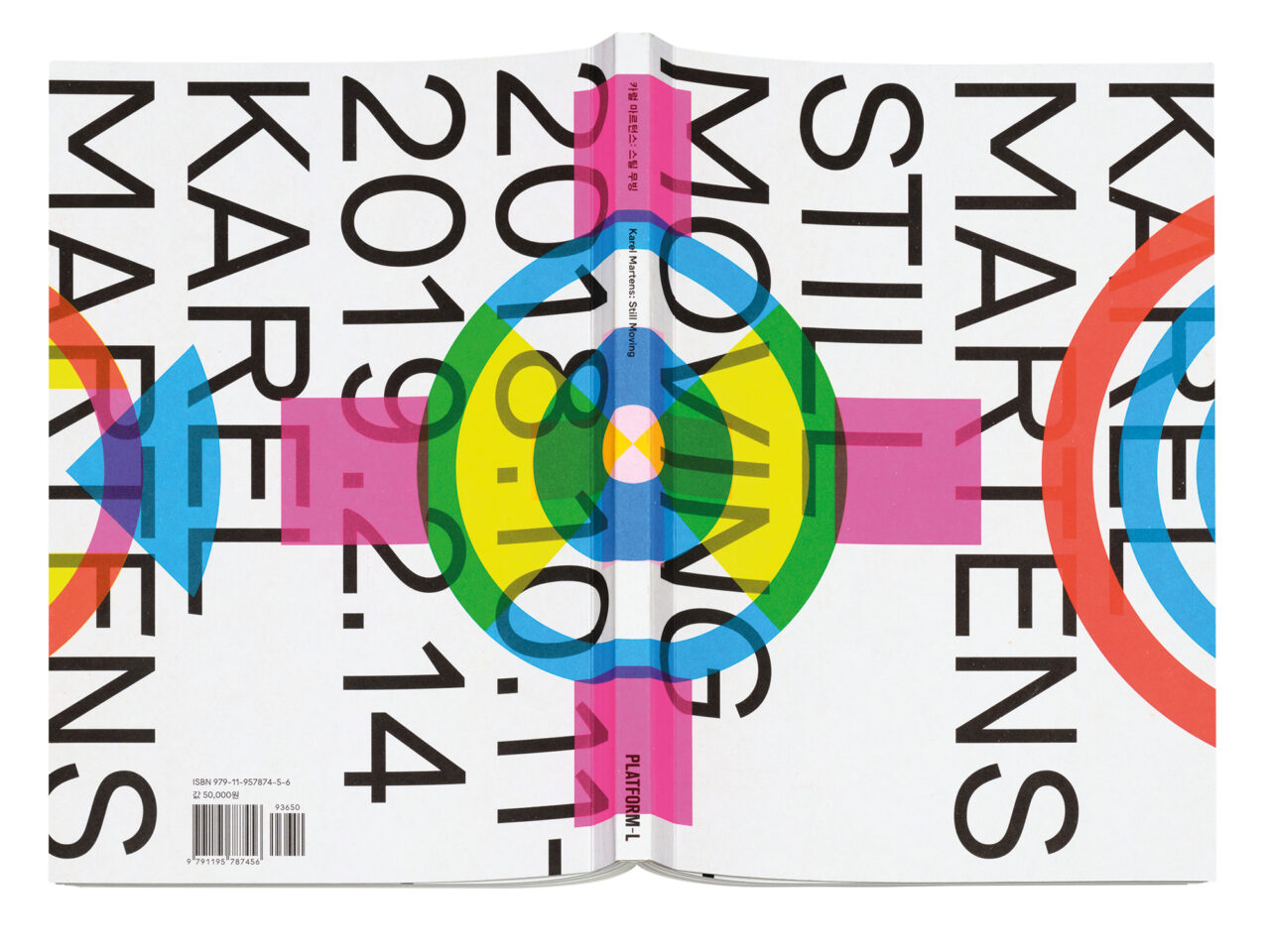
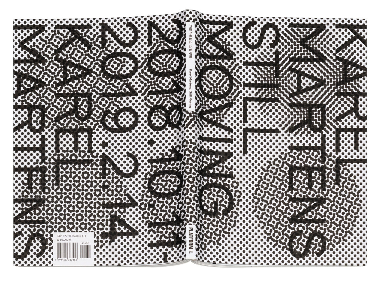
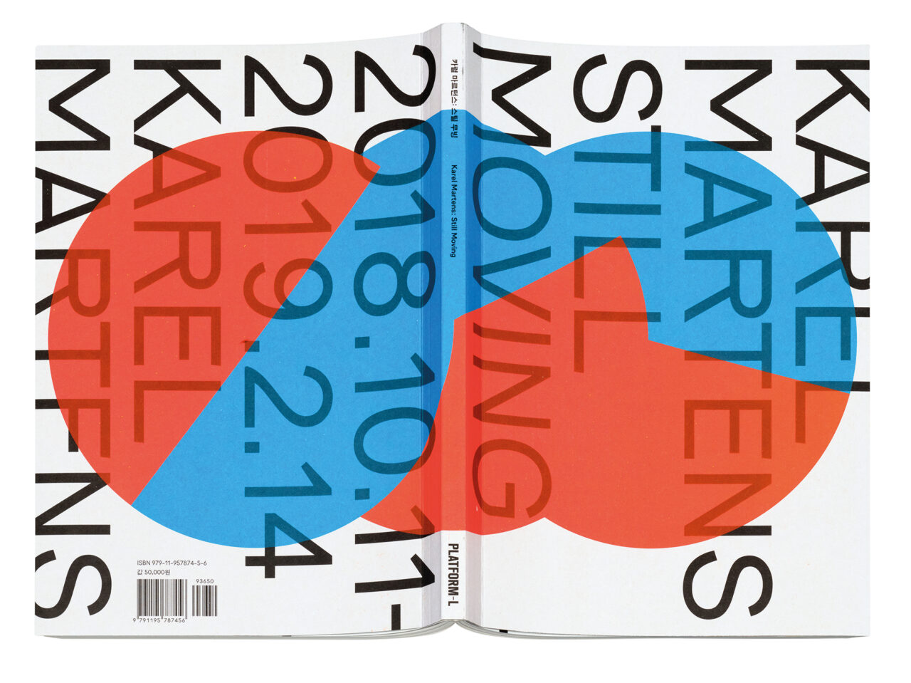
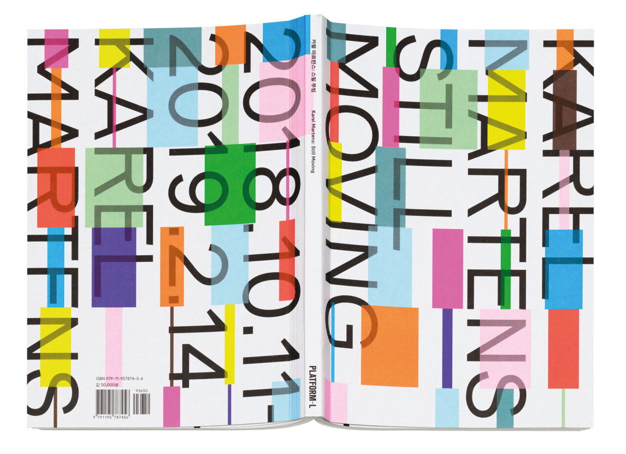
More inspiration came from designer Paul Elliman, who taught at Yale, and legendary Dutch designer Karel Martens (see Pulp 14). In 2019, Sulki and Min made the catalogue for their mentor’s exhibition Karel Martens: Still Moving.
After opening their own Specter Press (2006-21), Sulki and Min now focus on collaboration with Workroom Press, a publishing house and graphic design studio, previously their neighbours in Seoul’s Seochon area. Since 2013, Workroom has run a joint imprint, Workroom Specter, with Sulki and Min. Together they have published nearly 50 titles, with subject matter ranging from graphic design and typography to performing arts and AI literature.
A recent, significant change for Sulki and Min has been the creation of their first Korean font family, Protoform. To make this, they had to learn everything from constructing characters in glyphs to mastering and generating font files. They say, ‘It’s not perfect, obviously, but it’s also okay to leave it imperfect. We prefer to remain happy amateurs rather than gloomy professionals.’
The Korean alphabet and official writing system Hangeul consists of twenty-four phonetic letters, which are combined into square syllabic blocks rather than arranging them linearly like the Latin alphabet. Sulki and Min say: ‘In mechanical terms, this means you need thousands of syllabic characters to properly represent the writing system. This resulted in a historical setback of efficient mechanisation and digitisation in the early days of technology.’
So as part of their design process, Sulki and Min explored the origins of unsquared Hangeul, inspired by pioneer of modern Korean graphic design Young-Jae Cho’s 1976 proposal to restructure Hangeul characters for typewriters. Sulki and Min began researching Cho’s study but agreed that it had ‘rarely been discussed with the depth it deserves,’ so they decided to change that.

