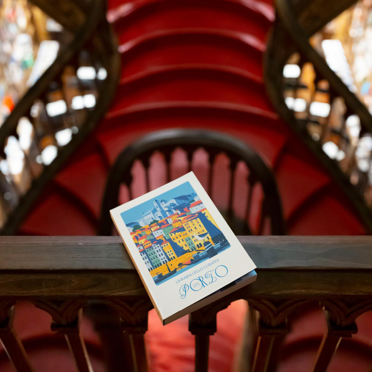
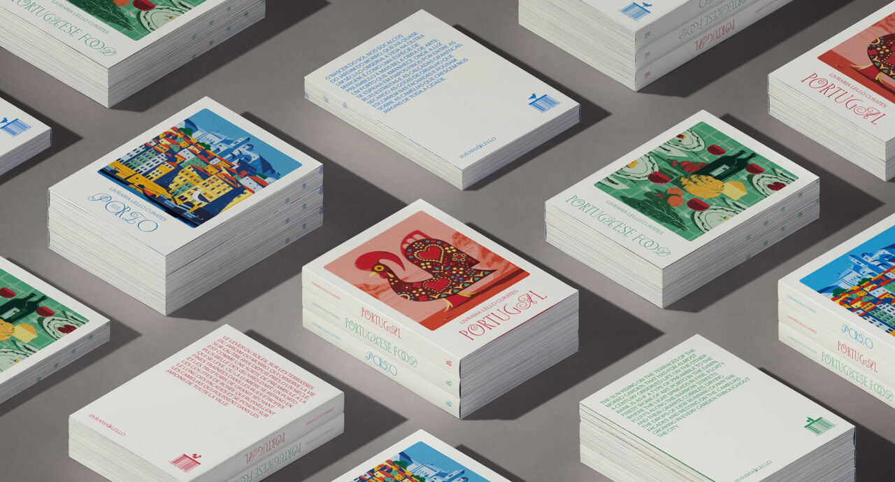
In 2024 the famous Porto bookstore Livraria Lello asked Verona studio Happycentro to collaborate on a series of publications that focused on Portuguese food, Portugal and the city of Porto itself. The shop, known for its forked staircase and beautiful stained-glass skylight window, is one of the oldest bookstores in Portugal, and has more than one million visitors each year. Happycentro, founded in the late 1990s by Federico Galvani and Giuliano Garonzi, comprises four people: Federico Padovani, Andrea Rubele, Mattia Cristini and co-founder Galvani. Livraria Lello’s creative director Hugo Cardosa and product development manager Mariana Neves reached out to Happycentro after seeing its work on Instagram.
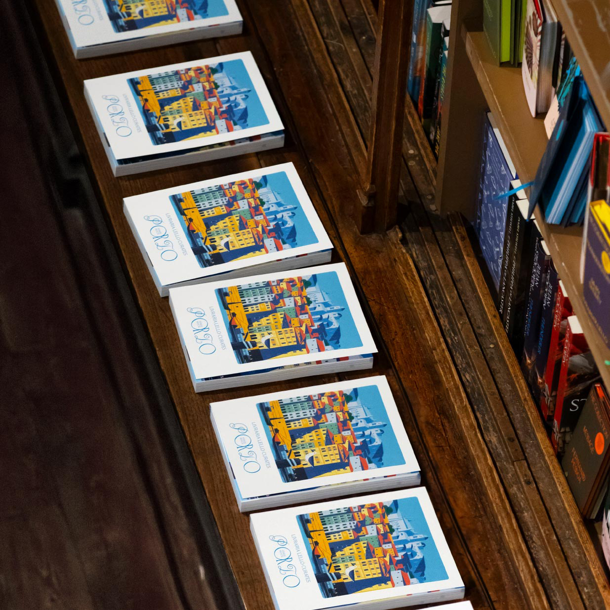
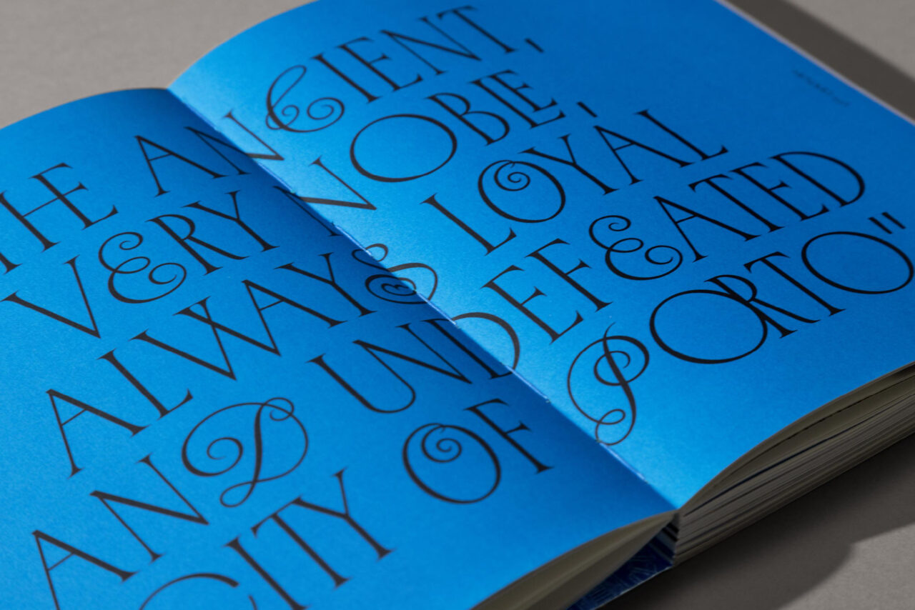
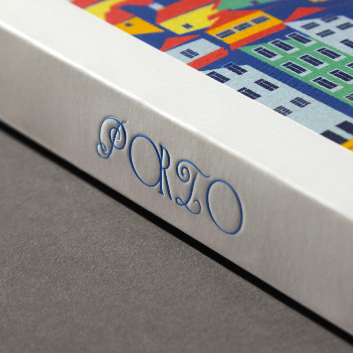
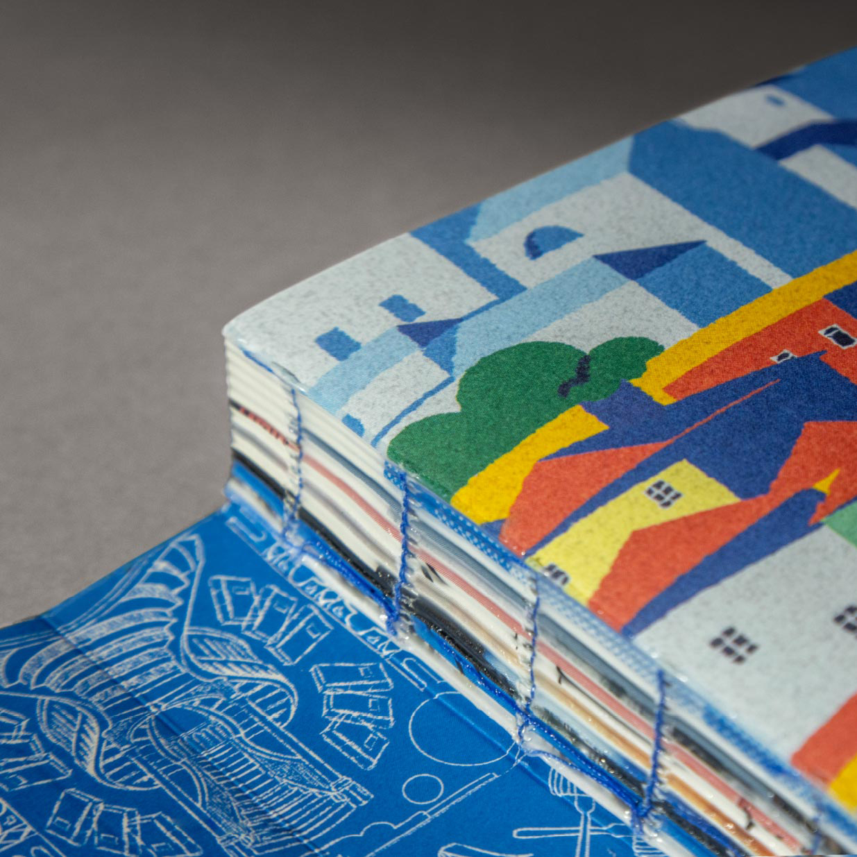
For book covers and chapter openings, Happycentro developed custom illustrations by Andrea Rubele that were inspired by azulejos, the painted ceramic tiles that feature in Portuguese architecture. Mattia Cristini created Manoel, a typeface in tribute to Portuguese calligrapher Manoel de Andrade de Figueiredo (1670-1735).
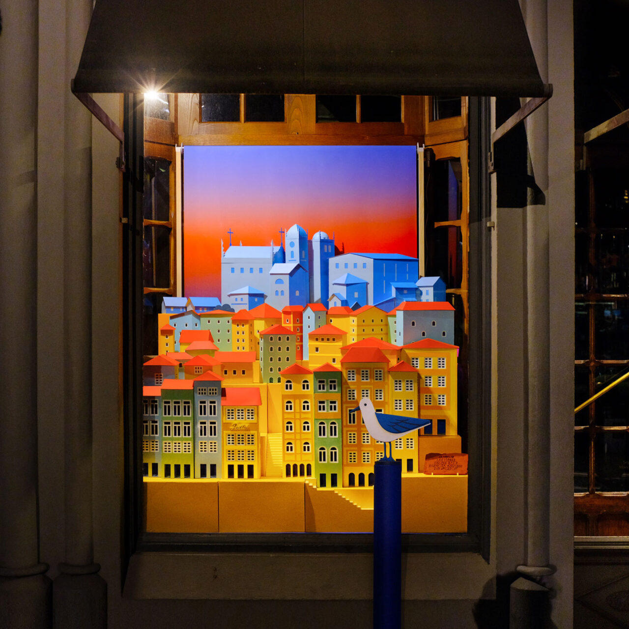
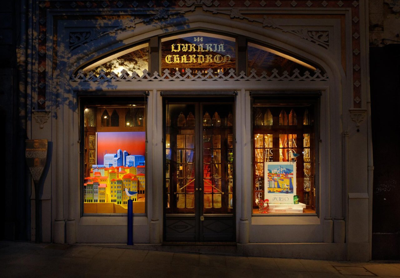
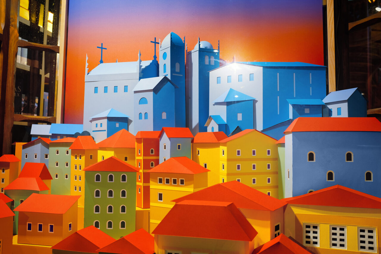
Happycentro also designed displays for the grand, wood-carved windows at the front of the store. One was dedicated to Porto, transforming illustrations of the city into a three-dimensions. The studio asked Verona printer Simeoni Arti Grafiche to cut thousands of paper pieces (in Woodstock and Sirio Color ) that would become the city buildings when glued together. Padovani says: ‘We added a touch of magic by adding an analogue rolling background that would slowly shift during the day from vibrant pink dusk to bright blue skies, from breathtaking sunsets to the deep blue nights that Porto offers.’
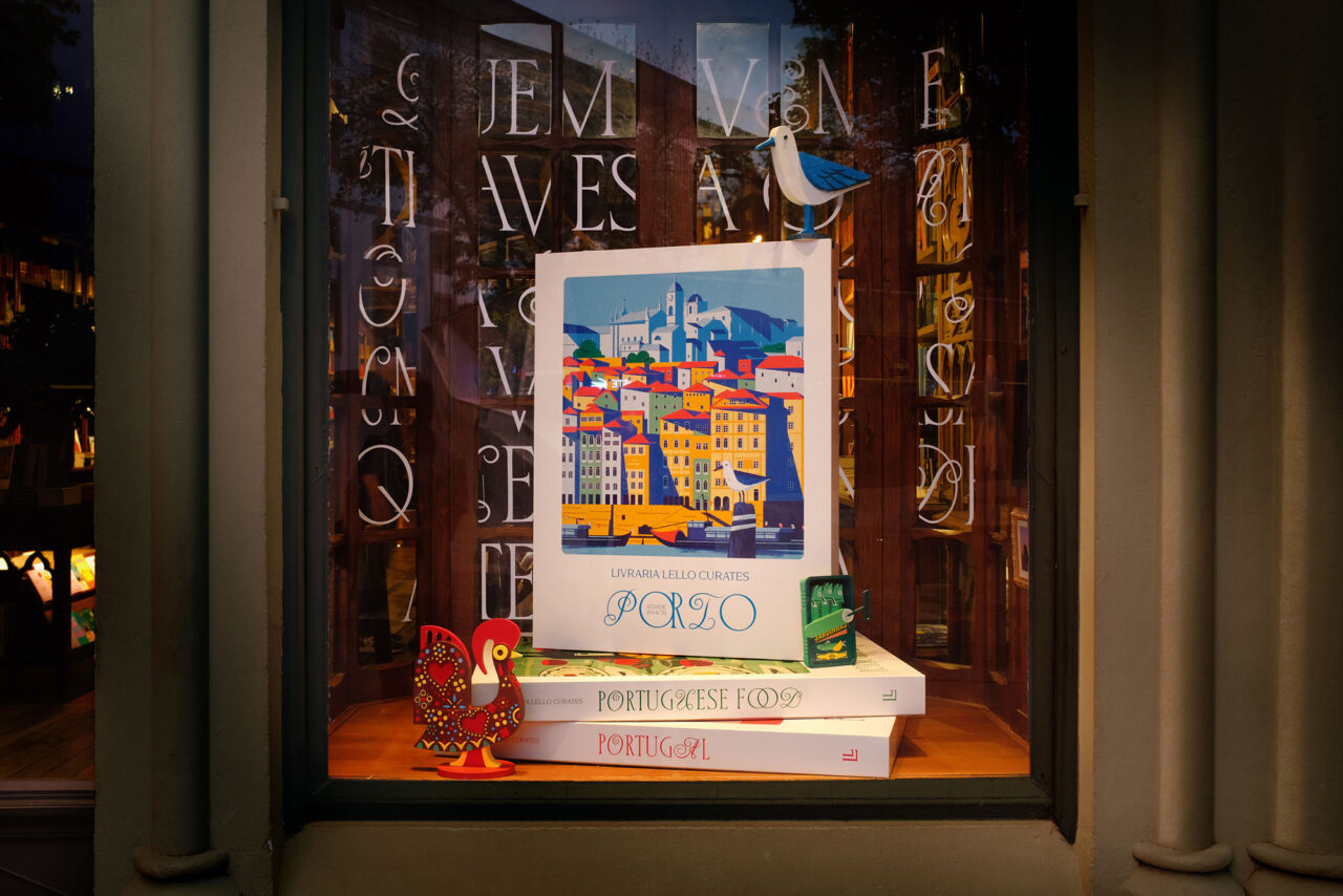
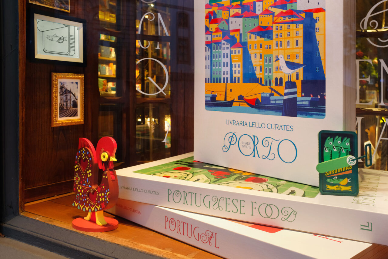
The other window displayed a giant stack of the three books paired with handmade wooden items inspired by the illustrations: seagulls, canned sardines and galo barcelo – the colourful rooster that is an unofficial symbol of Portugal.
The logistics of producing everything in Verona and transporting it more than 2100 kilometres to Porto were challenging: all components were designed and engineered to be collapsible, light and dismountable. In April 2025, the process was reversed when the shipment arrived in Porto so that the team could reconstruct the paper and wooden elements for the window installations.
Papers:
Books interior: Arena Natural Rough 140g/m2
Book cover: Arena Natural Smooth 350g/m2
Window display:
Woodstock – Giallo and Verde 225g/m2
Sirio Color – Celeste, Gialloro, Jasmine, Lampone, Turchese, Vermiglione 210g/m2