Mario Di Paolo, 44, designer and photographer, is known for his innovative wine labels. His ‘factory’, Spazio Di Paolo – a white building just on the approach to Pescara (on Italy’s Adriatic coast) – has been adapted for use as a design studio, photographic studio, archive, publishing house, art gallery and event venue, and has won 140 prizes at fairs such as Vinitaly, Los Angeles International Wine Competition, San Francisco Wine Competition and design competitions such as the European Design Awards, Red Dot Design Awards, Pentawards and Fedrigoni Top Award.
Mario’s father Gino, who dedicated his life to photography, teaching, and the world of art and advertising, is his inspiration. ‘When I was little I would spend the weekend with him in the dark room,’ says Paolo. ‘I grew up surrounded by artists and printers: for years my father’s studio was above a small print works – they often used to work together on projects. That’s how I came to develop my passion for photography, graphic design and printing. And then, twenty years ago, I began a new venture, dedicated to packaging and communication design, specifically focused on wine producers.’
‘Today we’re one of the most prestigious companies in Europe and we’re extending our focus to incorporate liqueurs,’ Di Paolo continues. ‘We know how to adapt to the shifting demands of the market. We work well with every kind of company, regardless of scale. With large companies we deal with huge volumes – millions of bottles a year, while with smaller companies the numbers are clearly more limited. In both cases, what matters is the viewpoint we bring.
‘It’s my role to bring this perspective,’ Di Paolo goes on. ‘Let’s take paper, for example. In the digital age it is anything but an “obsolete” material. Paper, from the viewpoint of a sculptor, is a material to be worked and assembled in a myriad of combinations to bring into being any number of ideas and artefacts. My way of approaching design work involves choosing an integrated, practical and informed viewpoint. Technical understanding, research and passionate involvement guide creativity. There’s nothing to be gained from analysing the competition, watching what others are doing or studying “references” as they teach in academic settings. For me, the starting point has to be the blank page.’
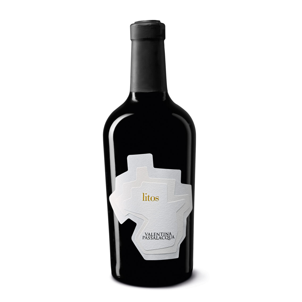
‘Our first prize-winning wine label was Litos for Valentina Passalacqua. It is a raisin wine that embodies all of the mineral characteristics of the chalky strata in the sub-soil. To communicate this biodiversity we selected three natural papers with three different white tones with the technical help of label manufacturers Rotas. It was the first time that anyone had made a self-adhesive label with three layers using an automated process; part of the reason was because no-one had ever tried it before. I was able to prove that paper offers endless untapped potential.’