Billy Kiosoglou and Frank Philippin, of two-man design agency Brighten the Corners, have worked with Anish Kapoor since 2009. Their first collaboration was the minimal ‘white rectangle’ website anishkapoor.com, a colour-coded system in sans serif type that lists every item in the internationally acclaimed sculptor’s long career.
Since the 1980s, Kapoor has made increasingly monumental work from a variety of materials – including wood, acrylic, slate, marble, cement, earth and metals – often using intense primary pigments. In 1991 he won the Turner Prize, and from June to October 2015 there will be a solo exhibition of his work at the Palace of Versailles, near Paris – the latest show in an annual series that has featured Jeff Koons, Takashi Murakami and Joana Vasconcelos.
In the past five years, Kiosoglou (in London) and Philippin (in Odenwald in Germany) have forged a close relationship with Kapoor, making books and catalogues together and working on a huge book about Kapoor’s architectural installations (that as yet has no confirmed publication date). The catalogues, by contrast, are smaller and come with tight deadlines. But Kiosoglou and Philippin aim to make work that reflects the ‘process’ of Kapoor’s work.
‘The process is what we have in common,’ the designers declare, and reflections on the processes of art and design recur frequently in conversation. Brighten the Corners reject the conventions of art world publishing, dismissing the ‘super-thick artists’ catalogues’ that show page after glossy page of artworks with a full bleed photograph on the cover.
‘Design for art catalogues often aims low,’ says Kiosoglou. ‘The designer and artist are not in the same room. It is often hard to tell whether the artist is living or dead!’
Kapoor, born in Mumbai, India in 1954, is very much alive, and fully involved in every aspect of Brighten the Corners’ fastidious and adventurous print design. Based in Camberwell, South London, Kapoor is a big presence on the international art scene, a sculptor whose work can be seen throughout the world, from Kaipara Bay, New Zealand to Italy’s Pollino National Park; from Naples to Nottingham, and in many more places where his work changes the look of the landscape and soon becomes part of local culture.
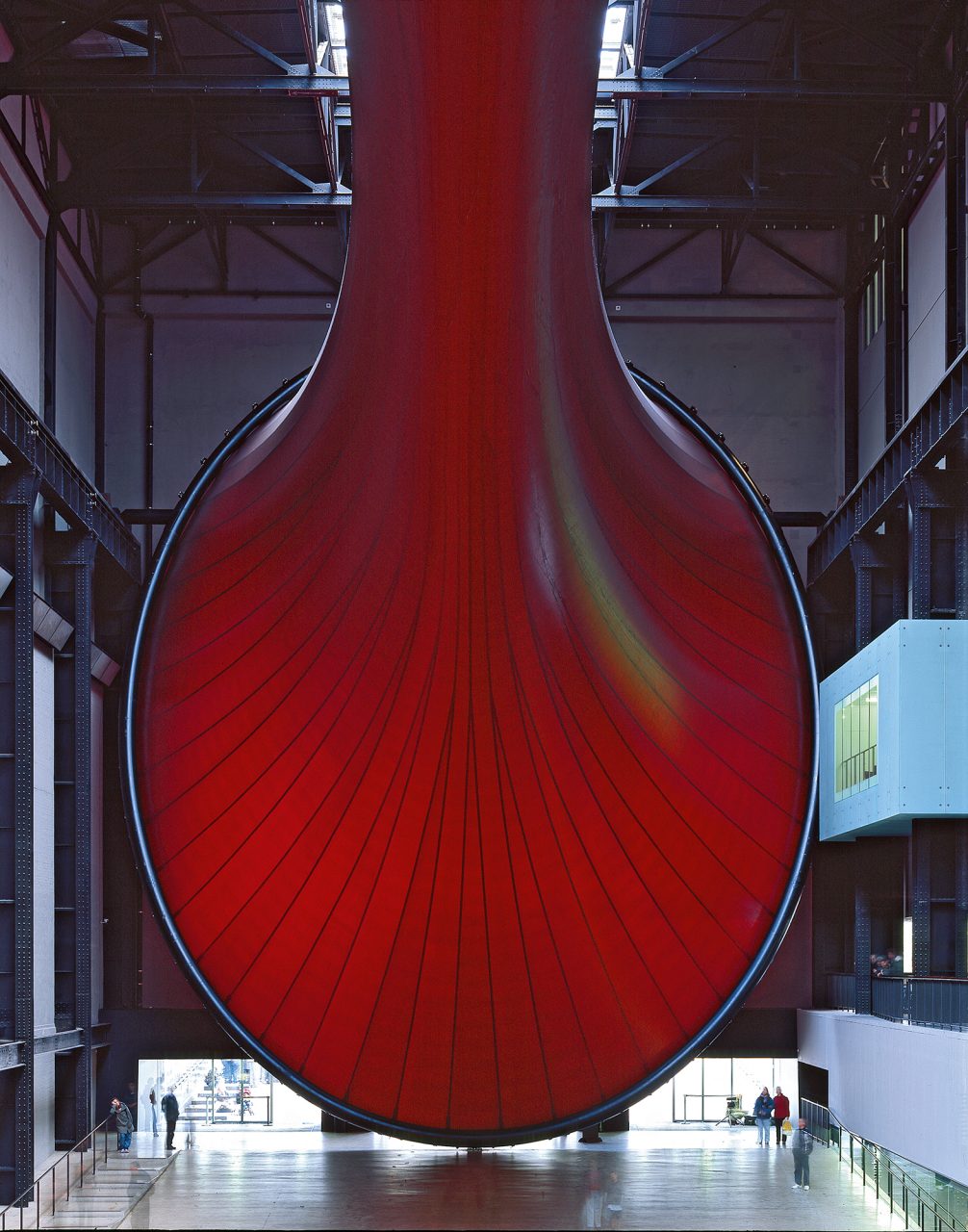
His polished steel Cloud Gate (2006) in Chicago features in the movie Source Code; his 120m-high construction, Orbit, for the London 2012 Olympics, is a haunting presence in Hari Kunzru’s novella Memory Palace (and its accompanying V&A exhibition). Even Kapoor’s temporary installations tend to remain in the memory, such as his epic Marsyas, the giant red steel-framed PVC membrane he fashioned with engineer Cecil Balmond for Tate Modern’s Turbine Hall in 2002, and Symphony for a Beloved Sun (2013), the visceral, somewhat unnerving assembly of wax, steel, canvas and paint – one of 45 works Kapoor installed for a big show at Berlin’s Martin-Gropius-Bau.
Symphony for a Beloved Sun is a big, noisy work, in which clanking conveyor belts drop big blocks of red wax on the gallery’s floor. It provided Kiosoglou and Philippin with a visual metaphor for the design of the exhibition’s eponymous catalogue. The cover displays an intense red oil-paint ‘stain’ that appears to bleed through many of the subsequent text pages. Within the book, there are double-page spreads that show two portrait-format photographs of individual artworks, framed by wide margins and a generous central gutter. ‘The work itself is so much stronger than an image of the work,’ says Philippin. ‘The book has to step in and do what’s not there,’ adds Kiosoglou.

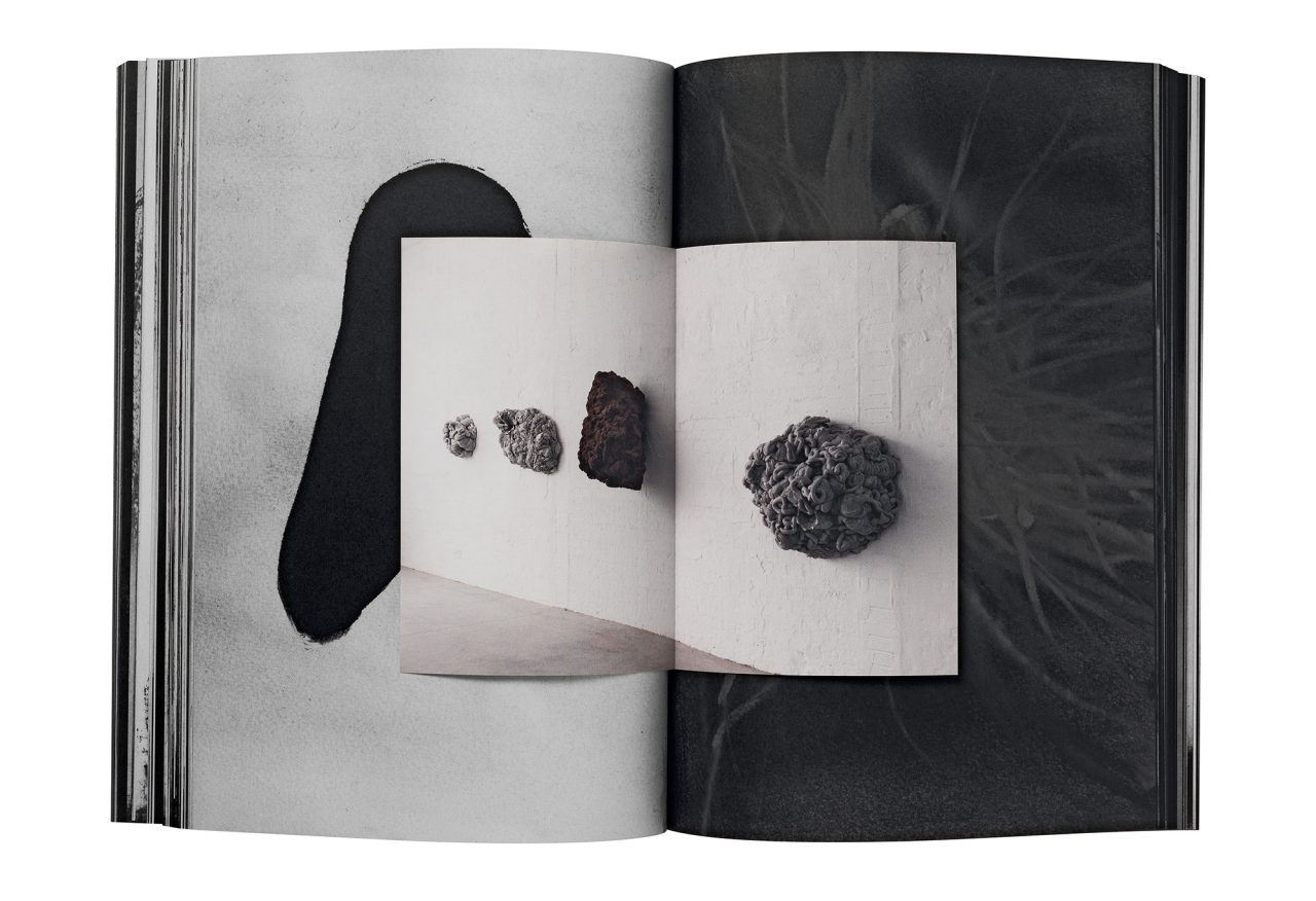
Another example of Brighten the Corners’ counter-intuitive approach to catalogue design is In the shadow of the tree and the knot of the earth (2012). In this book, colour images from the London exhibition of the same name are inserted as loose, folded prints between bound pages that feature Kapoor’s preparatory monochrome gouaches. The result is dark and dense and atmospheric. These gouaches weren’t actually in the Lisson Gallery exhibition. ‘This was one of our most extreme suggestions,’ says Philippin, ‘but the gouaches show the thinking behind the show.’
Kapoor often draws preparatory sketches like these. ‘A lot of the sculptural work comes out of the drawings,’ says Kiosoglou. ‘When we go to his studio we often see sketches that he is working on. Gouaches are much more descriptive of an atmosphere … they say what the sculpture should feel like.’


Brighten the Corners worked with Kapoor in a similar way with their design for the two-volume 2011-12 annual report for lighting firm Zumtobel. One volume is a mesmerising sequence of coloured pages derived from Kapoor’s 1998 video work Wounds and Absent Objects. The other volume is purely typographic – information in the typewriter font Courier is shaped into forms suggested by Kapoor’s work. This rare example of art and design within a commercial context was a popular success, winning several design awards. The Zumtobel report demonstrates the relationship between Kapoor, Philippin and Kiosoglou, in which there are clear yet complementary distinctions between two methods of working.
The designers return again and again to ‘the process’ of working with Kapoor. To explain their ideas, they present the sculptor with mock-ups. ‘What we have learned is that we can discuss [a catalogue] in a conceptual way,’ says Kiosoglou, ‘but we can’t really get a decision until there is something Kapoor can hold in his hands. He will not commit on a theoretical level. If there is an idea, then you have to follow it through and look at it.’ Philippin points to the spacious double page spreads of Symphony: ‘If we had just described this he would have said “no”.’
In some regards, Kapoor is not so different to clients in other sectors, but Philippin and Kiosoglou say that there is no other client whose view they respect so much. The designers have an adventurous spirit that matches Kapoor’s, aided by sympathetic galleries and publishers who are happy to see their ideas to fruition once Kapoor has given the green light. ‘He wants what we want,’ says Kiosoglou, ‘that the book is a thing.’
The ‘sculptural’ materials of printing, the paper and ink, the binding and cover, all contribute to the physical aura of Brighten the Corners’ work with Kapoor. These are not ‘artists’ books’. Rather, they are multiple copies made through carefully supervised manufacturing processes. Each book has a certain mass, a physical presence that serves either as preparation for seeing Kapoor’s work in its monumentality, or as a memento of the experience. At a time when so many artistic experiences are weightless and ephemeral, Brighten the Corners’ collaboration with Kapoor ensures that the art and its process can endure, in different times and spaces, on the printed page.

