Le quartier graphique is the multidisciplinary design studio of Chloé Ceschin, Julien Santran and Valentin Lefeuvre. Based in Bordeaux since 2017, the trio have worked for a wide range of cultural institutions and organisations in the city, including the Bordeaux métropole itself.
In 2021, the studio began designing the first in an ongoing series of publications on the theme of ‘inhabiting the metropolis’ for La fabrique Bordeaux métropole, a public company established by the city in 2012 to counter urban sprawl and instigate housing projects in line with the development of travel routes in the area, anticipating demand accordingly.
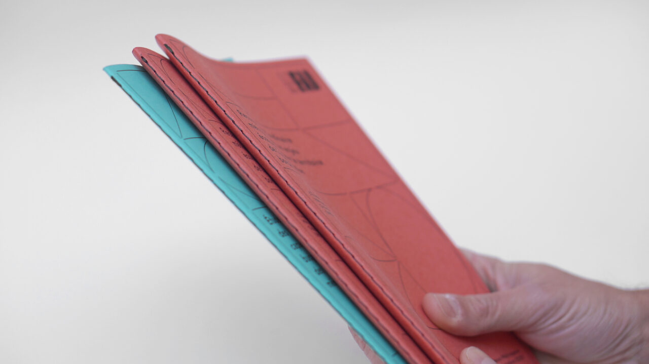
La Fab, as the organisation is known, was commissioned by the city to implement the ‘Habiter, s’épanouir’ (‘Living, flourishing’) housing programme, which aims to provide 50,000 houses for the area. The latest of its publications to be designed by Le quartier graphique, Le logement sur Bordeaux Métropole: des clés de lecture pour décider et agir (Housing in Bordeaux Métropole: approaches to taking action) features a deep red cover.
‘Printed in black, the colour is brought out by the paper,’ explains the studio. ‘We have chosen the Materica, Terra Rossa and Verdigris range in 180 g/m2. Its roughness and natural tones were of particular interest to us for this project.’ Visually linking to the theme of the publications, Le quartier graphique conceived the editorial design ‘in the manner of a plan’, whereby ‘a geometrical construction grid unfolds on the covers and throughout the pages,’ adds Le quartier graphique.
The studio also produced La Fab’s 2021 and 2022 greeting cards. ‘The letters of the logotype [were] reworked, highlighting a joyful, multiple and colourful graphic composition,’ they say. ‘Printed in four-colour offset on Tintoretto paper, they are also micro-perforated and detachable into four postcards.’


Paper: Materica – Terra Rossa, Verdigris 180g/m2